I was recently asked how to change the color assignments for Edge fonts. An Edge font is a special filled type style that has predetermined colors, tints, and halftone assignments. There are a few Edge based fonts that ship with a standard Omega CP package, plus, there are additional Edge fonts available for purchase. Using Omega (or other supported vector based design packages) along with Font Designer, its possible for an end user to create Edge based fonts as well. Creating such fonts will be covered at a later time, as for now, Id like to explore some options for changing these preset conditions.
The following animations and most of the text will concentrate on the current Omega 2.0 package. Not all options or procedures revealed will be available in prior, or possibly future, releases of Omega (or Graphix Advantage).
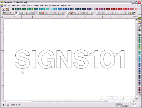
First thing Id like to do is change the current Helvetica Medium SIGNS101 copy to an Edge based font called Alpa Medium. This is accomplished by double left clicking on the text to produce the Enter/Edit Text dialog box. Once inside this dialog box, a press of the [F3] key will produce a sub dialog box titled Font Select. From here, a scroll or jump operation can be performed for a different font selection. Knowing the first available Edge font is Alpa Medium, I started typing each letter, A, l, p and then using the [Down Arrow] key to actually highlight the font name and ultimately the [ENTER] key to accept it as the selected font. Once back at the Enter/Edit dialog box, a press of the [F11] key accepts the changes and returns the user to the desktop area.
The SIGNS101 text has now been changed to the Alpa Medium Edge font. In order
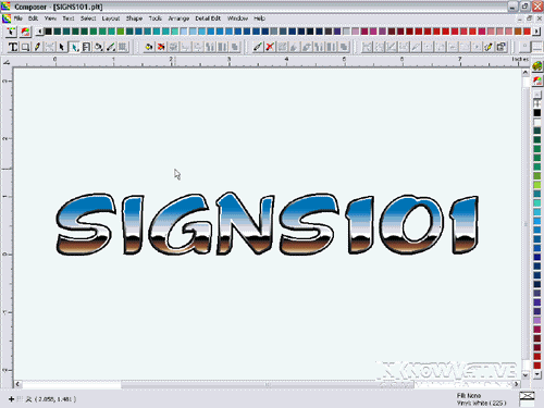
to see the copy in a filled or colorized version, press the [F8]
key. Inside the Gerber software environment, the user toggles between Filled
and Wireframe view by pressing the [F8] key. This particular type style
gives the illusion of a bevel and is rendered in various tints and gradients
of Spot Black.
Looks nice, but what if your design would reflect better if Ruby Red was to be used. There are few ways to go about making this happen. First, and perhaps on of the most easiest in this situation is to simply load the Ruby Red cartridge in the Edge machine when it requests the Black foil. May not be such a bad thing, particularly for owners of the original Edge model, however, not advisable for owners of Edge2 machines. And if other Black elements are in the design, the integrity of the design may be compromised. Additionally, if the Edge font has multip0le colors, spot or process, this usually isnt an appropriate option.
Another option, and the one performed in the animation sequence, is to actually assign the Ruby Red color in place of the Black. To start this procedure, press the key combination of [SHIFT + F3]. This is a faster way of getting to the Select By Spot Color dialog box then going to the drop down menus of Select>Spot Colors>Fill.
A single left click on the Black color swatch
will select every object that contains a Black fill style. Notice, we dont
have any 100% solid Black fills, but we do have plenty of Black gradient fills
happening. These objects, since they do contain some form of Black are selected
by this method. After selecting all of the black based objects, press the [1]
key or left click on the Fill short cut icon to get the Assign Colors
dialog box. This dialog box will allow us to change every instance of Black
to Ruby Red.
The first thing we want to do inside the Assign Colors dialog box is to enable
single color gradient fills. This can be done quickly by pressing the [Z]
key, or left clicking beside the Use single color in gradient fills option.
This will ensure that what ever color is chosen will be used through the entire
gradient fill. With that option enabled, we can now change the color.
Another fast way of changing colors is to press the [:] key (thats the [SHIFT] + [;] keys). That operation will automatically highlight the assigned color which allows for the immediate typing of the desired color. For this exercise, R, u, b was entered then the [Down Arrow] key pressed to jump and select Ruby Red.
One key operation needs to happen before moving forward. The Changes Only option needs to be selected. A fast way to perform that is by pressing the [H] key. If this option was not enabled, every object selected would take on the properties of the current settings. In this case, 100% solid fill of Ruby Red; not at all desired. With this option, only the changes that have occurred within the dialog box will be applied to the selected objects. As we exit this dialog box, by pressing the [ENTER] key, you see the former Black text has now changed to Ruby Red.
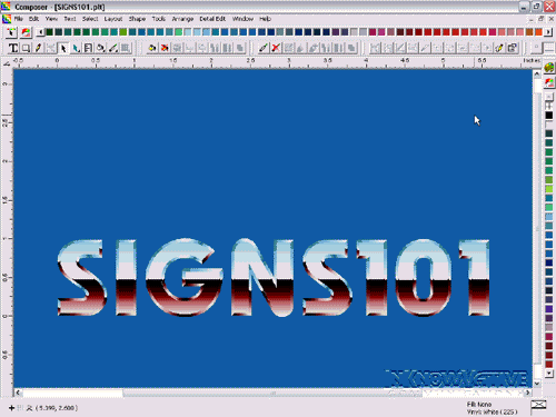
For this next portion, lets use another approach to change the type style. Starting with the Omega package, the user has the ability to work with text on the work surface (TOWS). This is the feature being used in the animation below. Pressing the [SHIFT + T] combination is the short cut to enter TOWS mode. To verify that TOWS mode has been imitated, look for the TOWS toolbar to be displayed (along the top in this example). Once in TOWS mode, perform a left click sweep selection starting just to the left of the desired text. Youll know if this was successfully executed when the text become highlighted.
There is an additional, or supplemental, TOWS toolbar available that contains some extended functionality. One of the features of this extended toolbar is the filtering of fonts based on predetermined categories. To invoke this additional toolbar, press [SHIFT+CTRL+2] key combination (could also left click on the down arrow icon to the far right of the standard TOWS toolbar). To enable filtering, press the [SHIFT+CTRL+O] key combination or left click on the Select Font Categories short cut icon.
The resulting dialog box will show all available font categories. There is a category titled EDGE, and, by default installation, should include all EDGE based fonts currently available to the system. If wanting to filter by multiple categories, hold the [CTRL] key and left click on each desired category. Once the categories have been chosen, press the [ENTER] key. Now the only fonts available from the drop down list are those that are included in the selected categories (EDGE only fonts in this example).
[SHIFT+CTRL+F] is the speed key combination to access the font drop down menu, however, it does not provide a font preview. In order to see a preview of the font, a left click on the down arrow is required. As the animation reflects, you see a real time, wireframe view, of the font using the selected copy. For the next part of the exercise, Burgess Chrome is the font of choice.

This type style differs from our first example in the fact it has multiple colors assigned and completely rendered with process fills. This is a case where we cant cheat and take the easy way out by putting in a different cartridge then what the EDGE asks for. Using what was learned above, it shouldnt be very difficult to institute a color change (or other changes for that matter).
For this example we will be changing the Blue to a Red in the top portion of the chrome appearance. One change to consider is the fact that the fill style for this font uses process colors. To select by a Process Color, press the [CTRL+4] key combination to bring up the Select by Process Color dialog box. From here, left click on the Blue swatch then press [ENTER]. Every Fill instance of that Blue is now selected. Open the Assign Color dialog box, [1]. Because we are working with Process fills, Process is the preferred Color Type. Perhaps there is a certain Pantone number that the client would like matched in this area. If thats the case, select the Gerber EDGE PANTONE Process Palette in order to get better matches for Pantone colors. Now that the palette has been selected, lets change the color.
If there are gradients within the selection,
be aware of the selected control node or point in the gradient. The Black
box or Black triangle is the current selected control point and where the
changes will be applied. The left most control is the current selection, so
any color change will be applied to that control point only. A little more about
this a little later.
There are a few ways of selecting color swatches at this point, but the fastest
is to actually type in the name if you now the Pantone numbered desired. To
keep things simple, lets use PMS 185. Perform a sweep selection to highlight
the current entry in the Color Name section. Now, start entering the
Pantone number in the proper format. That format takes the form of "PANTONE®
185 CV. That is PANTONE, followed by the registered
mark, (Hold the [ALT] key then press [0], then [1], then
[7], then [4] (from the numeric keypad) then release the [ALT]
key), a space, the actual PMS number, another space, then CV.
A little cumbersome until you get use to it, but a huge time saver with a little
practice.
So the beginning of the gradient is filled with a process color matching PMS 185, however, there is still some of the default Blue present. To change that, left click on the control point triangle on the gradient that contains more of the Blue. In this case, its just to the left of the current selection. With it now selected, any color changes will be applied to this control point. Lets try it!
Something I did once the Pantone data was entered in the above step was to press the [SHIFT+HOME] key combination. This highlighted the current data that was just entered and allows the saving of a little extra time if this data will be used again in the near future. I knew that I wanted to apply this same color to the next control point, so once it was highlighted, I pressed the [CTRL+C] key combination to copy it to the clipboard. Now, when I have the new gradient control point selected, I can perform a sweep selection of that data in the Color field and press the [CTRL+V] key to post the Pantone 185 information, foregoing the need to re-type it. Not a huge time saver in itself, but one that does add up over to measurable results over the course of a year.
Notice that all the Blue has been removed from the gradient. Again, need to enable Changes Only to make sure that the only thing that is changing is the color assignment. Quickest way to do this is by pressing the [H] key. Once that is done, press the [ENTER] key and see how quickly the characteristic of the font changes. Going from a cool and cold feeling from the north to a warmer desert feeling of the southwest.
Other changes can be made in the same fashion. The only changes so far has been color assignments. If you wanted to apply an underbase, or Prime, to certain sections of the font, this is the way to do it. Any changes, and only the changes, made within the Assign Colors dialog box will apply to the current selection providing the Changes Only option is enabled. Real time saver if wanting to changes multiple properties at once. Perhaps not only a change with the color assignment, but also a halftone change and an Overlap/Overprint state.
The following animation shows a simialr example as above, but changes two colors within the font. Nothing new is introduced here that has been reviewed further above. It does require two visits to the Assign Colors dialog box since it was dealing with two separate selections and areas within the font.
Edge fonts can add some dressing to a design, however, there default color assignments may not always lend themselves to a proper look, feel, or readability. This little exercise exposes some ways to modify the default look and perhaps set yourself apart from those that dont make changes.
Have fun and if you have any questions regarding anything covered within, please post and Ill do my best to answer.
© InKnowVative
Communications 2002-2003; All rights reserved.
The above text and associated pictures are copyrighted materials of InKnowVative
Communications and may not be altered or reproduced in whole, or in part, in
any print or electronic form without direct written permission from InKnowVative
Communications, a division of The InKnowVative Group, Inc.