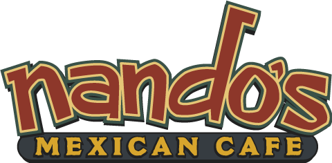
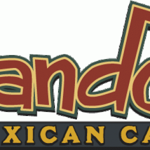
This is the final logo type version for nando's Mexican Cafe. The restaurant was under construction when I met the owner quite by accident. He was in the process of getting his signs designed when I spoiled everything. We rushed to get this layout into production before a decision had been made on the final colors for the logo. The buidling sign was built with this typestyle, but with steel gray, halo-lit, reverse pan channel letters for "nando's" and a black internally lit cabinet for Mexican Cafe.
Like my Tap House layout, the pictures are in digital heaven and 800 miles away.