-
I want to thank all the members that have upgraded your accounts. I truly appreciate your support of the site monetarily. Supporting the site keeps this site up and running as a lot of work daily goes on behind the scenes. Click to Support Signs101 ...
Recent content by HardbargerSigns
-

Looking for a seasoned designer in Virginia?
Greetings all! My Wife is in the Army, as a Diver, and her duty station will be Fort Langley/Eustis. I'll be looking for work in the Yorktown area if anyone is looking for a top notch designer to join the team! :) Not sure where I should post this, but I figured General Chit Chat would...- HardbargerSigns
- Thread
- Replies: 0
- Forum: Member to Member Classifieds • Employment Wanted
-
Resizing JPGs for large prints
.Jpeg is a compressed image type, .Tiff retains more of the pixels and thus provides better results. When I size an image up in scale, either by inches or DPI, let's say it's 72 DPI, obviously it's going to be a terrible image if it's ALSO only 5 inches wide. If you size it ip to 150 DPI by...- HardbargerSigns
- Post #11
- Forum: Digital Printing
-
Resizing JPGs for large prints
Don't resize in one big jump, Photoshop automatically adds a sharpen to the image with each resize. So sizing up 25 or so DPI at a time will result in a better image in the end. Also, saving as a .Tiff will also help your final image quality. :)- HardbargerSigns
- Post #7
- Forum: Digital Printing
-

A fun project, using Photoshop & Corel! Feedback?
Thanks! I can't TELL you how much fun this project is! :)- HardbargerSigns
- Post #25
- Forum: Portfolio Board
-
Another newbie...
Howzit! And welcome! We look forward to seeing some of your work! Best of luck! :)- HardbargerSigns
- Post #7
- Forum: New Member Introductions
-
Thoughts on this one...
Closing up the graphics top and below the headline might give it more cohesion. Like this attachment. Rather than the scales just floating free, they now form a part of the logo as a whole. :) Love your style my friend! B. :cool:- HardbargerSigns
- Post #5
- Forum: Designs & Layouts
-
Thoughts on this one...
Nice! I would alternate some bright yellow into the tagline and sub tagline to break up the text and improve readability just a tad. Another less ornate panel for the taglines might help draw more attention to the headline text too. Obviously, we don't have to tell you that it looks FABULOUS...- HardbargerSigns
- Post #2
- Forum: Designs & Layouts
-
A fun project, using Photoshop & Corel! Feedback?
I was wondering... I was wondering if anyone would notice that! Thanks jfiscus! It's been bugging me since I created the bloody thing! haha I've made the change, and added a close up view to show the filters working their magic. :) This IS indeed a fun project, and I try to add a special...- HardbargerSigns
- Post #22
- Forum: Portfolio Board
-
A fun project, using Photoshop & Corel! Feedback?
Hahaha! Well, he IS, after all, the Alpha. The toons were supplied by the client, he wanted a very kid friendly look. :) haha- HardbargerSigns
- Post #20
- Forum: Portfolio Board
-
A fun project, using Photoshop & Corel! Feedback?
A few more banners... Being a large project, I'll add more as the artwork progresses. :) I still have the info A-Frame panel design coming.- HardbargerSigns
- Post #16
- Forum: Portfolio Board
-
A fun project, using Photoshop & Corel! Feedback?
Thanks everyone! I'm still, even after so many years in the trade, taken aback by the outpouring of praise the Letterhead community is capable of. It's truly awe inspiring that so many kind folks, masters of the craft themselves, can find it in themselves to appreciate the work of their...- HardbargerSigns
- Post #14
- Forum: Portfolio Board
-
A fun project, using Photoshop & Corel! Feedback?
A few more from this project... Some of the concession area signs, again, with Photoshop CS6 hand made filters! Yummy raster goodness! :Big Laugh Cheers, Bryan- HardbargerSigns
- Post #7
- Forum: Portfolio Board
-
A fun project, using Photoshop & Corel! Feedback?
Wow! OK, ya'll are making me BLUSH. :) Thanks SO MUCH for the kudos, it means a great deal coming from you lot! :toasting: Keep it shiny side up everyone! Cheers, Bryan- HardbargerSigns
- Post #6
- Forum: Portfolio Board
-
Creating a transparency in Flexi 10... or, NOT?
Update... Just heard from Flexi Worldwide on Facebook: "The Lens effect is only available in certain levels of Flexi - FlexiSIGN-PRO, FlexiPRINT-SERVER, FlexiPRINT and FlexiDESIGNER. To see what level you have, open Flexi and go to Help > About." So, There ya go. :)- HardbargerSigns
- Post #3
- Forum: Flexi
-
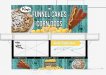
Corn dogs.....funnel cakes!
Nice! Nice job! Love the graphics, great images, nice layout too! :rock-n-roll: Cheers, Bryan- HardbargerSigns
- Post #8
- Forum: Portfolio Board