-
I want to thank all the members that have upgraded your accounts. I truly appreciate your support of the site monetarily. Supporting the site keeps this site up and running as a lot of work daily goes on behind the scenes. Click to Support Signs101 ...
Search results
-

Honest opinions & suggestions please
Havent been in here for a while now and the first thing i look at getting back was the A... OMG that must be the ugliest thing ever made... Your boss should never ever be aloud to use a computer for designing thing again. Darn don't even give him a pencil and a paper... :omg...- sthammar
- Post #44
- Forum: Logo Design
-
-

New company logo! Critique?
I also think it looks good, very simple and elegant. I however agree with Artbot pull the text up a few notches and as jill sad it lacks a bit odf contrast, at least in the picture. In real life i cant say since the colors probably looks a bit different and the contrast just might be ok then...- sthammar
- Post #8
- Forum: Logo Design
-

A little logo help....
Artbot. Very good idea accually. I have tryed not the door nocker but a door handle, but the client sorry to say didn't want to listen. As i sad to Dan i tryed to skip the rules and emphased that it would be good for them to change and that it sad much more with those logos. But to be honest i...- sthammar
- Post #24
- Forum: Logo Design
-
A little logo help....
Dan, thanks again for some very useful insites and i agree completley with your statement about a company can loose cash with the wrong picture. I don´t agree with you about the feeling the sun and so on gives. but hey we are all different and see things differnetly. I do how ever respect your...- sthammar
- Post #18
- Forum: Logo Design
-
A little logo help....
Jasper: Thank you for your straight answers! Yes you might be wright about the size of the buildings but in real they are 7 buildings with 5 floors and 15 to 20 apartments or condos ( not as i wrote in my first post 10-15) Where the buildings are seated there is no other buildings even...- sthammar
- Post #15
- Forum: Logo Design
-

Logo layout. Let me know what you think
Don´t be so defensive! Try to listen to what people here say, belive me most of them are very good at giving pointers. I get the feling that you accually didn't want any critics. I think you made that logo and liked it very much and i also think you where proud of it and just wanted to...- sthammar
- Post #16
- Forum: Logo Design
-
A little logo help....
Jasper, i see your point but in sweden everyone knows what BRF stands for so i don't think it will be missled to solarpanels here, but thanks for the warning. Do you have any more ideas considering making the logo feel warm and welcoming insted of the sun ? SignManiac i never considered puting...- sthammar
- Post #10
- Forum: Logo Design
-
A little logo help....
New mockups Ok thx for the inputs. Here are some more suggestions i made... What do ya think?- sthammar
- Post #6
- Forum: Logo Design
-
A little logo help....
Ok i am stuck.... Need ideas or a new way to think. Its an economic association that has several big houses and in each house there is like 10 to 15 apartments. I don´t know what its called in english but i guess tenant-ownership is the closest i can find, but you can buy an apartment or the...- sthammar
- Thread
- Replies: 23
- Forum: Logo Design
-

Need critique on logo
Well SignManiac i think your first was the best. Very plain and simpel, you can use it like that or inverting it wount either be a problem. Very good imop.- sthammar
- Post #33
- Forum: Logo Design
-
Logo Design Help
So? What happend ? did you do the logo for them? If you did cant you show the end result ?- sthammar
- Post #49
- Forum: Logo Design
-
Big Swede!
Oslo is in Norway Oslo is the capital of Norway, Or are you from Sweden and grandparents live in Norway now ?- sthammar
- Post #18
- Forum: New Member Introductions
-
-
-
Sp300 vs SP 300i
Hey all. I have a Roland SP 300i and i am very happy with its preformance for what i am doing. A friend of mine is also thinking of buying a Versacamm but hes thinking af getting the older SP 300 Now to my question. What is the difference between the older SP 300 and the newer SP 300i -

Logo Critique
Looks great imop. :clapping: Just one thing... Are you making a logo for black and white to or ? I think you always should have in mind what it would look like if it gets used in a very small scale and black and white. I have seen many really good looking logos look like sh-t whne copied or...- sthammar
- Post #39
- Forum: Designs & Layouts
-

Logo Critique
I agree with some of the others about using the old picture but with your layout. One thing i am woundering about why the circle around the familly ? Are they a global company or ? If they are only local i probably would choose to take the globe away from the old picture and just keep the...- sthammar
- Post #12
- Forum: Logo Design
-
Logo Design Help
Some quick mockups of ideas i put together while making some backups of my files. Don't know if you allready have decided and made the logo... but here they are... I know i am a bad english speller so please don´t bash me if there is anything misspelled....:frustrated: hmm well i hope i am...- sthammar
- Post #48
- Forum: Logo Design
-
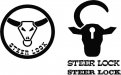
Logo Design Help
the lock Lots of good advices in here... My tought tough is. - Its a lock that locks golf carts - the "brand name" is steer. - The client wants a steer head in the logo. Ok that all good.. but i must agree on the fact that a big steer head is making me think of cattle not strenght...- sthammar
- Post #43
- Forum: Logo Design
-
Big Swede!
Well.. Hello to everyone. I am a graphic designer or well... that my title at least. Been doing flyers, logos, broschyres, posters, branding, magazines, and so on. Now i am about to enter a world i have found very interesting but have never really been in, the makings of SIGNS. Sure i have...- sthammar
- Thread
- Replies: 20
- Forum: New Member Introductions