-
I want to thank all the members that have upgraded your accounts. I truly appreciate your support of the site monetarily. Supporting the site keeps this site up and running as a lot of work daily goes on behind the scenes. Click to Support Signs101 ...
Search results
-
Vinyl lettering on dumbbells
A local fitness center wants to have their name and the weight amount applied to ends of 40 sets of dumbbells. These end pieces are a painted metal with some sort of protective finish. On the end pieces, there are two recesses, the top will have "UGL" and the smaller one will have the weight... -
-
To remover or not to remove?
Rollepro.com - Rob Ivers will show you the way......... (p. 107 of new Feller's catalog)- dweinmann
- Post #3
- Forum: Tips & Tricks
-
Getting started as a hobby
Signs101 isn't for all interested!?! Why are so many giving this new-comer such a hard time? On every page of this forum, it says "We are a community of professional sign makers and others interested in our craft. If you are, once were, or want to be a professional sign maker, we invite you to...- dweinmann
- Post #16
- Forum: New Member Introductions
-
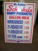
Where do you get changeable milk price signs?
What about making them out of a 1 mil PVC (styrene)? Only $2 for a gallon of milk? Nice!- dweinmann
- Post #3
- Forum: General Signmaking Topics
-

Changing a tire on I-75
Thank you SO much for that laugh today. Whew, I needed it. Out of curiosity, what did you get cited for?- dweinmann
- Post #3
- Forum: General Chit-Chat
-
-
Methods to mount a full coverage print on a substrate?
Do you have a laminator? There was a great post (do a search) on how to use a laminator to mount vinyl. You'll save a ton on masking tape!- dweinmann
- Post #2
- Forum: Digital Printing
-
Best Wrap Training/Seminars - Thoughts?
I, personally, have not had any professional wrap training, but do want to check one out someday. I'm sure there are hundreds of classes available, but this quickly comes to mind. http://fellers.com/index.cfm/spKey/wrap.training.htm?spId=B0A6DC6A-0F44-65F1-7E491C27F74306F1 Anyone have...- dweinmann
- Post #2
- Forum: Vehicle Wraps
-
Logo Critique
Looks great! Well constructed, good use of colors. Typically, using three different fonts is bad, unless you have good reason for that third one. In this case, the third being part of the logo, it works. I like that you've used a blocky font in the logo box and balanced that out with rounded...- dweinmann
- Post #5
- Forum: Logo Design
-

Recent simple free standing sign
Great looking sign, thanks for sharing! I don't have much experience with constructing larger signs like this, so this may be a dumb question. Is there any top and bottom piece at all? From your 'top view' attachment, it doesn't look like it.- dweinmann
- Post #11
- Forum: Portfolio Board
-

Church Logo
I agree with Marlene. It is sending out a sort of 'shipping' or 'trucking' feel. I like the circled G, but the words, using the impact font, are just too boring. It doesn't have any character. The circled G does have character; I like that its an italicized letter and that the outline of it...- dweinmann
- Post #7
- Forum: Logo Design