-
I want to thank all the members that have upgraded your accounts. I truly appreciate your support of the site monetarily. Supporting the site keeps this site up and running as a lot of work daily goes on behind the scenes. Click to Support Signs101 ...
Search results
-

Suggestions Logo Critique?
Do you use a color palette (3 to 4 colors and/or shades) in your current branding? If not, probably time to develop one. The Adobe Capture app is great for creating/playing with palettes. If in doubt, look to nature for colors that work well together. Crazy thought: What about J in red, B in...- Michael Lord-Imaizumi
- Post #41
- Forum: Logo Design
-
-
Suggestions Logo Critique?
I like it generally. The J in this font is a little hard to read, you might convert to curves and shorten the tail. Part of your challenge is making sure JBM doesn’t read as IBM, so I guess that limits some of the font choices. Lastly, I think you are missing an opportunity to be more...- Michael Lord-Imaizumi
- Post #39
- Forum: Logo Design
-
Please opine on theses Print Test results.
No worries. It's printing pretty good for now. I'll replace the head when it finally craps out. Sent from my iPhone using Tapatalk- Michael Lord-Imaizumi
- Post #8
- Forum: Roland
-
Please opine on theses Print Test results.
Thank you. I'm hoping a head soak will help? Sent from my iPhone using Tapatalk- Michael Lord-Imaizumi
- Post #6
- Forum: Roland
-
Please opine on theses Print Test results.
Thank you. I thought this machine only had two print heads, are they shared heads like K/C and M/Y?? I'm working on getting my hands on the service manual. Guess I'll be learning hoe to replace the print head...- Michael Lord-Imaizumi
- Post #3
- Forum: Roland
-
Please opine on theses Print Test results.
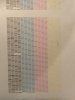
Total noob here, so many thanks in advance. I just picked up a used SP-540V. Ran a print test (before purchase) and got these results (please see attached file). Are these good, bad, okay, or? Seems like something is not quite right with the black, but honestly, I have no idea what i am...- Michael Lord-Imaizumi
- Thread
- Replies: 7
- Forum: Roland