-
I want to thank all the members that have upgraded your accounts. I truly appreciate your support of the site monetarily. Supporting the site keeps this site up and running as a lot of work daily goes on behind the scenes. Click to Support Signs101 ...
You are using an out of date browser. It may not display this or other websites correctly.
You should upgrade or use an alternative browser.
You should upgrade or use an alternative browser.
Advise and Opinions
- Thread starter dakotasignwerks
- Start date
Fred Weiss
Merchant Member
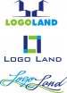
I like either #1 or #2 ... #1 slightly better. #3 is a no go for me. Too hard to read and script typefaces aren't even being taught in classrooms anymore.
oldgoatroper
Roper of Goats. Old ones.
or LegoLand....I just can't get past Candy Land after reading the name.
visually, #1 is pretty good, though, but could be a little more unified-looking
<edit> not sure if the attached would be better or not...
Attachments
Last edited:

C
ColoPrinthead
Guest
I like the first one, second one is L7.
Signmaker1234
New Member
Top font, middle icon!

Johnny Best
Active Member
Marlene
New Member
the simple fix oldgoatroper did really made a huge change on #1 and I like. the name bothers me as it sounds like a knock off of legoland and the font you used looks like the one they use. I would suggest finding another font because of that. having a logo design for a logo designer look like like another's logo isn't a good idea
eahicks
Magna Cum Laude - School of Hard Knocks
LOL...we have a customer with a similar logo, I always refer to them as "L7"....I like the first one, second one is L7.
Attachments

Nix the script, I would say #2 but as eahicks pointed out, there is one familiar. What does your primary logo look like?Trying to work on a secondary logo for oneself can be very difficult. I put together a few ideas that I really need help on. I am thick skinned so hammer away.
Circleville Signs
New Member
#1 has potential, but needs reworked.
Also, my initial thought with a name that sounds as playful as this, is that the logo needs to match that level of playfulness. #2 and #3 definitely do not do that.
Also, my initial thought with a name that sounds as playful as this, is that the logo needs to match that level of playfulness. #2 and #3 definitely do not do that.