• I want to thank all the members that have upgraded your accounts. I truly appreciate your support of the site monetarily. Supporting the site keeps this site up and running as a lot of work daily goes on behind the scenes. Click to Support Signs101 ...

Another Donor board

SignManiac

New Member
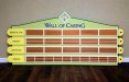
Just finished this up a few minutes ago and will be installing tomorrow. 3' x 7' wall donor recognition board. Multiple layers of PVC all shot with Matthew's satin paint. It's going inside a six bed hospice so they wanted me to come up with something cheery and gave me free reign. Made some matching ADA wall signs that go with it too.
 

Attachments

  • Gulfside Wall of Caring.jpg
    Gulfside Wall of Caring.jpg
    60.6 KB · Views: 90

SignManiac

New Member
Thanks, the photo dun really do it justice. I'll have to see if I can some better shots with different lighting to show more of the dimension. Fluorescent lights always shoot worse than natural light.
 

SignManiac

New Member
those are being laser engraved on separate pieces of brushed copper Romark with an adhesive backing. They will be the same size as the metallic copper panels I made, so that I can mail it to them and they will put the names on themselves.
 

Scott Reynolds

New Member
I am a little confused, you say there are six beds at this hospice, but there is only five spots on the sign. Somebody is going to feel left out, are they? Other than my cynical observations, the sign looks really really good.
 

CanuckSigns

Active Member
I am a little confused, you say there are six beds at this hospice, but there is only five spots on the sign. Somebody is going to feel left out, are they? Other than my cynical observations, the sign looks really really good.

a donor board is for people who donate money to the hospice, not the people who are being cared for.
 

Scott Reynolds

New Member
a donor board is for people who donate money to the hospice, not the people who are being cared for.

I know that, but there are 6 beds, it wouldn't be unreasonable to think there could be 6 benefactors, one for each bed in such a small facility. Im not trying to split hair's here, I just noticed that the number of benefactors was one short of the beds. If there was 5 benefactors and 20 beds, it wouldnt have even crossed my mind.

But back to the sign .... Looks REALLY good.

Much better than my hand drawn with a sharpie on butcher paper sign would have looked. :Big Laugh
 

SignManiac

New Member
Thanks again everyone. These things are challenging with the space and design restrictions to be considered. Each of their locations all have different architectural problems to work with. There next facility is in a wing of a hospital and they want something very modern and contemporary. Should be fun!
 
Last edited:

Marlene

New Member
really pretty colors. nice looking sign as these are usually kind of cold looking signs. this one is nice, warm and friendly looking. I usually hate the big cap on the front and end of a phrase but I can forgive that as the rest is so pretty.
 

J Hill Designs

New Member
I know that, but there are 6 beds, it wouldn't be unreasonable to think there could be 6 benefactors, one for each bed in such a small facility. Im not trying to split hair's here, I just noticed that the number of benefactors was one short of the beds. If there was 5 benefactors and 20 beds, it wouldnt have even crossed my mind.

But back to the sign .... Looks REALLY good.

Much better than my hand drawn with a sharpie on butcher paper sign would have looked. :Big Laugh

theres actually room for 65 names on that thing
 

SignManiac

New Member
The number of beds has nothing to do with the donor board at all. It only has to do with the contribution amount. More money gets you a bigger plaque with your name on it. They would have loved to have more spaces allocated but the hall is very small and there was only one spot for it to fit in between two doors that are 8' apart.
 

SignManiac

New Member
really pretty colors. nice looking sign as these are usually kind of cold looking signs. this one is nice, warm and friendly looking. I usually hate the big cap on the front and end of a phrase but I can forgive that as the rest is so pretty.

Good eye Marlene. I was waiting for that to come up and I wrestled with doing it that way. Because the layout isn't symmetrical, I originally had just an initial cap for Wall of Caring. But it visually was off balance and made the left side heavier. Fortunately, the colors distract your eye from it :)
 
Top