• I want to thank all the members that have upgraded your accounts. I truly appreciate your support of the site monetarily. Supporting the site keeps this site up and running as a lot of work daily goes on behind the scenes. Click to Support Signs101 ...

Before & After on myself.

Jillbeans

New Member
This is one of those layouts where the customer is also a dear friend, who happens to love hammers.
His store is housed in a grand old bank building which has hammers hand-painted onto the hardwood floors.
:wink:

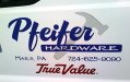
I did his old truck back in 2005. It's still AVERY after all these years, in case anyone wants to see what a classic Avery failure looks like. (note grey hammer) This was when I was still running my 4B/GA6.2, and the design is one of my first forays into trying something other than just puked out computer letters. I needed to clip that background hammer so it didn't show thru the letters in the panel but hindsight is 20/20.

One door took me 2½ hours to peel off. I still need to do the other side but I have to wait for my fingers to heal up. Note the angle of the sun in the 2nd photo.

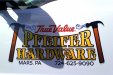
I pointed out the Avery failure to him, which he hadn't really noticed. I wanted to fix it about 3 years ago and doodled up the layout I eventually used, but he is a slow-moving guy. To me, the layout is relying too heavily on clipart scrolls for an antique-y feel and I wish he wouldn't have liked it so much. I kinda prefer the old layout, with a tweak or two.
:wink:

So anyway, I spent my St Pattys Day getting sunburnt and peeling Avery, then quickly applying the new prints from D&T Graphics onto two trucks. Luckily one was still naked. Those took less than 5 minutes each. My friend LOVES this.

It just makes me wonder how many more customers think that's what vinyl is supposed to do and never said anything?
Love....Jill
 

Attachments

  • pold.jpg
    pold.jpg
    104.4 KB · Views: 139
  • new.jpg
    new.jpg
    116.9 KB · Views: 97

fmg

New Member
What is the name of the typeface in the second picture the True Value section please. Looks real nice what you did!
 

skyhigh

New Member
Is it my imagination, or is nothing centered? I like the looks of the yellow, black & gray shadow.....but thats about it. The gradient in the hammer handles looks hokey, and I don't understand why you would use scrolls off the head (they look outta place....but I guess they do frame the TV part) If you were getting prints, why not use a real picture of a hammer?

Sorry Jill. You know I'm a big fan of your stuff....but the only part of this I like, is the font and colors.
 

Jillbeans

New Member
I wouldn't mix a photo hammer with this layout.
Like I said, I sorta liked the old one better.
I do like the colors in the new one.
The fonts are LHF classic caps (if memory serves) & chesham sans.
I think the T on the True Value makes this look off-centered, or maybe the angle of the pic.
 

skyhigh

New Member
I think the T on the True Value makes this look off-centered, or maybe the angle of the pic.

I was more drawn to the "Pfeifer" to the "Hardware". As for the TV.....the R-trademark shouldn't be included in centering process (imo)
 

ova

New Member
Hey Jill. I think I like the first one also. Second one seems kind of busy. Sometimes simple is better.

Is business picking up any? Hope so. I still looking for an employee down this way.

Dave
 

Moze

Precision Sign Services
I like the second design better, but think it would look better without the scrolls.

I think the off-center look may be from the spacing: The 'P' in 'Pfeiffer' is closer to the hammer and scroll than the 'R' is.
 

OldPaint

New Member
i like the 2nd one. show how your own tastes change over the years. nice font. iam with skyhigh on the positioning. the left hammer head is almost sitting on the P, and the scroll is just at the head of the hammer. on the right, the hammer is higher off the R, AND OVER THE SCROLL, and phifer is not centered over hardware, the P is a little to the right to far. but overall a great layout.
 

Gino

Premium Subscriber
I like it. Don't care for the flourishes, but that's just me.

I don't know if I've ever used an intentional shadow cast to the direct bottom..... interesting....

Last thing.... I think I would've used only one schwoosh in those 'A's
 

sfr table hockey

New Member
Jill, this is more for the removal part. Have you ever tried a clothing steamer to remove old vinyl. It makes the vinyl soft and pliable again and it works wonders on lexan backlits. Just wondering if it would do the same on vehicles. I have not tried this yet as I have not had one to do but if it works like it does on Lexan you may find it will take 20 min to do the same job and you still have fingers.... unless you steamed them..... that would not be good.

If you do try, just note, try a test spot or hold the steam on an old junker and see if it does anything to the paint. Or try it on the first guys car that parks in your spot.
 

SignosaurusRex

Active Member
Overall....Nice change. :wink:

My critique if you care:
I like the new layout and fonts concept, considering the location of his store. In my honest opinion Jill, I think the scrolls are overkill and unnecessary. I agree with Sky on the Pfeifer being visually off-center. I do like the use of the LHF Classic Caps. Personally, I think a slightly thinner outline would have looked better, but that's just me. The graphic style of the hammers don't fit IMO. I hate to say it Jill, but in all honesty, Where you rushed for time or tired on this one? I don't see your higher level of heart & skill shining in this one compared to your usual work.
 
J

john1

Guest
I like the layout better on the first layout, I'm not a fan of overlaying vinyl where you can see the edge under the top layer. That's a huge peeve i have.

Vinyl breaks down, He got 5 years out of it and i say it was well worth his investment. Even if it was a $1000 job, he only paid $200 a year for advertising. Not bad if you ask me. The hammer is the only problem that i see with the first as far as vinyl holding up. If it wasn't layed under the first vinyl, you could simply replace it no problem.
 

Deaton Design

New Member
I like them both. Dont know about the scrolls, but if they were the same color gray as the shadow, they would blend better.
 

Mike Paul

Super Active Member
I prefer the first layout also, I don't see the need for two hammers...

2.5 hrs. per door for removal seems crazy long. A heat gun, torch or steamer will make that a lot quicker. I'd toss the blow dryer because it doesn't produce enough heat. If the vinyl is heated and you can't get your fingers under it to peel/pull it up, you need to plow it with a hard plastic removal tool.
 

Jillbeans

New Member
I do like the first layout better.
I did the second layout about 3 years ago, and he already has it on some other stuff.
(work shirts and ads)
I did try something else but he LOVES hammers.
:)
This is from a time when I was just learning Corel so I agree with everything that's been said (except using a photo hammer)
Especially about the outlines and the all-caps HARDWARE.

The reason the removal is such a killer is because it's Avery. This stuff peels off as tiny little shreds. I told him to take the truck to a self car wash and hit it with a pressure washer wand. Then I will go back at it with my L'il Chizler, hairdryer and my Rapid Remover for the adhesive.
I asked if he has a wallpaper steamer but he doesn't and neither do I.
He helped me pick a little bit and he said "Hell Jill you should be telling me what a good job this vinyl does at staying put!"
The thing I don't understand about Avery removal is why the heck is it so hard to get off even if the adhesive is so crappy that the vinyl originally pulls away?
 
Top