-
I want to thank all the members that have upgraded your accounts. I truly appreciate your support of the site monetarily. Supporting the site keeps this site up and running as a lot of work daily goes on behind the scenes. Click to Support Signs101 ...
You are using an out of date browser. It may not display this or other websites correctly.
You should upgrade or use an alternative browser.
You should upgrade or use an alternative browser.
Business cards
- Thread starter ucmj22
- Start date

Craig Sjoquist
New Member
I liked the top it was simple
OldPaint
New Member
since you DO PHOTOGRAPHY...... do you have any PHOTOS... that are outstanding???? you put in background of colors....why not take that "outstanding" photo that you did........use it for the background???
do it in black n white, sepia, or some mono color......then put YOUR TEXT on that.........
not only does it show case YOUR PHOTO SKILLS. but how to make the most of a small space(2" x 3")
do it in black n white, sepia, or some mono color......then put YOUR TEXT on that.........
not only does it show case YOUR PHOTO SKILLS. but how to make the most of a small space(2" x 3")
vid
New Member
Of the two, the top is my preference. In either case there are some visual hang-ups for me.
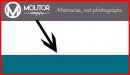
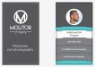
Top left: The diagonal of the card takes my eye off the layout. When it returns, I find myself looking for something interesting in the in teal field. In flipping the image, I don't find myself searching as much, but rather focusing on the logo.
Top right: I really find myself looking for something interesting in the teal field. Flipping this side, the white at the top of the "ladder" pulls my eye back to read the contact info... circles through the teal part and returns to the white without getting as lost.
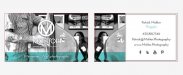
Bottom left: I kind of like the idea of the status bars... perhaps a touch narrower. As is, I think it puts too much weight at the bottom of the card and seems a little busy creating some tension near the edge of the card.
Bottom right: The center of the card creates a vibration for me. My eye bounces between the white, teal, photo, and the pinched space between the photo and the teal band never really getting through the rest of the card. Flipping that lower portion, I find myself stepping and cycling through the photo and information in an orderly fashion.

Like HDvinyl, I'd think about pulling that darker teal from your website into the card. The teal color you've got doesn't leave me feeling much other than it's a pretty color combination. The other darker teal has more swagger and confidence.
Finally, for the imagery on the top card, I'd try flipping the image on one side making it look as if the image was printed on glass and one could see through the card.
...but that's my .o2
Top left: The diagonal of the card takes my eye off the layout. When it returns, I find myself looking for something interesting in the in teal field. In flipping the image, I don't find myself searching as much, but rather focusing on the logo.
Top right: I really find myself looking for something interesting in the teal field. Flipping this side, the white at the top of the "ladder" pulls my eye back to read the contact info... circles through the teal part and returns to the white without getting as lost.
Bottom left: I kind of like the idea of the status bars... perhaps a touch narrower. As is, I think it puts too much weight at the bottom of the card and seems a little busy creating some tension near the edge of the card.
Bottom right: The center of the card creates a vibration for me. My eye bounces between the white, teal, photo, and the pinched space between the photo and the teal band never really getting through the rest of the card. Flipping that lower portion, I find myself stepping and cycling through the photo and information in an orderly fashion.
Like HDvinyl, I'd think about pulling that darker teal from your website into the card. The teal color you've got doesn't leave me feeling much other than it's a pretty color combination. The other darker teal has more swagger and confidence.
Finally, for the imagery on the top card, I'd try flipping the image on one side making it look as if the image was printed on glass and one could see through the card.
...but that's my .o2
Attachments

thinksigns
SnowFlake
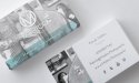
I would put a white border on your photo the same thickness as the one on the logo. I don't dig the progress bars. My first thought is you aren't as good with Special Events as you are with Fine Art. While that may be true, I wouldn't put it on a business card.
Attachments
Rick
Certified Enneadecagon Designer
I get jaded when I read someone is a photographer,
I studied to be one for a while and in my early days
carried a camera around all the time.
I saw your work and you are really good. My sister
nieces and nephew do similar neo-portrait/event
photography very well and they travel all over the place
to do it.
That being said... I dig your quirky pic... but the card does
not reflect the quality and personality of your work. I think
teal should always be used in moderation, I myself, would't
use it, but thats probably because teal was the in color form
1988 - 1992 and 50% of the signs I HAD to design, had tea
I would design something cleaner, less detracting... get them
to your site... I think once they are there, the job is sold.
EDIT: Having just seen your site... the card really does not match the site.
The site is clean, yeah there is teal, but it's not covered in it... Make the
card clean use colors to ties them together, but you don't need the clutter
or massive amounts of teal.... I enjoyed your website...
ucmj22
New Member
Thanks for all of the great comments. Sounds like I need to go back in for round 2. Vid, I like what you did with the progress bars. Rick, I didnt set out to be a Photographer, I just bought a decent camera because I wanted to have beautiful pictures of my family. Everybody loved the pictures I was taking, and wanted me to take pics of their kids, then a couple friends wanted me to do their weddings and it kind of went on from there. I think this year could be pretty good. Thanks for taking a look at my site too I havent had any critiques of my photography from anyone other than clients so I appreciate you comments. I'll try and make another couple of layouts tonight.
OldPaint
New Member
I HAVE TO SAY........
that photo of you(the profile)is to much like the WANTED POSTERS in the post office)))))))
wife is big into photography and i seem to be her #1 model.......but then iam "pretty." works out well most of the time.her pic was done by a professional........she took the one of me...
that photo of you(the profile)is to much like the WANTED POSTERS in the post office)))))))
wife is big into photography and i seem to be her #1 model.......but then iam "pretty." works out well most of the time.her pic was done by a professional........she took the one of me...
Attachments


ucmj22
New Member
I HAVE TO SAY........
that photo of you(the profile)is to much like the WANTED POSTERS in the post office)))))))
LOL, I was just wanting something different than a standard portrait while getting familiar with my new lighting equipment.
Is this attempt any better?
Attachments
OldPaint
New Member
i like it.........the photo says I TAKE GREAT PICS... and the text tells them who, how and where to get in touch with you.......the purpose of a BUSINESS CARD...
i do a front/back on my cards.........like it better then the split front you have.
the back of my card is just info in plain simple text.....with a cartoon of me...
i do a front/back on my cards.........like it better then the split front you have.
the back of my card is just info in plain simple text.....with a cartoon of me...
Attachments

Rick
Certified Enneadecagon Designer
I think that matches your site more... one thing though
putting your Facebook, YouTube, Pinterest blah blah
means very little if I can't click on your card. You are treating
your like it's dynamic... They will go to your site, or google you,
if they go to your site, then lead them to your social media, if
you can't be seen on google, start working on your SEO... Your
business card will not help your search engine standings and I
think that stuff is clutter.
Another thing I have been doing with another photographer is,
having more than one card, that way you showcase different images.
Cards are cheap, you hand a set of cards to someone, you have
potential for them to hand it too others.