-
I want to thank all the members that have upgraded your accounts. I truly appreciate your support of the site monetarily. Supporting the site keeps this site up and running as a lot of work daily goes on behind the scenes. Click to Support Signs101 ...
You are using an out of date browser. It may not display this or other websites correctly.
You should upgrade or use an alternative browser.
You should upgrade or use an alternative browser.
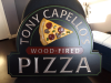
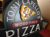
Carved Pizza Sign
- Thread starter neato
- Start date
Pixels Are Bad Mmmkay?
New Member
Nice work. Is this HDU? What kind of paints are you using?
bob
It's better to have two hands than one glove.
The carving is nice work.
The slice of pizza is visually discordant. Perhaps because it's positioned symmetrically on the X axis as if signalling for a right turn. Maybe that's because you wanted that corner stuck there between the 'Y' and the 'C'. It would fit in a lot better if it were at some arbitrary angle and better filled the space available to it. I should think that overall visual harmony, something desperately needed here, would trump having that corner ending up in the text.
The slice of pizza is visually discordant. Perhaps because it's positioned symmetrically on the X axis as if signalling for a right turn. Maybe that's because you wanted that corner stuck there between the 'Y' and the 'C'. It would fit in a lot better if it were at some arbitrary angle and better filled the space available to it. I should think that overall visual harmony, something desperately needed here, would trump having that corner ending up in the text.
Marlene
New Member
The carving is nice work.
The slice of pizza is visually discordant. Perhaps because it's positioned symmetrically on the X axis as if signalling for a right turn. Maybe that's because you wanted that corner stuck there between the 'Y' and the 'C'. It would fit in a lot better if it were at some arbitrary angle and better filled the space available to it. I should think that overall visual harmony, something desperately needed here, would trump having that corner ending up in the text.
I agree with bob on the angle of the pizza but that is one great looking slice! nice job on the carving
")
I'd agree with others on the position of the slice, but I think overall it looks awesome.
The only other minor thing I picked up on was at the top of the letter "A", the vanishing point seems a little clumsy. Its such a minor point to bring up, but I noticed it.
We all need to remember that its a HANDCRAFTED sign and should not look like some Peachtree injection formed piece of foam.
The only other minor thing I picked up on was at the top of the letter "A", the vanishing point seems a little clumsy. Its such a minor point to bring up, but I noticed it.
We all need to remember that its a HANDCRAFTED sign and should not look like some Peachtree injection formed piece of foam.

Thanks for the tip about the Aves Apoxie Sculpt. I actually imagine that would be easier and faster than modeling everything and then cutting it out of HDU or PVC.
I agree with others that the slice of pizza's orientation is off. My only other small nit pick is the painting finish. I think you may benefit from spraying your base coat with a HVLP gun. If you decide to go this route, just get the largest fluid tip possible. Typically this will be between 2.2-2.5mm. This will allow you to spray latex without thinning it a crazy amount.
I agree with others that the slice of pizza's orientation is off. My only other small nit pick is the painting finish. I think you may benefit from spraying your base coat with a HVLP gun. If you decide to go this route, just get the largest fluid tip possible. Typically this will be between 2.2-2.5mm. This will allow you to spray latex without thinning it a crazy amount.
shoresigns
New Member
Pizza slice pointing down would be the most aesthetically pleasing in most cases, I think, but you haven't left enough space to do that.

tattoo.dan
New Member
Nice work Phillip. Really like it
bob
It's better to have two hands than one glove.
...I'm a vegan.
Why?