-
I want to thank all the members that have upgraded your accounts. I truly appreciate your support of the site monetarily. Supporting the site keeps this site up and running as a lot of work daily goes on behind the scenes. Click to Support Signs101 ...
You are using an out of date browser. It may not display this or other websites correctly.
You should upgrade or use an alternative browser.
You should upgrade or use an alternative browser.
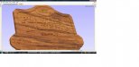
CNC Carved Sign
- Thread starter GC3
- Start date

 ...Plantas y Maderas SA de CV. "plants and woods"
signmeup
New Member
You mean there are other languages on the planet besides "American"?
I think the sign looks pretty good although I wouldn't stretch "cnc routing services". The colours work for me.
Unless there is some really important reason for it to be there I would also drop the little hanging sign at the bottom.... it looks like an afterthought.
I think the sign looks pretty good although I wouldn't stretch "cnc routing services". The colours work for me.
Unless there is some really important reason for it to be there I would also drop the little hanging sign at the bottom.... it looks like an afterthought.
Last edited:
TommyFastLane
New Member
That is Spanish, the "Y" is a word. It means "and".
SignManiac
New Member
I wish I was able to explain why, but I can't. Something isn't feeling right to me. I'm sure your concept can be made to work, but I can't put my finger on what it is. It seems over worked? And there is something about the proportions that is making my eyes twitch.
Williams Signs
New Member
Try moving Plantas even with Maderas. Then in the space between the to words place a small cursive y letting it overlap both words. Make the y a brown like your oval with a tan or white outline.
petrosgraphics
New Member
for me, it just seems that there is a lot going on.... a little to busy.....to much stuff...
just my thoughts......
just my thoughts......
Ron Helliar
New Member
Gene,
If it's anything like your posts over at SB, it'll look great.
Doing it in one pass or using Joe's Dibond inset panel technique for the letters? Would look great with Gold & Abalone touches also.
If it's anything like your posts over at SB, it'll look great.
Doing it in one pass or using Joe's Dibond inset panel technique for the letters? Would look great with Gold & Abalone touches also.
WildWestDesigns
Active Member
Plus I don't like designing a hanging panel into a sign they always look like an after thought.
I actually like a hanging panel and I was thinking about doing that for my first one since I just recently got a CNC as well.
I think the hanging panel can add a nice touch to it, but then again I am weird like that.
Ron Helliar
New Member
SB is the Shopbot cnc forum.

Here's a few tweaks to your design Gene...
We liked all of you designs! Excellent service Phillip

Thanks for all of the responses and the views.

Gene