-
I want to thank all the members that have upgraded your accounts. I truly appreciate your support of the site monetarily. Supporting the site keeps this site up and running as a lot of work daily goes on behind the scenes. Click to Support Signs101 ...
You are using an out of date browser. It may not display this or other websites correctly.
You should upgrade or use an alternative browser.
You should upgrade or use an alternative browser.
Come on people, no more with backlit
- Thread starter ams
- Start date
Texas_Signmaker
Very Active Signmaker
I thought this was the new thing, I see that combination alot.
visual800
Active Member
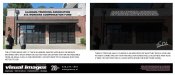
and to add to this below is a customer I quoted. The building signage does not face the interstate but only to one direction which means you have limited time to read it. I advised against halo lit because thickness of letters would cut down on visibility.....what did they do? Went with another company, duranodic bronze letters and at night halo lit with a reflex blue.. I cant even read it at night and I know what it says. I cant blame whoever did it because obviously the company did what they wanted
Attachments
You need ambient lighting for Halo letters to be effective. This means they are very effective for malls and relatively effective on streets that are very well lit.
People are in their cars anyway roughly 1-2 hours a day. I tell them to look around a little bit more and see what signs are effective and which ones aren't. I also make it clear that there is a reason why most people do signs one way vs another. Typically, people do things a certain way because it works.
People are in their cars anyway roughly 1-2 hours a day. I tell them to look around a little bit more and see what signs are effective and which ones aren't. I also make it clear that there is a reason why most people do signs one way vs another. Typically, people do things a certain way because it works.
Texas_Signmaker
Very Active Signmaker
I like to do the installs under my carport. Shaded and I get a breeze.
Johnny Best
Active Member
Why didn't you take a picture of it in the dark..... in action ??
Is that your photograph ??
Is that your photograph ??
The only time that I have done this was with a sign located in a dark skies ordinance. Backgrounds had to be darker in contrast to the letters. It turned out nice, but very subtle. Top speed on this street was 15mph and mostly walking traffic, so it worked for the environment. My point...there is a time and place for some of these things.
Gino
Premium Subscriber
I like to do the installs under my carport. Shaded and I get a breeze.
Hey little buddy..... I think you're in the wrong thread. Pay attention.
and to add to this below is a customer I quoted. The building signage does not face the interstate but only to one direction which means you have limited time to read it. I advised against halo lit because thickness of letters would cut down on visibility.....what did they do? Went with another company, duranodic bronze letters and at night halo lit with a reflex blue.. I cant even read it at night and I know what it says. I cant blame whoever did it because obviously the company did what they wanted
For someone who doesn't typically design electrical signs, are there any "rules" you can think of that would help us make a better sign? I've ordered channel letters from wholesalers in the past, and they will just make what you send them, whether it will work or not. The first channel letter sign we ever did would have looked a lot better if I had kerned the letters closer together, but I didn't know that when I ordered it. But now I know.
and to add to this below is a customer I quoted. The building signage does not face the interstate but only to one direction which means you have limited time to read it. I advised against halo lit because thickness of letters would cut down on visibility.....what did they do? Went with another company, duranodic bronze letters and at night halo lit with a reflex blue.. I cant even read it at night and I know what it says. I cant blame whoever did it because obviously the company did what they wanted
Is that the actual wording you used in a correspondence or communication to the client?
You should have added, "Whatever you do, please don't use our company"
eahicks
Magna Cum Laude - School of Hard Knocks
First thing I noticed too. REEEAAAL nice on white letters.The sign shop should be shot for using corrosive screws...
DerbyCitySignGuy
New Member
The sign shop should be shot for using corrosive screws...
What purpose are those screws even serving?
Rick
Certified Enneadecagon Designer
What purpose are those screws even serving?
There are tabs on the backer, the backer is attached to the face - then the letter to the backer with those screws.
tulsagraphics
New Member
Yes yes... but look on the bright side. Maybe this job didn't go so smoothly for your competitor either. Sign shop received a deposit, did the job and the customer saw the appearance at night. The customer refuses to pay the balance until the sign is re-done to their satisfaction (which could be another mess in itself). It hasn't been that long (presumably) and they're already dealing with warranty issues. Fortunately, you were able to avoid all these expensive nightmares simply because the customer thought they knew what they wanted. No harm to your reputation. Your competitor only hurt themselves, and the customer won't doubt your expertise the next time they come to you for a sign.
hard to tell without seeing it at night, thou looks crap why the hell are those bolts even there ? sign is prob new and already running rust youck, one season and it will look all rusted or will need cleaning often. specially if its located near where people pass it.Im no expert in such signs but by the looks its something that should belong inside.either done really cheap or someone without much experience or care.
ams
New Member
and to add to this below is a customer I quoted. The building signage does not face the interstate but only to one direction which means you have limited time to read it. I advised against halo lit because thickness of letters would cut down on visibility.....what did they do? Went with another company, duranodic bronze letters and at night halo lit with a reflex blue.. I cant even read it at night and I know what it says. I cant blame whoever did it because obviously the company did what they wanted
Oh man that is horrible, bronze and blue is a bad match.
ams
New Member
Why didn't you take a picture of it in the dark..... in action ??
Is that your photograph ??
Not my photo, but I do lots of work at the shopping center. The previous owners had built it, the new owners hate it. I'll get a night time photo.