-
I want to thank all the members that have upgraded your accounts. I truly appreciate your support of the site monetarily. Supporting the site keeps this site up and running as a lot of work daily goes on behind the scenes. Click to Support Signs101 ...
You are using an out of date browser. It may not display this or other websites correctly.
You should upgrade or use an alternative browser.
You should upgrade or use an alternative browser.
Corel 2020 - Text size vs actual size way different?!?!
- Thread starter Andy D
- Start date
Boudica
Back to "educational purposes"
Same in .ai Depending on the type face, that is never accurate. You have to outline it first.
Maybe I don't understand the question. Wouldn't be the first time")
I understand why - but I probably won't use the right typography terms to explain it. I'll let someone else do that.
Maybe I don't understand the question. Wouldn't be the first time
I understand why - but I probably won't use the right typography terms to explain it. I'll let someone else do that.
GAC05
Quit buggin' me
All male coding team bias?When editing text in Corel Draw 2020, I have it as inches instead of points. When I set it to, for example, a 20" "H" in the text, the actual size is 14.32" tall.
Any idea why?
Most programs are a little off from text size to actual size, because text size is top to bottom of a capital square letter, like; H T L Z A, etc.,Same in .ai Depending on the type face, that is never accurate. You have to outline it first.
Maybe I don't understand the question. Wouldn't be the first time
I understand why - but I probably won't use the right typography terms to explain it. I'll let someone else do that.
ignoring the slightly larger curved letters; S C etc. & the drop down from lower case letters like; p q j, etc....
But one capital letter "H" called out to 20" should be an actual 20" tall, but it's way off at 14.32"
Jester1167
Premium Subscriber
Andy, I think it has more to do with the font designer than Corel. Type in a capital "H" and cycle through different fonts, and watch each font's size change. It's not a big deal when dealing with one or 2-inch fonts. I never trusted any design program when they called out for a specific height. Somewhat like Boudica, I type the letter "H," scale it, and then select it and type my actual text or copy text properties to the actual text. Lots of ways to skin a cat.
On a side note, I was taught in Corel that 100 pts = close to an inch, and it still works with Helvetica. I never got around to changing the font size to inches... (yes, it is supposed to be 72 points to an inch.)
On a side note, I was taught in Corel that 100 pts = close to an inch, and it still works with Helvetica. I never got around to changing the font size to inches... (yes, it is supposed to be 72 points to an inch.)
Andy D said:When editing text in Corel Draw 2020, I have it as inches instead of points. When I set it to, for example, a 20" "H" in the text, the actual size is 14.32" tall.
Any idea why?
All digital typefaces are built within an imaginary box called an Em Square, aka "em size" or UPM size. There are numerous horizontal guide lines built into those fonts (baseline, x-height, cap-height, ascender and descender). Then there is often extra space above and below those lines (see the attached images).
So when you enter a value of 20" in the Text Properties box any graphics program will include that extra space in the em square and maybe even more space than that, depending on line spacing settings.
In CorelDRAW there is currently no sure-fire way how to set letter sizes based on cap letter height. I use a work-around in the Transformations palette or the transforms values on the top tool bar. I'll size up a dummy letter such as "E" and then enter the desired size in inches within the Transformations palette. I'll position/align that letter where I want it. Then I'll either type out the text using that letter or copy that dummy letter's values to another piece of artistic text and then baseline-align that text to the dummy letter's position.
That approach works best on sans serif typefaces like Helvetica or others that have at least some cap letters whose tops and bottoms match with the baseline and cap height line. The approach starts to fall apart the more a typeface has features dipping below the baseline and rising above the cap line. That happens with lots of serif typefaces, display faces, scripts, etc.
Some sign making applications try to size text by cap height in part by using the font's built in dimension numbers. All fonts have them. It's just a matter of extrapolating the distance between the baseline and cap height line in relation to their positions in the Em Square. But the approach is not perfect. There are many typefaces whose letter tops fall well below the cap height line. Script typefaces are common offenders, but they do that automatically reserve greater amounts of line spacing (especially if the script has prominent swash features).
Adobe Illustrator added a new feature called Font Height Variations with the AI 24.3 update last August. I can personally take some credit for that feature being added.
https://helpx.adobe.com/illustrator/using/whats-new/2020-3.html
I sent the Illustrator development team some image diagrams of how type is sized and positioned in sign design: according to cap height. I also included screen shots from FontLab Studio to add to the explanation. So far the feature works reasonably well. It's as good as the implementation in any dedicated sign making app. Plus Illustrator supports way more type technologies than any existing sign making app (Extended OpenType features, OTF Variable Fonts, SVG Color Fonts). The Font Height Variations feature is not visible by default. You have to enable it in the Character palette. Smart Guides react to those type features, snapping objects to baseline, x-height, cap-height, etc. But they still need to add new alignment functions to make the most of the feature. Hopefully that will be coming soon.
Jester1167 said:On a side note, I was taught in Corel that 100 pts = close to an inch, and it still works with Helvetica. I never got around to changing the font size to inches... (yes, it is supposed to be 72 points to an inch.)
Helvetica is close to one inch when set at 100 points. But not quite. And depending on the "flavor" of Helvetica chosen that font height is going to vary. I have Helvetica Now, Helvetica Neue and the old '57 version of Helvetica along with various clones (Swiss 721, Nimbus Sans, CG Triumvirate, etc). All of their cap heights vary to some degree when set at 100 points. If I want Helvetica, or Arial, Univers, Gotham or any other sans face like that set at 1 inch in CorelDRAW, I'll just type out a dummy artistic text letter and literally size it to 1 inch in the Transformations palette.
Attachments


Last edited:
RaymondLoewy
Pretty fly for a Sign Guy
I have templates of sized text to use for specifically sized letters because AI has a similar problem. I used to use actual height desired times 1.5, not sure if that is accurate anymore.
myront
CorelDRAW is best
Been a complaint in the sign industry for years for both Corel users and illustrator. SignLab has it right but I don't particularly like SignLab and we no longer have that capability.
There is a nifty macro available for Corel that will size the text according to the height you input. It's password protected so I cannot see the code to post here. Nor can I say whether or nor it would work with any other version than X7. This forum won't allow posting of gms file either so...

There is a nifty macro available for Corel that will size the text according to the height you input. It's password protected so I cannot see the code to post here. Nor can I say whether or nor it would work with any other version than X7. This forum won't allow posting of gms file either so...
Attachments

RaymondLoewy said:I have templates of sized text to use for specifically sized letters because AI has a similar problem. I used to use actual height desired times 1.5, not sure if that is accurate anymore.
Actually, the font sizing issues were previously worse in Adobe Illustrator than they were in CorelDRAW.
In Corel it's at least possible to create dummy block letters like "E" as artistic text objects, then size and position them as needed. It's a somewhat reliable way to get something like 10 inch tall letters that are accurately 10 inches tall (and positioned precisely too).
In Adobe Illustrator both Point Text objects and Area Text objects would be surrounded by an Em box (or ICF box). Funny thing: that box wouldn't be the same size as the Em box dimensions of the actual font file. It's just another thing to muddy the waters worse. Users would have to deploy all kinds of odd work-arounds just to size lettering in the crude approach I described with CorelDRAW. It was a real PITA.
Now it's a lot easier in Adobe Illustrator with the Font Height Variations. I attached a cropped screen shot from Illustator 25.2 showing the drop-down menu listing the four sizing options.
myront said:There is a nifty macro available for Corel that will size the text according to the height you input. It's password protected so I cannot see the code to post here.
Most of those macros for both CorelDRAW and Illustrator just automate the crude approach I described to some degree, sampling the physical size of a certain cap letter, such as "E" or "H," and then using that to extrapolate a capital letter size for the type object. Some sign making applications, and now Illustrator, appear to take a more sophisticated approach.
Attachments
Geneva Olson
Expert Storyteller
I guess I'm confused at the question and then it makes me question what I'm doing and if what I'm doing is screwing things up. Or there's an easier way?
So if I'm doing lettering in a specific font. I type out the word then change it to the font that they want. I then size it to fit where it's going. I don't even look at the point size. Should I be? And what is the benefit of doing that?
So if I'm doing lettering in a specific font. I type out the word then change it to the font that they want. I then size it to fit where it's going. I don't even look at the point size. Should I be? And what is the benefit of doing that?
myront
CorelDRAW is best
I guess I'm confused at the question and then it makes me question what I'm doing and if what I'm doing is screwing things up. Or there's an easier way?
So if I'm doing lettering in a specific font. I type out the word then change it to the font that they want. I then size it to fit where it's going. I don't even look at the point size. Should I be? And what is the benefit of doing that?
We do a lot of boat registration numbers that by law have to be of a legible font AND 3" letter height. If you type it out and use the text size input box in corel and type 3" and hit enter. that doesn't make a 3" letter height. You have to look at the physical dimension.
Geneva Olson
Expert Storyteller
I guess I have mine set up differently?We do a lot of boat registration numbers that by law have to be of a legible font AND 3" letter height. If you type it out and use the text size input box in corel and type 3" and hit enter. that doesn't make a 3" letter height. You have to look at the physical dimension.
View attachment 152531
De.signs Nanaimo
New Member
I think it is more simple than you think, and working in inches is a smart way to work as most of your materials are measured that way.
First off always design at full size, that is one of the advantages of Corel, and it makes for less mistakes down the road. The tip to ignore text size and just design to eye is good advice, just make it look good, convert to curves and it will give you the size of the overall decal to cut, sometime I adjust a touch to fit into the material I am cutting.
Probably the biggest factor in typography for sizing is not only all fonts are different dimensions, but curved fonts are larger than flat, and then the word you are using makes a huge difference. All caps are very consistent in sizing, but a words like together has tall lower case text, as well as a drop down small case g. So the final size of that word in say 2 inch text, will be much taller than a different word like new, that has all consistent height text. So the word together in 2 inch lower case text is likely closer to three when actually cut.
We have zoning signs where I am that if you follow the city`s advice on letter height, you would need a sign that is 18 feet wide, but is supposed to fit on a 4x8.
myront
CorelDRAW is best
Yes, if just 1 line of text one can input into the physical ht box but what are you going to do for a whole paragraph? Sure you could start by typing 1 line, make your font choice then put in the desired height then type the rest. And if the customer decides to change the font? Now what? I, personally, have a couple of macros I can use to make quick work of it.
Geneva Olson
Expert Storyteller
I haven't had many paragraphs when doing graphics. Maybe a couple of scripture verses.Yes, if just 1 line of text one can input into the physical ht box but what are you going to do for a whole paragraph? Sure you could start by typing 1 line, make your font choice then put in the desired height then type the rest. And if the customer decides to change the font? Now what? I, personally, have a couple of macros I can use to make quick work of it.
I generally change the font into what they want and then size it. So I guess I'm doing it a "long way"...not really a shortcut.
I did have an issue recently that I had to explain to a customer. I told her her lettering was 2.5" x 45 inches. It was Arial Upper case. When she changed it to upper and lower case lettering, it shortened it to 23.5". I had to explain to her what happened..
Geneva Olson said:I guess I'm confused at the question and then it makes me question what I'm doing and if what I'm doing is screwing things up.
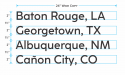
Take a look at the attached diagram. That gives an example of lettering being sized according to the capital letter height in terms of inches, as well as spacing lines of lettering apart in inches.
I don't mess around with sizing lettering in terms of points unless I am composing graphics, body copy, etc for a printed page. In those cases point size, baseline grids and all that good stuff are important. In sign design much of that has to be tossed out. The capital letter heights as well as the distance from the bottom of that letter to the top of the capital letter on the next line is what's important. It's a physical distance that can be seen with the naked eye. Baseline grids, em spaces and other stuff associated with page layout is invisible. Installers and service people can't see any of that out in the field.