• I want to thank all the members that have upgraded your accounts. I truly appreciate your support of the site monetarily. Supporting the site keeps this site up and running as a lot of work daily goes on behind the scenes. Click to Support Signs101 ...

Critique my Vehicle Wrap

nikdoobs

New Member
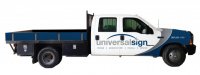
This will be my first vehicle wrap, and the first of our company fleet. We have multiple trucks, cranes, bucket trucks, etc. The design of this first truck is very crucial because the rest of our vehicles will be based off of this design. We are in the middle of a company rebrand so it is very important for us to keep our new color palette and logo clear. (The logo is finalized so, please no logo critiques).

The phone number and silver trim would be cut silver vinyl. The Universal Logo and text would be cut vinyl as well. I'm not really sold on the placement of our phone number. The truck is white right now. I have attached a close up of the halftone pattern in the blue part of the wrap.

Any advice as far as design or application technique is appreciated. I know it's not super crazy or eye catching. I would like to keep everything clean, simple, and professional.

Thanks in advance.
-Nick

F350_Wrap-2.jpg F350_Wrap-1.jpg
 

nikdoobs

New Member
I will probably be using window perf for the back two windows as well. It would be white with brushed silver digital print and silver cut vinyl trim.
 

Gino

Premium Subscriber
Well, if you don't want any critiques on the logo, then I guess what you have will just have to do. :smile:
 

SignBurst PCs

New Member
I would leave out the blue / silver arcs on the rear of the cab.

I don't think that it adds anything to the design and it crowds your logo. Leaving it white will clean things up a bit.
 

nikdoobs

New Member
I think you may be right about removing the back graphics. It seems to give it a little more breathing room, plus it will make my installation much easier. Our logo is really tough to size in there without going through the door handles.
 

Attachments

  • F350_Wrap-3.jpg
    F350_Wrap-3.jpg
    23.8 KB · Views: 86

2B

Active Member
if you are going with the white background then the gray needs to be darker, it is too light for contrast.


IMO wrap the whole cab in a dark matte (maybe carbon fiber), then do the accents/information in a gloss.
With this simple of a design no need for printing, just layer it.
 

John Butto

New Member
I think you may be right about removing the back graphics. It seems to give it a little more breathing room, plus it will make my installation much easier. Our logo is really tough to size in there without going through the door handles.
First one looks better, just reduce the logo somewhat so it is not so jammed. And, if you wanted to keep it clean just put the logo on the door, if it is a good logo it will stand up without all the color swirls and hoopla.
 

nikdoobs

New Member
if you are going with the white background then the gray needs to be darker, it is too light for contrast.

I disagree. There seems to be a misconception in the signage industry that everything has to be super contrasted to be visible/ stand out.
 

Joe Diaz

New Member
I disagree. There seems to be a misconception in the signage industry that everything has to be super contrasted to be visible/ stand out.

It's not a misconception. It's called science. So yes, not everything on a design has to be high contrast, but it does if you want that element of your design to stand out, if you don't want it to stand out or don't want it to stand out as much as another element of the design, a designer could choose to make that element not as high contrast. However, if the goal is to have something kick you in the head, than high contrast is one of the best ways to achieve that. This is fact. I would imagine a company would want their logo to have the highest contrast on something like a vehicle wrap.

In your case what you have isn't bad. sign is the highest contrast so your eye is more drawn towards that. It's as if you have emphasized that part of your name, that being said you have at the same time taken the attention away from "universal". Which isn't necessarily bad. It depends on what your strategy is. To get people to first identify you as a sign shop, or to get people to remember your name "universal"

Oh and I know you don't want a critique of your logo, but you may want to check out "Universal Media Studios" or "Universal Television" Your logo is very similar. Since the logo is still new, now might be the time really make sure if this is the direction you want to go.
 

nikdoobs

New Member
You don't always have to kick someone in the head to get their attention. I know what you are saying, but I don't want to get into the science/psychology of design over a shade of grey.

That being said, what do you guys think about this layout? I think this color layout works a lot better. It gives more contrast to the logo and hides the door handles with the dark background.

F350_Wrap-4.jpg
 

Gino

Premium Subscriber
So, instead of listening to good sound advice.... and changing your logo to something which isn't already being used, you're going to concentrate on a value of grey and stick your head in the sand ??

Your words : I know it's not super crazy or eye catching. I would like to keep everything clean, simple, and professional.


It looks like a tow truck company without the tow hitch. Grey/blue, blue/white or whatever combination.... it's still a copy in progress once it's on your fleet.
 

GuizmoDesigns

New Member
I liked the first wrap with the white area bigger personally. But I would definitely make your phone number bigger and easier to read and add a website.
 

SIGNTIME

New Member
i woule get ride of the list under the logo and put your phone number there and i would listen and take in joe's advise as he is one of the best.
 

nikdoobs

New Member
Thanks for the feedback guys. Anyone care to share with me what their company's vehicle graphics look like?
 

Craig Sjoquist

New Member
I like the 1st & 2 one posted, 2nd one mostly for the cleaner look, easier to deal with, also with a bigger phone number on front fender.

I'll vote for less is more.

The 3rd one is just to dark looking for no reason.
 

nikdoobs

New Member
I think its the door handles that are so distracting to me. They really take away from the logo being placed right it the middle of it. Maybe we can paint them white.
 
Top