-
I want to thank all the members that have upgraded your accounts. I truly appreciate your support of the site monetarily. Supporting the site keeps this site up and running as a lot of work daily goes on behind the scenes. Click to Support Signs101 ...
You are using an out of date browser. It may not display this or other websites correctly.
You should upgrade or use an alternative browser.
You should upgrade or use an alternative browser.
Critique this layout
- Thread starter Signed Out
- Start date


J Hill Designs
New Member
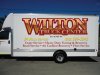
i can barely read any of it from the thumbnail...can hardly even make out that it says 'Wilton'
"Deposit Please"
New Member
Place the services on the lower back doors, that way you don't have to stack them. replace yellow with black and thicken black stroke on Wilton truck center...just a little.
laserman70
New Member
If you want to keep the yellow, outline it.
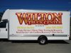
on the middle picture, my eye goes to the negative space where the door handle is.
With the name on the bottom like in the last my eye goes to the name.
just my .02
The rest looks good.
on the middle picture, my eye goes to the negative space where the door handle is.
With the name on the bottom like in the last my eye goes to the name.
just my .02
The rest looks good.
J Hill Designs
New Member
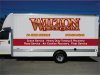
I still say you cant read it...red outline around similar contrast copy
Signed Out
New Member
yea the yellow was bothering me the black outline helps. i hate the back of this truck especially with all the info the customer wants on it i had thought of putting the logo bigger across the windows but quickly remembered that he wants everything on the truck reflective. these are the company colors... although he came around on the printed reflective so he could have the gradient in his logo.
Attachments

Signed Out
New Member


Unfortuneatly the customer isn't budging on his services list. Any input on these layouts? I showed the customer a layout that was suggested here by gmr55, which i liked but customer didn't. Any input would be helpful. Thanks
Dan11thHour
New Member
I would stay away from the lt yellow/ gold lettering it will get lost in the white of the truck.
SignManiac
New Member
The outline color is too close in value to the lettering color. It needs some contrast to help it read better. From a distance the name looks blobbish. That's just one of the problems. I think you could come up with a better layout if you tried a few other approaches. Devo's example is a good start in the right direction.
Signed Out
New Member
thanks guys, can't believe i forgot to hit spell check. I can't really change the logo, i didn't design it and they have already been using it for some time. Also i feel limited to use the burghandy and gold to match the colors in the logo, I will try the black and white with red bullets, i think that will help out.
Patentagosse
New Member
Newbie here (1st post) Here's my observation:
in your last layouts, try to use same character slant for all copies 'cause from what I see on monitor, each line has it's own angle (+ the safety stripes that have their own too). Bottom line where it reads Adirondack Northway / Exit 16 should be made of same formula too... one is compressed while the other looks stretched. That's what pops to my eyes at first look. Logo is OK but would benefit of bold black stroke to add in constrast.
in your last layouts, try to use same character slant for all copies 'cause from what I see on monitor, each line has it's own angle (+ the safety stripes that have their own too). Bottom line where it reads Adirondack Northway / Exit 16 should be made of same formula too... one is compressed while the other looks stretched. That's what pops to my eyes at first look. Logo is OK but would benefit of bold black stroke to add in constrast.