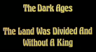
I was channel surfing and saw the end of this 80's movie playing. The typeface used in the opening titles and end credits of Excalibur seems pretty familiar looking, but I can't seem to figure out what it might be. I'm starting to wonder if it's something I might have seen in an older 70's or 80's Letraset catalog before digital typefaces became a thing. Any ideas?
-
I want to thank all the members that have upgraded your accounts. I truly appreciate your support of the site monetarily. Supporting the site keeps this site up and running as a lot of work daily goes on behind the scenes. Click to Support Signs101 ...
Excalibur Credits Typeface?
- Thread starter Bobby H
- Start date