-
I want to thank all the members that have upgraded your accounts. I truly appreciate your support of the site monetarily. Supporting the site keeps this site up and running as a lot of work daily goes on behind the scenes. Click to Support Signs101 ...
You are using an out of date browser. It may not display this or other websites correctly.
You should upgrade or use an alternative browser.
You should upgrade or use an alternative browser.
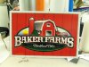
Farm Logo I have been working on
- Thread starter Ursta Graphics
- Start date

SignManiac
New Member
Coming together nicely. It has that "feel" to it.
WildWestDesigns
Active Member
Good luck gettin that embroidered lol.
It's a lot that's for sure. Gradients can be done in embroidery if they are linear (which they appear to be to me in this design), but that small text and all those small outlines (I have found that it's better not to have outlines when it comes to embroidery then to have them, if you have to have them, stick with one).
Overall it's a nice look. I too would have gone for a little less, but then again, I think towards embroidery.
J
john1
Guest
Looks sweet!
johnnysigns
New Member
That's an LHF script, can't remember offhand.
Looks nice Ursta
Looks nice Ursta
idsignsil
New Member
I think it looks great, and only have one minor suggestion. The E, F, & S in BAKER FARMS are closing in on themselves. I am not sure what the correct term is, or if I am even describing it correctly. To me the F is almost a P and the S is almost an 8. If you shorten the ends up a little to give it some more space I think it will be even better. Just my opinion though, to each his own, and I am sure your landlord farmer will love it.
threeputt
New Member
Shows a good deal of creativity. I like it.
But one thing......and I see this all the time.
Why is it people love to say "farms" plural? Maybe this guy does have a number of farms, but I see this a lot even when there is only the one farm referred to.
Off topic, but just askin'.
But one thing......and I see this all the time.
Why is it people love to say "farms" plural? Maybe this guy does have a number of farms, but I see this a lot even when there is only the one farm referred to.
Off topic, but just askin'.
ucmj22
New Member
Shows a good deal of creativity. I like it.
But one thing......and I see this all the time.
Why is it people love to say "farms" plural? Maybe this guy does have a number of farms, but I see this a lot even when there is only the one farm referred to.
Off topic, but just askin'.
Maybe it's a verb...?
Jillbeans
New Member
I wish you used the same script on the date and the city...it bugs me to see two scripts in the same layout.
I think I would have liked to see LHF Hensler for the name (I agree with idsigns)
I never like to see multiple outlines, I'd eliminate that inner green one in the oval.
and I think there are some issues with your shadows.
The sun looks too computery.
It's still a nice layout but it could be even nicer.
I do like the weathered look.
Love....Jill
I think it looks great. Where did the op say anything about having it embroidered?
It will look great on the farm trucks. The weathered one could go out front like the century farm signs do.
I also like the inner outlines (?)
This is supposed to be a fun business, right? That's why I go into it...
It will look great on the farm trucks. The weathered one could go out front like the century farm signs do.
I also like the inner outlines (?)
This is supposed to be a fun business, right? That's why I go into it...
WildWestDesigns
Active Member
Where did the op say anything about having it embroidered?
No one said that the OP did. Just making the comment due to all the elements going on in that design.
Ursta Graphics
New Member
Thanks for the script catch Jill ") ... Thats a no - no for me also. I originally had the town in the same script as est. then changed it and forgot to do the same with the top.
... Thats a no - no for me also. I originally had the town in the same script as est. then changed it and forgot to do the same with the top.
... Thats a no - no for me also. I originally had the town in the same script as est. then changed it and forgot to do the same with the top.Dan Antonelli
New Member
cool!
Sidelinemgr
New Member
I'm sure it has taken you awhile doing the sign.
 I think it looks really cool!