-
I want to thank all the members that have upgraded your accounts. I truly appreciate your support of the site monetarily. Supporting the site keeps this site up and running as a lot of work daily goes on behind the scenes. Click to Support Signs101 ...
You are using an out of date browser. It may not display this or other websites correctly.
You should upgrade or use an alternative browser.
You should upgrade or use an alternative browser.
Firetruck Lettering
- Thread starter jfiscus
- Start date
Pippin Decals
New Member
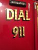
this is what i found
for" DIAL "....------OPTIAltheaBold-Two (Bold)
and for the 9 it is a system font ------Geometr706 BlkCn BT (Black)
and 11 looks like Lindberg (Regular) Lindberg - Search - dafont.com
for" DIAL "....------OPTIAltheaBold-Two (Bold)
and for the 9 it is a system font ------Geometr706 BlkCn BT (Black)
and 11 looks like Lindberg (Regular) Lindberg - Search - dafont.com
James Burke
Being a grandpa is more fun than working
How many kids today actually know what it means to "dial" a number?
JB
JB
printhog
New Member
very similar to Newtext Reg or Demi - common font on Pierce fire apparatus. But you'll have to add the top serifs on the "A" and the numerals will need tweaking if you go with that font.. but if youre gold leafing an engine the project should cover that labor quite fine. Hard to see if it was originally hand lettered, the style is reminiscent of ones featured in the book "Gold Leaf Techniques" by kent smith. It could be one that someone digitized from those in the book, but its been years since ive leafed thru that book.. (pun intended)
signbrad
New Member
It is possible that these letters are not from a font at all, but hand drawn. This is not a particularly difficult letter style to execute. It appears hand lettered to me. The edge of a clear coat is clearly visible in the photo. And the center of the nine is slightly imperfect.
The placement and size of the turns are interesting. I tended to always center the pattern in the middle of a stroke, which they are not in the picture. And unless these letters are smaller than I think they are, the turns are quite large. The letters look to be in 3 to 4 inches tall. So the spins were either made with fairly huge cotton balls or a larger size of one of those velvet spinning tools they used to sell.
Back in the late 70s, I worked for a while for a shop that was located next door to a company that built custom fire equipment. We rarely lettered two vehicles that were alike. If I remember correctly, a full box of gold was around 250 dollars at that time. It's a little more than that now!
Brad in Kansas City
SellersSign&Design
New Member
That is Leo's Gold material, which came in two versions. One was real 23 kt gold and the other was brass leaf imitation gold. It was 15" punched material and the turns were randomly done by hand across the entire roll, which is why they don't line up with the strokes of the letters. It is hard to exactly match the font because Leo's had several of their own fonts, which were usually standard fonts that they customized.
Pixels Are Bad Mmmkay?
New Member
It appears hand lettered to me. The edge of a clear coat is clearly visible in the photo.
That could just as easily be adhesive vinyl with a laminate laid over the top. We do most of the firetruck jobs that we do using that approach, unless the customer is cheap and doesn't want the overlay. I think it helps to keep the metallic polyester films from oxidizing quickly and prevents delamination of the layered graphics/lettering.
SellersSign&Design
New Member
That could just as easily be adhesive vinyl with a laminate laid over the top. We do most of the firetruck jobs that we do using that approach, unless the customer is cheap and doesn't want the overlay. I think it helps to keep the metallic polyester films from oxidizing quickly and prevents delamination of the layered graphics/lettering.
That is exactly what it is. All Leo's Gold materials had to be edge sealed, either with a vinyl overlap or Seal It pen.