Yup, seriously.
You should actually be referring to much more than a single profile here. Input profiles, rendering intents and, at least, both a CMYK and RGB profile because you tried to RIP the file in question with the two different modes. One mode worked and the other did not. Why do you suppose that happened? EDITED ADDITION: Yes, you probably use a single output profile but other shops often use different workflows to handle CMYK and RGB.
Designer? Exactly what would you say they're missing? Are designers also responsible for the RIP process as some shops who have in-house designers are?
Caldera's "flavor" is controlled by the profiling process and settings. Using spot adjustments are fine when the file has a discrete spot color but when the same values are used elsewhere as a process color then what? Caldera receives a certification from Pantone for meeting certain specs from a single ICC output profile and not by using spot adjustments. EDITED to say "certified as well as a particular printer brand model."
What does one do to become MORE dialed in? Read more or less color swatches? Average those readings more than usual? Use a more expensive spectrophotometer? A polarized light source? Calibrate 2 times per shift using a densitometer? What do you do exactly?
Is this a product of your profiling or a spot color adjustment? (Remember my comment above about Pantone certification.)
Is this a product of your profiling or a spot color adjustment? (Yup, remember my comment above about Pantone certification.) Are your prints using Cool Gray the same from both CMYK and RGB and spot color callouts because earlier you said your grays were different from one mode or another.
Yes, if you change the color mode IN an Illustrator layout it does change the appearance and this behavior is normal. However, you make this statement immediately following your statement about Cool Gray and earlier you said your grays were different from one mode or another. The grays in all modes should print the same. If not, there is a workflow issue and / or a profiling issue. Remembering calibration is a very important stop in the profiling process.
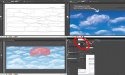
Seriously, I don't expect you to answer any of these questions. I've just posted these as some areas you might consider and explore if you ever find the time. Also know that Illustrator is very much a PDF and if you're using Caldera on a Mac, the Mac uses PDF technology to draw the image to the screen. So, the preview looked correct but the file did not initially RIP properly. Illustrator file good, screen good, RIP area maybe not so much.
Good luck.
I really am glad I'm not expected to answer all of this...very gracious considering the broad stroke you slathered all over my color workflow and the twenty years of knowledge it took to build it. My favorite part was when you explained Pantones to me as if I haven't utilized their system since the 90's. Thanks!
I can assure you if I send a grayscale image from RGB or CMYK they are one in the same. Neutral. My rendering intents are the same for each colorspace.The color shifts I was referring to are more in line with when a designer converts a spot color to cmyk and it translates with THEIR working space into cmyk builds to several decimal points. I absolutely think the designer should take some stake in preparing workable art. Many of the things that create rip errors. I partly blame adobe for making things possible in their software that don't really work in the real world...like pantone to pantone gradients. We handle artwork for the same brands but different designers, and I can tell you they are seldom in compliance with the brand's guidelines. We feel it is more important to honor the brand than the designer.
I responded about my "profile" in a general term because that's what I was told I should check. I've created a print condition that is consistent and repeatable. I also consider being a printer more than tweaking rip settings as a kludge to a deeper problem, be it file construction or a poor linearization. Consistently on this forum I see people looking for shortcuts through software when the issue is hardware. Or process control. Not sure if you're familiar with grand format dye sublimation, but I can tell you it's a different beast than other more traditional printing methods.
Speaking to my awesome 485C...yes it is a corrected formula, but how can that not speak to the success of my output profile? Isn't it direct proof that the print condition is solid?
We do admittedly run only one output profile on one printer. We've found this helps consistency which is above all a major concern in my market. Many of the fabric covers we print last for years, and I'm constantly called on to "hit the same color" to either seam to an old piece or stand next to older prints. Poking and tweaking with rip settings can complicate this...although I have full access to 5 years of print log.
The "flavor" I referred to with Caldera really is a thing. I can tell you because I have built profiles with Onyx and Caldera with the same hardware, substrates and environment. They were hugely different. I was honestly bummed when Caldera won out because I prefer Onyx.
When I talk about being dialed in it plays on my complete workflow. Like equipment maintenance, controlling the environment and research and development on the best products to use as a baseline. I would like to get a nicer spectro as I only have and eyeone. When it comes down to brass tacks, unpredictable show lighting can nullify ALL of the efforts I've taken to assure good color.
But yes we average several readings, and in some instances have to rotate the fabric grain between. I also spot measure every patch instead of swiping a whole row. The texture on the fabric can affect readings.
Now....pdf's are very much Illustrator? Not sure I can get on board with that. A pdf generated from Indesign is vastly different than one created natively in Illustrator. On an object to object basis they are handled completely different. As far as throwing MAC technology into the mix...the previews I showed were through Caldera's viewer.
This post started as a simple bug I found in Illustrator, but turned into some kind of test about WTF I know. I've built several color departments from the ground up, and have been a service technician for inkjets large format scanners. I am well versed in most things involving digital arts and imaging and it didn't come from forums, it came from boots on the ground.


")