• I want to thank all the members that have upgraded your accounts. I truly appreciate your support of the site monetarily. Supporting the site keeps this site up and running as a lot of work daily goes on behind the scenes. Click to Support Signs101 ...

Help with my wedding invitations, please!

GoodPeopleFlags

New Member
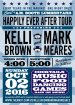
I'm getting married in October and am designing my wedding invitations. My guy & I go to several concerts a year in the jamband genre (Grateful Dead / Widespread Panic mainly) so I wanted the invites to look like concert tickets but I couldn't make it work the way I wanted while keeping the ticket look so I decided to go with a concert poster look. Here's what I have so far and would love some input. I like it but I don't love it. (It's not a formal wedding! :)
 

Attachments

  • Invitations2.jpg
    Invitations2.jpg
    77.1 KB · Views: 247

oksigns

New Member
very tight.

The 3rd color of that darker blue/purple appears to be out of place as it is not evenly used throughout.

"Reception to Follow" script is too hard to read and appears jarring. Maybe just an italicized or cleaner hand written typeface to replace.. just something with more structure there.

lastly, the whole box at the bottom containing the details "Sunday OCT.."- something could be done about it's outside shape to add variety rather than a square uninteresting box compared to the rhythm already going on.

It's fun.
 

GoodPeopleFlags

New Member
Yeah, the purple box at the bottom is bugging me, too. I want to separate it from the date but I don't think the box is the answer. Thanks for your input! I see what you mean about the script font; I'll try to find something better. :)
 

fresh

New Member
Can you put the date info on one line, then you can write the description below in a coordinating font/style. Also, I'm confused by the two different times listed. What time is the ceremony taking place?

And congratulations :)
 

Cranniga1

New Member
attachment.php
Put this in there for the Panic/Dead Combo
 

Attachments

  • 2453ba9eef8ee6db334d234c2ffab60a.jpg
    2453ba9eef8ee6db334d234c2ffab60a.jpg
    14.8 KB · Views: 280

fresh

New Member
Put the date on the same line as the times, and then write "reception to follow" below the times. Or just leave that out, because its clear there will be reception because you are listing the activities on the invite.
 

GoodPeopleFlags

New Member
@Cranniga1: Ha! Love that! I'm part owner of an online flag company (after 25+ years in signs) and someone ordered a flag very similar to that the other day! :rock-n-roll:

@fresh: But I love the date written like that! But I'm willing to change it if it's the only way to fix the issues. "Doors Open 4:00" is when people can get there and start drinking if they want and "Showtime 5:00" is the ceremony time. I thought it was a cute idea to go along with the concert poster theme but I don't want it to be confusing.
 

royster13

New Member
Love the theme you have going....I have done a few magnets like this over the years.....Some of the "tweaks" suggested are a good idea....
 

GoodPeopleFlags

New Member
I like that, ddarlak! Our main color is the teal/blue but purple will be an accent color so I was hoping to work some purple in somewhere. I don't have the PMS colors yet; I can't find my Pantone book! Gotta match the teal/blue bridesmaid dresses and then find a complimentary purple. We wanted a *simple* wedding but dang! Simple is still a lot of work!
 
Top