-
I want to thank all the members that have upgraded your accounts. I truly appreciate your support of the site monetarily. Supporting the site keeps this site up and running as a lot of work daily goes on behind the scenes. Click to Support Signs101 ...
You are using an out of date browser. It may not display this or other websites correctly.
You should upgrade or use an alternative browser.
You should upgrade or use an alternative browser.
Honest opinion please
- Thread starter Fatboy
- Start date
Jillbeans
New Member
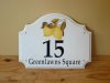
Next time try flipping the blank 180° and then you could put the pictorial in the bottom curve.
Your lettering is still very close to the bottom edge.
And the street name looks as if the text has been squeezed somewhat.
It doesn't have much flow, looks like three separate things stuck onto a sign blank.
Love....Jill
Your lettering is still very close to the bottom edge.
And the street name looks as if the text has been squeezed somewhat.
It doesn't have much flow, looks like three separate things stuck onto a sign blank.
Love....Jill
Rodi
New Member
Fatboy, are you a masochist? You keep posting similar pieces with very little variety. Either you want to be hammered, or you are a passive aggressive type who wants to illicit the worst responses possible.
My suggestion is to listen to what the good criticisms that have been posted thus far, work on your pieces and come back when you think you have made real progress, not just the same type of signs.
My suggestion is to listen to what the good criticisms that have been posted thus far, work on your pieces and come back when you think you have made real progress, not just the same type of signs.
Jim Doggett
New Member
It's way-finding and not selling Greenlawns Square, per se. (just a unifying look is what's needed.) Emphasis should thus be on the numbers, I think. And you've done that.
I'd just fix the bottom element; the decender on the q is running off the page. You want extra margin on all bottom elements .... and it look likes there's none.
My $0.02,
Jim
I'd just fix the bottom element; the decender on the q is running off the page. You want extra margin on all bottom elements .... and it look likes there's none.
My $0.02,
Jim
Fatboy
New Member
Next time try flipping the blank 180° and then you could put the pictorial in the bottom curve.
Your lettering is still very close to the bottom edge.
And the street name looks as if the text has been squeezed somewhat.
It doesn't have much flow, looks like three separate things stuck onto a sign blank.
Love....Jill
Jill...that is a fantastic idea.Never though of that.Will try one and post it.Thank you for the help.
Fatboy
New Member
Fatboy, are you a masochist? You keep posting similar pieces with very little variety. Either you want to be hammered, or you are a passive aggressive type who wants to illicit the worst responses possible.
My suggestion is to listen to what the good criticisms that have been posted thus far, work on your pieces and come back when you think you have made real progress, not just the same type of signs.
I don't know what a masochist is(looked in the dictionary and could not find it either) These are orders that I get on a daily basis.So I post them. Is that a problem ? I want to learn...that is all.I want to master this thing very,very badly...and I will. I was under the impression it is ok but if not and the administrator of the site tells me so I will stop posting them......until then why don't you just ignore my posts. Some people here are willing to help me.
I might not be the sharpest tool in the shed as far as designing is concerned but I bought this business a year ago and already tripled the previous owner's turnover.
Don't be so angry at life. You look like a nice guy on your profile pic. Go outside right now and just reflect on everything God has given us. See where you were a year ago and be gratefull for what you have today. Life is fun....learning is fun and if you don't enjoy teaching newbies a few things them maybe you should not be in this industry at all...no matter how good you are at it.Find that thing you have a passion for and go out and do it.
Gino
Premium Subscriber
Basically, your recent posts of several signs all suffer from the same plight…… non-theme-able
You’re just throwing elements [lines, shapes, colors & textures] around with no concern for balance, continuity or aesthetics.
Your signs aren’t only lacking design values, but there is little to no attention paid to any cohesiveness. It’s more or less an eclectic array of things. Design or layout can be symmetrical like the eyes on either side of your nose….. or it can be asymmetrical balance which occurs when elements are placed unevenly, but work together to produce harmony.
Fatboy
New Member
It's way-finding and not selling Greenlawns Square, per se. (just a unifying look is what's needed.) Emphasis should thus be on the numbers, I think. And you've done that.
I'd just fix the bottom element; the decender on the q is running off the page. You want extra margin on all bottom elements .... and it look likes there's none.
My $0.02,
Jim
Thank you Jim
signmeup
New Member
Keep posting Fatboy. Check out clover signs and springvalley signs. They do house number signs in a formula kind of way. The customer picks from a limited number of elements done in a limited number of ways with a limited number of colours. It keeps the designing to a minimum.
Here is alink that has a customer driven online design feature. http://designer.my-house-sign.com/builder.html
Here is alink that has a customer driven online design feature. http://designer.my-house-sign.com/builder.html
Lunatic Taskbar
New Member
Keep posting Fatboy. Check out clover signs and springvalley signs. They do house number signs in a formula kind of way. The customer picks from a limited number of elements done in a limited number of ways with a limited number of colours. It keeps the designing to a minimum.
Here is alink that has a customer driven online design feature. http://designer.my-house-sign.com/builder.html
Signmeup Thats a great idea.
Fatboy look at these and you will see all the help that you are being given here in its most basic format.
Its not 100% by any means and it has some very good help.
Build on that.
Ian