• I want to thank all the members that have upgraded your accounts. I truly appreciate your support of the site monetarily. Supporting the site keeps this site up and running as a lot of work daily goes on behind the scenes. Click to Support Signs101 ...

Jobs that Got Away in 2010

cartar929

New Member
I was just creating some backup disks from 2010 jobs and came across 2 I never heard anything back from.

I figured I would post them on here and ask for some feedback, so I could at least get an idea about what people thought about them. Both of these jobs were for monument signs.

The Adams International job was for a Montessori School, they asked for their sign to be black and gold. They have a lot railing work out there so I made sure to incorporate some of that.

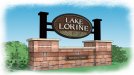
The Lake Loreine job was for a small community, and they requested a stone material, and that's about all I got from them.

Regardless just want to get some feedback from other people's perspective about what the like and what they don't, so that I can at least try to get something more out of these lost jobs.
 

Attachments

  • adamsInternationalSchoool[2] copy.jpg
    adamsInternationalSchoool[2] copy.jpg
    47.3 KB · Views: 109
  • adamsInternationalSchoool[sign].pdf
    1.1 MB · Views: 113
  • view1.jpg
    view1.jpg
    52.3 KB · Views: 80
  • signface2.pdf
    423.2 KB · Views: 113

J Hill Designs

New Member
both top notch in my opinion

edit: have you visited the site's to see what they did end up with? might have just been out of budget range?
 

Billct2

Active Member
I like them both, though the school one may have too much emphasis on the on the decorative elements and not enough on the name.
Did either one go with someone else, and if so what did they end up with? That will often give the answer.
 

Jillbeans

New Member
Really nice renderings you have there.
My question is, did you get a deposit?
I don't even turn on my computer without a deposit.
You have quite the talent.
It's their loss.
The lake one is my fave.
Love.....Jill
 

Gino

Premium Subscriber
Very nice. I’m a little surprised that you have drawings this far along…. but didn’t get the work. Were you at least paid for your renderings ??

In the first one [Adams], the top and bottom borders on the sign are a little too busy for me, I don’t know what that double bar portion would be made from, but it looks like a lot of maintenance work down the road. Also, the size of the sign vs. how much reinforcement you have for installation of the sign does not look like enough.

The second one, I would rather see the columns go all the way up instead of the smaller posts. To me, it looks like too substantial a base for the actual overall appearance of sign and post combined.
 

cartar929

New Member
I don't own the company I work at, just want to throw out there at the beginning.

I have had the conversation about deposits, design time, project price versus hourly and what constitutes what, to really no result. Boss man has more of a contractor mentality, and I honestly feel he doesn't care too much for design work for whatever reason.

"jhilldesigns" as of now both of these places still have nothing new. As far as I can tell these people weren't ready to spend money.

Both signs were inline to be dimensional signs carved on a cnc from hdu. All of the metal work was going to be powder coated aluminum. The Adams International sign was going to have black smalts in the background, and I wanted to try to mica powder coat the letters. While the Lake Loreine sign was going to be a little more of what you see is what get, with a modern masters metallic paint for the letters.

Gino I agree about some of the maintenance issues with this sign as well, they asked for timber work in the structure. We would have outsourced the carpentry work to a company we have used numerous times, so they might have had something up their sleeves to make it a little less maintenance.
The reason for the column shift in the second sign is because the space it was going to fit in wasn't terribly large, and having the columns running all the way up at that width made it look too dominant.

I appreciate the feedback.
 
Top