• I want to thank all the members that have upgraded your accounts. I truly appreciate your support of the site monetarily. Supporting the site keeps this site up and running as a lot of work daily goes on behind the scenes. Click to Support Signs101 ...

Logo for my hobby

ChrisN

New Member
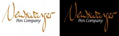
I am working at coming up with a logo for my pen making hobby. The wordmark is based on my own handwriting, with a few tweaks. I picked orange partly because I liked the connotation of the color, partly because that's the color of ink I currently have in my fountain pen, and partly because it is different. I am not stuck on the font for "Pen Company", so if you have any suggestions there, feel free to make them. Criticism & comments welcome.


attachment.php
 

Attachments

  • npc.jpg
    npc.jpg
    17.9 KB · Views: 227

TimToad

Active Member
I think you're off to a good start. I'm visualizing the "pen company" maybe being in all caps, in a light font weight with lots of open spacing so as to not compete so heavily with that free flowing calligraphic treatment you're using. At this early stage of development, color is not a consideration to put too much emphasis on. I'd suggest that you work in grey tones until you get your prioritization and form the way you like it.
 
I like it. But I don't know what it says? I like the calligraphy but I can't figure out what it says. If I saw a your logo and went to google I wouldn't know what to type in. Newsw......
 
Newswanger? Newswunger? Newswanzer? I honestly can't read what it says.

Good I'm not the only one. I thought I was gonna get criticized for not being able to read it. I honestly have no idea what it says. I know most people don't know calligraphy and I know that a large majority of people these days don't know cursive either.
 

shoresigns

New Member
Also, the lines are a little too perfect. If that's your physical handwriting then that's impressive, but it looks to me like it was drawn on a tablet. Not natural at all.
 

Jester1167

Premium Subscriber
Good I'm not the only one. I thought I was gonna get criticized for not being able to read it. I honestly have no idea what it says. I know most people don't know calligraphy and I know that a large majority of people these days don't know cursive either.

+1
 

Jillbeans

New Member
Definitely close up your "a" so it's more legible. And as has been said, make the subcopy in a nice sans serif, spaced out, to look dignified and not compete with the hand lettering.
There is an old logo by Dan Antonelli which is always a fave, he made the writing in white and divided the background with the lettering so the top was one color and the bottom another, bright blue and slime green. It used to be on the cards in the old SignCraft magazine.
Love....Jill
 

Marlene

New Member
I like the colors and the look of it. I would suggest that you rework the lettering so the two letters, the one after the "a" and the last one are readable and I think you would be good to go
 

GoodPeopleFlags

New Member
The thin parts are very thin and may not translate very well on small things like business cards. Basing it on your handwriting is a cool concept but like others said, kinda hard to read. There are many handwriting and calligraphy fonts out there. Maybe look at some and see if you find something you like and can build on?
 

mgriff

New Member
I like the colors and the over all design. I agree with the legibility concerns. It almost has a Hebrews/Arabic feel to it.
 

ChrisN

New Member
Thanks for the comments. Legibility is of course an important part, so your feedback on that area was great.

I made some changes to a few of the letters, so I would like to know what you think of that. I also switched the lettering to sans serif, based on a few of your suggestions. I am liking it a whole lot better with that change. I have two different font weights here - I usually go for thinner, but I the thicker is a bit more readable at smaller sizes.

attachment.php
 

Attachments

  • npc.jpg
    npc.jpg
    18.4 KB · Views: 192

Marlene

New Member
still not too sure what the letter after the "a" is. is it "n"? if so maybe an up stroke like a lower case n usually has might help. I think I like the first font for the words pen company better. I usually don't like two "fancy" fonts together but because it for a pen company to clearly write fancy looking lettering, I think it works better in this case. maybe put them up side by side for a final look at the two options once you finish tweaking out the main copy.
 

Jester1167

Premium Subscriber
I have always like the combination of a free flowing font and a crisp san serif. Always felt like it says creative without sacrificing quality, but that just me.

I think you on to something but I'm still guessing what it says "Newswayer"?

I like the bolder font but you need to adjust the kerning between the C O M. Too close to the C and too far from the M.
 

ChrisN

New Member
I am purposely holding back telling you guys the name, because I find if I know what something says, I will easily be able to read it.:smile:

I fiddled with the letters a bit more, hoping to increase legibility. I personally like the one on the left, but it does sacrifice legibility a bit.

attachment.php
 

Attachments

  • npc2.PNG
    npc2.PNG
    14.8 KB · Views: 196

Jester1167

Premium Subscriber
The one on the right is easier to read but you could get away with something between the two.

Make sure you have web address in a legible font somewhere on all your marketing materials. I now know that it says Newswanger but my mind is trying to make it something familiar - News wranger. I could just be crazy though...
 

nikdoobs

New Member
It almost has a Hebrews/Arabic feel to it.


I agree. I don't know much about calligraphy but aren't the vertical strokes usually heavier than the horizontal lines like you have?

It bothers me that both of your w's are exactly the same (minus the a connector). No handwritten letters are exactly the same.

Your new g looks much better.
 
Top