-
I want to thank all the members that have upgraded your accounts. I truly appreciate your support of the site monetarily. Supporting the site keeps this site up and running as a lot of work daily goes on behind the scenes. Click to Support Signs101 ...
You are using an out of date browser. It may not display this or other websites correctly.
You should upgrade or use an alternative browser.
You should upgrade or use an alternative browser.
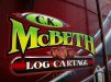
Logo I designed for logging truck
- Thread starter DEANO 55
- Start date

bob
It's better to have two hands than one glove.
Excellent execution of questionable typography. Generally a line of text is not reduced in height from left to right unless there's a real good reason to do so. This is not one of those cases. Rather than reading it, an observer spends its energy tilting it's head and moving side to side to get rid of the implied parallax. Other than that, nice work.
OldPaint
New Member
il bet this guy is a fan of ROD TICKLE...........also from down under))))they got some talented people doin sign work.........have had the pleasure of working beside a couple of them. rod being one..............
https://www.facebook.com/EastCoastAirbrushing/photos
https://www.facebook.com/EastCoastAirbrushing/photos

WhiskeyDreamer
Professional Snow Ninja
Really enjoy the colors on this. It's not overdone and conveys a nice brand.
