-
I want to thank all the members that have upgraded your accounts. I truly appreciate your support of the site monetarily. Supporting the site keeps this site up and running as a lot of work daily goes on behind the scenes. Click to Support Signs101 ...
You are using an out of date browser. It may not display this or other websites correctly.
You should upgrade or use an alternative browser.
You should upgrade or use an alternative browser.
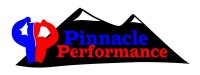
Logo
- Thread starter Jgentry
- Start date


Locals Find!
New Member
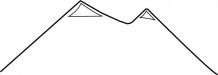
I like the 2nd logo you did. However, I am not liking the mountain graphic. Why not try just using a trace of the top of the mountain. So you get the effect without it being all colored in.
Edit: Here is a quick sketch up of what I was thinking with the mountain.
Edit: Here is a quick sketch up of what I was thinking with the mountain.
Attachments
Jillbeans
New Member
While it's not a bad start, it lacks contrast.
You need a thin white contour around your words.
The font looks like you've really put the squeeze on it.
I would not use the same font on your subcopy, use a simple sans serif, even Futura Condensed.
If something has a face, it should be looking into the logo (just an old rule I follow)
I would not use the two Ps, it makes me think of peepee (but I am kind of a pervert)
Plus the old mirror initial thing has been done to death.
Just the guy is enough.
I myself would use either the guy or the mountains but not both.
Love....Jill
PS
His old logo is just...(shudders) I have a feeling he will push for the peepees.
signmeup
New Member
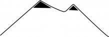
Nice rack.I like the 2nd logo you did. However, I am not liking the mountain graphic. Why not try just using a trace of the top of the mountain. So you get the effect without it being all colored in.
Edit: Here is a quick sketch up of what I was thinking with the mountain.
Locals Find!
New Member
Nice rack.
I didn't know if anyone else would catch that. I was thinking the same thing after I drew it.
signmeup
New Member
You gotta get up pretty early to sneak something like that past. :Big LaughI didn't know if anyone else would catch that. I was thinking the same thing after I drew it.
Jillbeans
New Member
Maybe if you like Janice's "Homer Simpson" chesticles...Nice rack.
OK Back to the topic, sorry.
Attachments

Custom_Grafx
New Member
Agree with Jill re the contrast.
Have a look at the attached. Grayscale. Lack of contrast.
Look at the black and whites with 2 different thresholds - you either get the front, or the background. You can't get everything in bw... so your client won't be able to photocopy anything in black and white either....
Have a look at the attached. Grayscale. Lack of contrast.
Look at the black and whites with 2 different thresholds - you either get the front, or the background. You can't get everything in bw... so your client won't be able to photocopy anything in black and white either....
Attachments


Custom_Grafx
New Member
I would prefer to present something like the following... the bicep can be lost and it still looks ok.
Be careful of details in a logo.... If they're a gym... then they might get tshirts and the such... small embroidering... anything. It should be nice and simple (but that's just me).
Be careful of details in a logo.... If they're a gym... then they might get tshirts and the such... small embroidering... anything. It should be nice and simple (but that's just me).
Attachments


Locals Find!
New Member
Lose the arm and the box. You got something good going then. Keep it simple. If you embroider or screenprint that box its going to have a heavy hand on clothing.
Custom_Grafx
New Member
Funny you say that, when I first started drawing it up, I started off with just the rectangle, and no arm... and liked what I saw. It always seems to be that simple is the way to go eh? no matter what you or the client wants.
Custom_Grafx
New Member

Custom_Grafx
New Member
That last one is pretty good.
Or make an arm with a mountainous looking bicep.
Really glad you posed the greyscale pix CG to better illustrate the lack of contrast.
I know it's really sometimes not so obvious or easy to explain till you do that.
Also, to the OP, to help with the contrast issue, to save yourself time, just start designing in black and white. That way, you know it'll look right no matter what colour scheme you give it later on

Jgentry
New Member
Hi people. I was up late, good morning.
OK here are a few modifications using your suggestions. Outlined the text, change font on the tagline, faced the man in, reduced his muscle size. Thoughts?
Notes: The muscle man is creating opposing P's with his arms. That was a design que from the customers original logo at top. I can drop it if it becomes a weak point. The tag line would only be used as part of the logo on larger graphic prints and be dropped on smaller stuff, say the logo on a T shirt.
P.S. I really like your black and white logo CustomGrafx. It just does not convey fitness/strength training. Also I don't want to scare women off with the muscle man design, any ideas? I did drop his size down a little on this design.
Attachments

Last edited: