• I want to thank all the members that have upgraded your accounts. I truly appreciate your support of the site monetarily. Supporting the site keeps this site up and running as a lot of work daily goes on behind the scenes. Click to Support Signs101 ...

New Church Logo

x2chris7x

New Member
Here are a couple ideas I'm working on for a church logo. The current logo was created by a friend of the minister, and is not very good... He's looking for something that may appeal to a younger crowd. I would imagine 18-30ish...

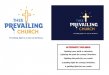
First version is pretty much a "generic" church logo in my opinion

Second is more creative. I came up with the tagline to help reinforce the idea. There are also other tagline that may be more suited to the church, but let me know what ya'll think

Comments and suggestions wanted. Thanks.
 

Attachments

  • Thee Prevailing Church (Version 1).jpg
    Thee Prevailing Church (Version 1).jpg
    55.5 KB · Views: 96
  • Thee Prevailing Church (Version 2).jpg
    Thee Prevailing Church (Version 2).jpg
    37.4 KB · Views: 76

Circleville Signs

New Member
First one looks like a tombstone with a cross on it.

2nd one isn't bad, but you need to make the idea of the cross as a lightbulb a bit more pronounced if you want people to really "get" it.
 

x2chris7x

New Member
Thanks for the input Gary... I actually included the filament (however you spell it) inside the cross.. Its a lil hard to see on this jpeg though. Is the overall idea good? Or should I send to the trash??

Either way, I think both versions are a big improvement to the current "logo"
 

Gino

Premium Subscriber
Yowsa..................


Much improved. :thumb:


What happens when things get turned around and they don't have to spout off negativity ?? Will you have to change out the tag line or come up with a new logo ??


Anyway, my first impression of the light beams was... I thought it was throwing off perspiration. I didn't get the sense of light at all. I studied it over a few times, then I realized that was a light chain and those were rays of light. I don't think your logo gets the idea across fast enough. Once ya know it, it's Okay, but until then.... someone might remain in the dark too long and not get their salvation.... young or old.
 

Deaton Design

New Member
I actually like the first one if you maybe moved things around a bit.
I took it into photoshop and did that, and added a glowing start behind the cross.
Just to give you some ideas...:)
 

Attachments

  • theechurch.jpg
    theechurch.jpg
    49.7 KB · Views: 78

visual800

Active Member
not to be harsh but it appears stiff looking and very corporate. maybe throw a flowing script in there?
 

x2chris7x

New Member
Harsh. no... Thanks for the input. Yes, it does look very corporate... which I guess could be good or bad. I've recently been trying to improve on my logo design, trying to make things look very professional/corporate, to give these smaller businesses the appearance that they are larger than they actually are... I guess in this case a logo thats less corporate may work better
 

ironchef

New Member
I like them both. Its up to the church or the pastor to decide. Also the one with the black cross is off, the top portion is way too short
 

inthesignbiz

New Member
"Providing light in a time of darkness"
Doesn't sound very optimistic for the future.
How about just
"Bringing Light".

This is for Youth Group?

If it was me, I'd try to stay away from the "boxy" corporate look
and try to make is something more that today's kid's can relate to
(you know how those damn kids are). Sorry, my father steps in sometimes.

Of course, that would be my 2¢
 

rjpjr

New Member
howdy...

at first glance, your submissions reminded very much of a Dr Suess graphic. I think it is the curve of the hill underneath the cross. My son looked at them with me and his first question was "Is it designed for Kids?", so I guess he picked up on it to.
Although your versions are great improvements in the readability department, I think the goal of reaching 18-30ish may have been missed.
The original logo is a little "Edgier" (if that is even a word) but clearly the legibility is very poor.
Maybe if the text was broke away from the cross graphic... see attachments
Those are my observations for whatever they are worth.
 

Attachments

  • Prevailing-Church.jpg
    Prevailing-Church.jpg
    65.5 KB · Views: 90
  • Prevailing-Church2.jpg
    Prevailing-Church2.jpg
    55.7 KB · Views: 92

visual800

Active Member
howdy...

at first glance, your submissions reminded very much of a Dr Suess graphic. I think it is the curve of the hill underneath the cross. My son looked at them with me and his first question was "Is it designed for Kids?", so I guess he picked up on it to.
Although your versions are great improvements in the readability department, I think the goal of reaching 18-30ish may have been missed.
The original logo is a little "Edgier" (if that is even a word) but clearly the legibility is very poor.
Maybe if the text was broke away from the cross graphic... see attachments
Those are my observations for whatever they are worth.

spot on!
 

Jillbeans

New Member
^I like RJ's take on it above.
In your 2nd one, whatever is dripping or hanging off the R descender (is it a pull switch?) just looks weird, I know I'm way too sexual but it reminds me of "seepage".
Anyway, the lightbulb idea is OK, but I think it's too literal and not "churchy" enough.
What about some sort of ancient lamp or lantern, such as in "lamp unto my feet" or "candle under a bushel" candle type icon?
Here's a photo of what I'm trying to describe.
Also, the typography is very cold.
I think a modern script would be nice, and I'd make Thee on the same line, because my brain keeps wanting to read it "the".
Love....Jill
 

Attachments

  • oil.jpg
    oil.jpg
    91.3 KB · Views: 79

SD&F

New Member
I agree that it needs to be changed up a bit. It seems to be stiff and the tag line is gloomy. Perhaps...Lighting the way on your journey, Enlightening our youth, etc...anything but gloom
 

Marlene

New Member
I like RJ's take on it above.

me too.

it is hard to make something with the word "thee" in it seem cool to 18 -30 year olds as it all ready sounds old, Medieval and very Scarlet Letter. by putting a light blub image into this, you've created an anachronism. it is like seeing a watch or sunglasses on one of the extras in a gladiator movie. with a word like "thee" in the name, it just doesn't work to have light bulbs and such as it feels really off. the layouts that RJ did resolved that conflict and fit the image. it may not be as trendy as having a light bulb but unless they are willing to drop that "thee", I wouldn't go in that direction at all.
 
Top