-
I want to thank all the members that have upgraded your accounts. I truly appreciate your support of the site monetarily. Supporting the site keeps this site up and running as a lot of work daily goes on behind the scenes. Click to Support Signs101 ...
You are using an out of date browser. It may not display this or other websites correctly.
You should upgrade or use an alternative browser.
You should upgrade or use an alternative browser.
Office Supply Logo
- Thread starter lukewarmtea
- Start date

ThinkRight
New Member
Hoping for some feedback on a logo for a friend. Honesty appreciated!
(Disclaimer - I don't do this for a living)
I think a pen or pencil would make a better "i"
lukewarmtea
New Member

I am trying desperately to keep it simple but make it visually appealing. Would it be too much to change the "i" to a pen and change "essentials" to a script tied to the pen? Or is that totally unoriginal?
lukewarmtea
New Member

lukewarmtea
New Member

lukewarmtea
New Member

ThinkRight
New Member
Getting better.
Something still looks off.
Maybe one of the real designers will chime in...
It looks kinda chunky,not easy on the eyes...
Does that make sense to you ?
Something still looks off.
Maybe one of the real designers will chime in...
It looks kinda chunky,not easy on the eyes...
Does that make sense to you ?
lukewarmtea
New Member
The font for office being a little too thick? I'll put it on a diet and see how it looks!
bob
It's better to have two hands than one glove.
I knew before I ever open up this thread that somewhere there would be a paper clip. I was not to be disappointed. The pens, pencils, dildos, what-have-you are no better.
It would really be refreshing to see someone at try for something at least a little bit outside of the box. These are all, each and every one, trite beyond the power of the English language to express.
It would really be refreshing to see someone at try for something at least a little bit outside of the box. These are all, each and every one, trite beyond the power of the English language to express.
lukewarmtea
New Member
Thanks for the honest opinion Bob! I am not a professional designer by any means but I am having fun, and you are 100% right that I am lacking originality with these designs. Would you be willing to suggest how I could change it to be less trite but still scream "office supply store"?
bob
It's better to have two hands than one glove.
Thanks for the honest opinion Bob! I am not a professional designer by any means but I am having fun, and you are 100% right that I am lacking originality with these designs. Would you be willing to suggest how I could change it to be less trite but still scream "office supply store"?
For my going rate of $75.00US per hour I'd be willing to suggest all manner of things. For free, not so much.
Flame
New Member
For my going rate of $75.00US per hour I'd be willing to suggest all manner of things. For free, not so much.
Then GTFO out of this thread.
Lukewarmtea, disregard any design advice from the above individual.
I'd start with saying for someone who does not design, it's really not a bad start. The paperclip may be overused, but it does do one thing...it says OFFICE. Nothing wrong with that. Like a landscaping company using a leaf...its been pounded into peoples heads so much, it instantly tells them "landscaping". That's actually a good thing!
A pen isn't bad either, but if you do use a paperclip, I'd make it not so stiff looking. It looks like bad clipart right now. Check out some vector paperclips on google to get some inspiration and draw one up.
lukewarmtea
New Member
Hey Flame and thanks for the advice! The paperclip was just something I drew myself quickly so it is a bit crude certainly. In my town the bar for graphics design hasn't even been put up yet, it is that bad. Is this 'concept' worth refining or should I try a few other ideas first?
I figured I might get shot down a bit so I'm not really concerned about the negative feedback. Most of us aren't born good at design, I've read a few books, but reading and doing are two very different things.
I figured I might get shot down a bit so I'm not really concerned about the negative feedback. Most of us aren't born good at design, I've read a few books, but reading and doing are two very different things.
2B
Active Member
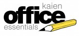
Had to change my export options on CD, hopefully these are better quality
this is better, for the "I" try using an "ink spot" then doing the line through the "T"
agree that the font is still unappealing and is not an eye catcher
Joe Diaz
New Member
I like the direction you were going with the pen. I would work on the pen a bit more though. Perhaps the cap of the pen could double as the dot on the i, serving 2 purposes, making it read better as an "i" and as a pen.
Perhaps try another option with tighter kerning. and maybe a bit more unique type style. I think your instinct to go with a case sensitive sans-serif font is a good one, that screams "office supply" for some reason, I just think it needs more character if it's going to be a logo type. There are a few nice ones to play around with here: http://www.topdesignmag.com/30-superb-sans-serif-fonts/ (be mindful of the usage rights)
I actually don't mind the pen crossing the "t"... Here again, good direction, just a bit more work on the execution. Perhaps a better font there might help too. Think legibility.
I agree with flame, not bad at all for someone who is new to design. A lot of new designers try to throw everything they have at a design and it comes out looking like a mess. Your design, although it needs some fine tuning in my opinion, is easy to take in, now you just need to work on making it stand out more as an individual brand.

lukewarmtea
New Member
Wow I never expected the quality of feedback I've been getting! Thanks Joe for giving me feedback on how I can improve my design that is worth its weight in gold. And visual800 and wraps ink those are all great designs! I really like bits from all of them I hope you don't mind if I use parts of your ideas in future revisions =)