-
I want to thank all the members that have upgraded your accounts. I truly appreciate your support of the site monetarily. Supporting the site keeps this site up and running as a lot of work daily goes on behind the scenes. Click to Support Signs101 ...
You are using an out of date browser. It may not display this or other websites correctly.
You should upgrade or use an alternative browser.
You should upgrade or use an alternative browser.
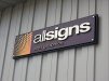
Our new sign
- Thread starter TimToad
- Start date
Pixels Are Bad Mmmkay?
New Member
That's very nice!
Looks sharp! What standoffs did you use that will hold up outdoors?
Thanks.
We just used some MBS aluminum ones that I shot with some matte clearcoat. Out here in Cali, it never freezes, snows, etc. They should be fine for a few years. We used some additional blocks with VHB tape behind the second panel so it laid nice and even without adding too many other visible fasteners.
I cut my teeth as a walldog back in the early 80's in Chitown. I went to Washburne Trade school for four years through the sign and pictorial painters union back when it still was open. You are in a great signmaking town.
Have a great holiday. Go Bears!
My father went to Washburne Trade School as well! I think he went for machining, but he is a jack of all trades! I hear a lot of people who say that school should have stayed open because their isn't any sort of school like it around anymore that teaches the trades.
Thanks.
We just used some MBS aluminum ones that I shot with some matte clearcoat. Out here in Cali, it never freezes, snows, etc. They should be fine for a few years. We used some additional blocks with VHB tape behind the second panel so it laid nice and even without adding too many other visible fasteners.
I cut my teeth as a walldog back in the early 80's in Chitown. I went to Washburne Trade school for four years through the sign and pictorial painters union back when it still was open. You are in a great signmaking town.
Have a great holiday. Go Bears!
Signmaker1234
New Member
Looks.........
Awesome!
Awesome!
Jean Shimp
New Member
Great job!
Very nice.
I would also like to know about the materials/methods used. Definitely a nice clean finished product.

Hope you all had a relaxing and safe holiday.
Thanks for all the kudos. We think it reflects the company's image well and projects the kind of work we do now and aspire to continue doing into the future.
Nothing all that out of the ordinary as far as materials and technique, but it did create some nice depth and the clean, modern, concise lines we were seeking. The primary backing panel is a 2" deep .063 aluminum panface. I really like this approach for a couple of reasons. You can create any depth sign you like without having to build up solid materials. Its easy to put up and there are no visible fasteners on the face of your sign. The MBS standoffs we used to adhere the second panel to the black backing panel were a conscious design decision. We could have blind mounted that panel also, but thought the aluminum caps were a nice touch.
The secondary panel is just 3mm DiBond with a matte laminated print mounted to it. The dimensional letters are all routed from 1/2" thick high density PVC and painted with a satin exterior enamel. We mounted the letters with VHB tape and a few dabs of Gorilla Gel Superglue on each letter just for added bond.
For the install, we mounted two 1"x1" x 1/8" wall aluminum square tube to the wall at the top and bottom inside measurements of the black panface length. After sliding the panface onto those, we adhered the sign to the tube with a couple self-tapping screws and called it done. Total install time was under an hour.
looks good. only suggestion would have been to make the orange dot thingy smaller so that there was a margin around it. it would have made the stand offs look better on that side of the sign as they conflict with the other dots.
The sunrise is a part of our logo and is sized that way on all of our marketing collateral. That secondary panel is 1.25" smaller on each edge than the black backing panel, so there is essentially a 1.25" black border all the way around it. The angle of the photo and lighting that day makes the standoff caps look way brighter than they really are.
Johnny Best
Active Member
Sweet.