-
I want to thank all the members that have upgraded your accounts. I truly appreciate your support of the site monetarily. Supporting the site keeps this site up and running as a lot of work daily goes on behind the scenes. Click to Support Signs101 ...
You are using an out of date browser. It may not display this or other websites correctly.
You should upgrade or use an alternative browser.
You should upgrade or use an alternative browser.
poster design
- Thread starter ucmj22
- Start date

J Hill Designs
New Member
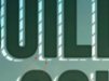
not bad! The one thing that is irking my eye is that the lines in the shading of the top copy turn the corners and dont all have the same angle
ucmj22
New Member
not bad! The one thing that is irking my eye is that the lines in the shading of the top copy turn the corners and dont all have the same angle
what do you mean by turn the corners?
the lines used for the photoshop mask were created in Illustrator. They are all at a 45º angle and are equidistant.
ucmj22
New Member
I like it! But I will be honest, I'm not totally digging the lines in the shadow. I think if they were more subtle (maybe a lighter color) it would be better but as they are I think your eyes really get distracted from the main copy and go directly to the shadow.
I thought it gave them more of a metal frame look which I thought worked well for this, but I dont have another designer to give a second look anymore so. I'll have to remember that next time.
J Hill Designs
New Member
ucmj22
New Member
yeah it may very well be an optical illusion, but this hopefully illustrates my point
I see what youre saying. I think its partially a biproduct of downsampling to less pixels, and partially just an optical illusion
Here is was before the line addition. Guess I should have quit while I was ahead
Attachments

ucmj22
New Member
The poster is a poster... it looks nice.
To continue on with the shadow, why are the insides of letter's shadows treated differently ??
how so? The main text has a uniform inner shadow effect applied. Is that what you're referring to?
SignManiac
New Member
Just don't see any benefit to the zebra stripe cast shadow. As small a detail as it is, it's distracting and takes your eye away from the main message of the poster. Otherwise I like the layout. Now my eye is twitching from it and it won't stop ")
J Hill Designs
New Member
how so? The main text has a uniform inner shadow effect applied. Is that what you're referring to?
they dont have the liney thing going on in the first post
ucmj22
New Member
The poster is a poster... it looks nice.
To continue on with the shadow, why are the insides of letter's shadows treated differently ??
I see, you too are distracted by my liney drop shadow. As I said before, I thought it gave it a framed out look that I thought worked with the construction theme, but I guess the consensus is that I missed the mark.
Gino
Premium Subscriber
The poster is a poster... it looks nice.
To continue on with the shadow, why are the insides of letter's shadows treated differently ??
how so? The main text has a uniform inner shadow effect applied. Is that what you're referring to?
This.............

Besides, when is a shadow lighter then the letter ?? Shadows are cast from a light source, hence the word shadow..... unless your letters are jet black on a very light background, but they'll still be darker than the background color. Otherwise, it's not a shadow.
A shadow would not be the place to try and get creative to achieve solid impressions. Either re-worked the letter itself or like OP said, let well enough alone.
If you want to give the impression of something strong.... have sun rays or something shining through. That's always gives a strong feelings.
J
john1
Guest
optical illusion
Sorry, couldn't resist.
Attachments
ucmj22
New Member
Sorry, couldn't resist.
Its the pleating on the pants.....
Craig Sjoquist
New Member
I like the poster looks great in fact .. those dash lines shading way cool
The flow is good, simple to the point, good colors & contrast.
The flow is good, simple to the point, good colors & contrast.
ucmj22
New Member
I like the poster looks great in fact .. those dash lines shading way cool
The flow is good, simple to the point, good colors & contrast.
awww crap, Craig likes it... now I know its terrible!
:ROFLMAO: Just messin with ya Craig! Thanks for the compliments.
one thing that I did with the colors was for the box at the bottom, and all of the text, I sampled colors from the image. the blue at the bottom is from the top left sky, the cream for the bottom text is from the paper, and the main head and bottom text drop shadow are from his jacket.
Sign Up Graphics
New Member
Sign Up Graphics
I like the poster, but not the shadow.
I like the poster, but not the shadow.