• I want to thank all the members that have upgraded your accounts. I truly appreciate your support of the site monetarily. Supporting the site keeps this site up and running as a lot of work daily goes on behind the scenes. Click to Support Signs101 ...

Printer- Resolution- Profile or Ink? Pics attached

supurb

New Member
So i've got a cj500 converted to an sc500 up and running with new heads. i'm running it off flexi. My prints are not looking all that great so i'd like to go down the list of things to do to get them in order. I did align the heads and per the manual i did adjust everything to line up correctly. I know my colors are off but i'll tweak that in time. I'm concerned with the gritty-ness of the image. It seams that especially the black ink is giving me bigger dots and not blending as well. I've attached an image printed by a professional company and my own. The artwork is vector are done in corel. So is my printer simply not as good as the professional companies equipment, is it somehow not printing at a high enough resolution. Will a good profile fix this issue? Ink limit perhaps? The black ink i have came with the printer and could be over a year old, the rest is fresh. It is all ecosol max. Please let me know where to start . Thanks !
 

Attachments

  • photo.jpg
    photo.jpg
    68.9 KB · Views: 172
  • photo1.jpg
    photo1.jpg
    57.7 KB · Views: 166
Last edited by a moderator:

sfr table hockey

New Member
Now that you have a couple profiles to try you should see a change in the color and now should match standard colors. You may need to play a bit with rendering intent and such. Keep it at perceptual for photo stuff and relative for most other stuff. The grain should also lessen and with the right heat setting that should go away. Cheaper media tend to show the grain more easily and gloss media as well. For example I found oracal 3641 needed to be at a higher heat than a cast media would or banner media. Also a matte finished media can print easier and if you want the gloss look you will have that if you laminate anyway with a gloss laminate.

You should be able to print at fine 2 with those profiles and get a very nice output. Key is to have the heads lined up bang on and you will see this in the print tests you are to do after installing new heads. Also through the year with temp changes and humidity changes the alignment needs to be checked as this does cause things to shift over time. Media feed is also something to watch as thicker media tend to print shorter and for me I always need to adjust the feed size of the image by 1 or 2 % so it stretches the image but yet once printed will be the right size. This is calculated by doing a test srtip and measuring and calculating the difference. I found that the settings for banner media or canvas did not ever feed right for me so I record what one I used and adjust the feed size manually.

Lots to leaning this printing stuff so I am sure you will have many more questions.
 

4R Graphics

New Member
Ok first thing your equipment is probably not as good as the the company you sent the prints out to. For one your machine is a converted unit and they are most likly running something designed for this.

Now that does not mean you cant get good prints.
First thing first you will never really get photo quality prints from your printer so dont expect it or you will drive yourself nuts.

Ok on to the fix I know nothing about your printer but the higher you set you resolution and pass number the smaller your dots will get to a point.
Since grainy is the problem try a higher resolution and a higher pass number also try unidirectional and bi directional as if this is off a little it will grain up prints.

Sorry I cant help much more but like i said higher resolution should fix your grain problem but the trade off is speed so higherres better print but takes longer.

Last thought did the out source company digitally print those or were the screen printed as this could be a huge difference.
 

supurb

New Member
Okay, so I loaded up the profile (thanks Hockey!) and the colors are looking great. I'm still not seeing clean lines though. That’s a bummer that I can't get photo quality because I thought I read several places that I could but at a slower pace. Speed is not an issue for me. This is pretty simple vector artwork with solid colors so I know it should be capable of printing that just fine. I'm just learning Flexi, there are a lot of factors and I’m slowly learning what they do at the cost of lots of ink :) Anyway if anyone could take a look at the new image and see if they can think of any settings to try. I think I have the resolution set all the way up. I don't know where you can set the number of passes in flexi, I only see that under the cutter option. Also, the company I worked with was definitely using a digital printer. I did try the unidirectional printing and lines showed a tiny amount of improvement but still showed bleeding. Hockey so far I have only been working with the profile that is used to show fine details, I’ll try the others tonight. I also lost some of my background completely which I thought was odd, but I know its some software setting that caused it because the test prints show the heads firing all colors, all dots.

I'm working with General Formulations Static cling material. I have the heat set to 50 C which is as high as she'll go. The print looks much worse at lower settings. The heater on my machine is old school, so hopefully that is not my issue. If I can't find any settings to clean this up, then I’ll probably check out head alignment again. Anyway, I've attached the latest picture.
 

Attachments

  • label.jpg
    label.jpg
    62.4 KB · Views: 165

sfr table hockey

New Member
Supurb,

Email me that file, if you want and I will print when I get up and running today and see what I get for color and grain. From there we will know if it is possible on these printers. Also your phone#, if you want and I can call and go over things. Too hard to do in emails.

Heat is the other issue. Depending on media the heat may need to be higher. I am up to close to 115 to 120 F for lower grade gloss media. Now I tend to stick with the higher end media and matte.
 

4R Graphics

New Member
Thatlooks a lot better.
As for my statement of photo quality what I mean is dont try to compare your prints to one of the professional level epsno photo printers or something like that as those printers will print at a much higher resolutiion than your printer can go.

Ok its been a while using flexi I used 8 so the screens may have changed but there is a screen in production manager that has the profile info and you can set the forgot whatthey call it but you have choices like FMxpress etc.. on that screen there should be a button that says advanced or something like that when you click it you will get a new screen that has many settings for your printer in the rip such as high quality mode high speed mode bi directional etc... a few things to try first try setting the number of passes to a higher number this may help but will take a lot longer to print stuff. second try turning on or off the high speed mode as this can cause overspray and what not.

last try turning on or off the high quality mode this may be on the screen where the profile is showen not sure been a while since I used flexi.

Remember to try each of these settings individually and then start mixing them until you get something that you feel is the best you can get.

Also before you change anything remeber what you are set at now.

My first change would be the number of passes see if it it to slow for you select one that gives you a good print at a reasonable speed then change the other settings.

As for color do not turn of color correction or you will get really messed up prints some may look good but others will be all messed up so keep color correction on and find a profile that gives you a reasonable print in color. Sorry to say but the odds are not in your favor as far as profiles and getting great color matching you really need to build your own profiles for that and that is a whole nother can of worms first get good prints then work on color.
 

supurb

New Member
Thatlooks a lot better.
As for my statement of photo quality what I mean is dont try to compare your prints to one of the professional level epsno photo printers or something like that as those printers will print at a much higher resolutiion than your printer can go.

Ok its been a while using flexi I used 8 so the screens may have changed but there is a screen in production manager that has the profile info and you can set the forgot whatthey call it but you have choices like FMxpress etc.. on that screen there should be a button that says advanced or something like that when you click it you will get a new screen that has many settings for your printer in the rip such as high quality mode high speed mode bi directional etc... a few things to try first try setting the number of passes to a higher number this may help but will take a lot longer to print stuff. second try turning on or off the high speed mode as this can cause overspray and what not.

last try turning on or off the high quality mode this may be on the screen where the profile is showen not sure been a while since I used flexi.

Remember to try each of these settings individually and then start mixing them until you get something that you feel is the best you can get.

Also before you change anything remeber what you are set at now.

My first change would be the number of passes see if it it to slow for you select one that gives you a good print at a reasonable speed then change the other settings.

As for color do not turn of color correction or you will get really messed up prints some may look good but others will be all messed up so keep color correction on and find a profile that gives you a reasonable print in color. Sorry to say but the odds are not in your favor as far as profiles and getting great color matching you really need to build your own profiles for that and that is a whole nother can of worms first get good prints then work on color.


Thanks for all of the tips 4R. I started messing with all the settings, i'll post the results in a second. First I would just like to rule out my head alignment. It is not perfect but seems to be with in the perameters per the manual. It says it can not be more than a half a dot off. To my eye it looks like i'm exactly at a half a dot off. I'm no expert so if you guys want to take a look and tell me what you think that would be great. Don't want to get too deep messing with the settings if it is my head adjustment. I"m hoping its not because i think the lever that fines tunes that is broke. It moves freely and doesn't seem to be attached to anything. It took me like 10 tries of applying different pressure and screwing the heads down to get it that close. I'm sure to get a new lever I would have to buy an entire carriage. I'd rather do random pressures until i hit it straight on rather than buy the new carriage. Anyway here is the pic:
 

Attachments

  • head test.jpg
    head test.jpg
    20.4 KB · Views: 155

supurb

New Member
Alright i've been trying all sorts of settings. I'm changing a lot of things but nothing has seemed to help with the fuzzy lines until i tried ink limits. I had tried them before but this time I thought I would crank them way down and see what happens and then if it helps, slowly bring them up. They seemed to have helped? I think the bleeding around the lines appears to be more acceptable. But now with the ink limits it seems to have white dots throughout? Does it seem right that I would have to limit the ink so much? The darker one is a 50% ink limit across the board, the lighter one is 25% ink limit. I think i'm going to try ink limits with several passes next. What do you think?
 

Attachments

  • 50 percent.jpg
    50 percent.jpg
    53.6 KB · Views: 168
  • 25 percent ink.jpg
    25 percent ink.jpg
    59 KB · Views: 192

sfr table hockey

New Member
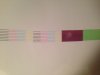
The first pic is looking better. On my test the black was more the issue with it bleeding too much with the profiles I sent you. You could just drop the black ink limit a bit on its own and see what you get.

Ink limits are read in the test prints on my I1 and on a particular media you may need more ink before it maxes out where is on another it may max out and pool with a lot less ink. By using a profile not made for your media you can do what you are doing and start off with at least the right color, then play with the amount of ink. You will also notice if you use a profile for fine 2 and print at super or photo, your print will have a darker look to the colors and look to be real wet and possibly pool the ink. This is because the profile is made for that one print quality and the ink volume is for that one media. You can get away with some profiles working for many medias but just know it is best to use one for that one media.

As for that lever, don't worry about it. It does just move on its own and you should feel it bump against the head in one direction and then free move to the other direction. All the lever does is there is a rounded bump that when the head is unscrewed, the spring forces it over and pushes against that lever. By moving the lever then you can adjust the head but really I tend to get it close and then slightly bump the heads to tweak it. The other lever on the right head for moving it forward or back for me does not seem to engage and there too just do it by hand. Tighten the screw, test print, and do again till it's ok.

Your lines look good for the heads both being straight but the Mg and Lc are off enough to work on some more. That would be moving the right head (I think ) more forward which is that lever on the side. Again mine for that one seems not to engage so I manually pull or push the head slightly and reset the screw and test print. That is an important one so try to do that to get them bang on. You may find fixing that twists the head and then that will be off on the other lines.

If the two heads are off a line (like they look on the Mg and Lc) this will blurr the look in the prints with the ink spray just slightly off when color is mixed from the two different heads.

You are close, just that one head comming forward a tad. You may hardly notice it move for that amount. You may even want to loosen the screw and then slightly snug it and try to move it so it does not jump forward and go way off like it can when the screw is totally loose.
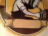
 

4R Graphics

New Member
I really dont know your printer or your rip but the darker print is really close. If you can get good colors (correct colors) with that setting your gold unless your trying to print POP up close photo type graphics but for most everything else that is as good or better than most.

Now as for messing with ink limits that is what the linearization I spoke about does and yess it is not uncommon to have the numbers down 20 30 40 percent from 100 however you will almost never have them the same.

So do the linearization and with your eye try to select the block that the color looks solid but is not wet and not bleeding. Bleeding look at the edge and see if it is a little fuzzy or crisp you will see what i mean when you do it and look at the 100.

Do the linerization for your printer and adjust each color and I think you will find that the print will be nice and your colors will be better as well.

You really need special equipment to do this right but you can eyeball it and it will at least be better than nothing.

As for the numbers in the linearization table my current setup Mimaki JV33 with the right equipment (i1 Photospectrometer) my Magenta is @ 72% my Cyan is @ 68% my Yellow is @ 60% and black is @ 55%.

These numbers were found with the proper equipment and after building a custom profile with the settings above and the right equipment I am able to hit at least 2/3 of the colors in the pantone book dead on.

Good luck I will check back in later.

Look around town at alot of the graphics you see that are printed with large format printers and you will see that the darker of the 2 prints that you just posted up is probably as good as most of the prints you will see around town so I would not worry about it to much it seems you got it really close now work on the colors.

If you do the linerization you will adjust the inks down like you did which should give you the cleaner lines like the darker print but it will also set the colors so you are not 1. laying down to much ink and 2 overpowering one color with the other (example magenta and cyan make purple but if your cyan is down to high or your magenta is up to high you will have a pinkish purple so linearize the printer this helps balance the ink use.)
 

avdodooel

New Member
Alright i've been trying all sorts of settings. I'm changing a lot of things but nothing has seemed to help with the fuzzy lines until i tried ink limits. I had tried them before but this time I thought I would crank them way down and see what happens and then if it helps, slowly bring them up. They seemed to have helped? I think the bleeding around the lines appears to be more acceptable. But now with the ink limits it seems to have white dots throughout? Does it seem right that I would have to limit the ink so much? The darker one is a 50% ink limit across the board, the lighter one is 25% ink limit. I think i'm going to try ink limits with several passes next. What do you think?
Did you fix this? I am having the same problem with my fj52 converted to eco solvent :)
 

studio 440

New Member
I really dont know your printer or your rip but the darker print is really close. If you can get good colors (correct colors) with that setting your gold unless your trying to print POP up close photo type graphics but for most everything else that is as good or better than most.

Now as for messing with ink limits that is what the linearization I spoke about does and yess it is not uncommon to have the numbers down 20 30 40 percent from 100 however you will almost never have them the same.

So do the linearization and with your eye try to select the block that the color looks solid but is not wet and not bleeding. Bleeding look at the edge and see if it is a little fuzzy or crisp you will see what i mean when you do it and look at the 100.

Do the linerization for your printer and adjust each color and I think you will find that the print will be nice and your colors will be better as well.

You really need special equipment to do this right but you can eyeball it and it will at least be better than nothing.

As for the numbers in the linearization table my current setup Mimaki JV33 with the right equipment (i1 Photospectrometer) my Magenta is @ 72% my Cyan is @ 68% my Yellow is @ 60% and black is @ 55%.

These numbers were found with the proper equipment and after building a custom profile with the settings above and the right equipment I am able to hit at least 2/3 of the colors in the pantone book dead on.

Good luck I will check back in later.

Look around town at alot of the graphics you see that are printed with large format printers and you will see that the darker of the 2 prints that you just posted up is probably as good as most of the prints you will see around town so I would not worry about it to much it seems you got it really close now work on the colors.

If you do the linerization you will adjust the inks down like you did which should give you the cleaner lines like the darker print but it will also set the colors so you are not 1. laying down to much ink and 2 overpowering one color with the other (example magenta and cyan make purple but if your cyan is down to high or your magenta is up to high you will have a pinkish purple so linearize the printer this helps balance the ink use.)
try printing on a different material than static cling and lets see results
 

Solventinkjet

DIY Printer Fixing Guide
That is the quality you would expect from such a machine. The heads are 4 generations back from current technology so any print you get from a current shop is going to look better than what you can make.
 

shoresigns

New Member
Looks like you're making some progress, but just to clarify some of the advice given here:

When you get a grainy texture on solid colours, there are a lot of possible causes, but you can improve it by:
1. Printing with a higher quality setting in your RIP, which will increase the resolution and slow down the printer.
2. Turning up the heat so the ink doesn't spread as much before it dries.
3. Printing on matte material instead of glossy.
4. Running a strong cleaning cycle to clear up clogged nozzles in the print heads.
5. Lowering your ink limits.

However, the fuzzy edges around your lines is not something that #1–4 above would usually fix. It's most likely your ink limits being too high, so you're laying down so much ink that it's pooling and spreading, causing the fuzzy edges.
 
Top