• I want to thank all the members that have upgraded your accounts. I truly appreciate your support of the site monetarily. Supporting the site keeps this site up and running as a lot of work daily goes on behind the scenes. Click to Support Signs101 ...

Railroad Font Help Please

westpointsigns

New Member
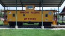
I've been contacted about removing and replacing the lettering and graphics on this UPPR caboose.
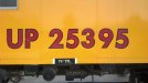
They will not be repainting it and don't want any signs of the old lettering to remain.

Does anyone know what the exact font is that was used on these?

Also if someone has a line on where I can get a flag like the one in the picture I'd be very thankful. I have lots of
flags but none with the spiked pole like this one.

Thanks in advance.
 

Attachments

  • IMG_20130619_110855_304.jpg
    IMG_20130619_110855_304.jpg
    67.7 KB · Views: 64
  • IMG_20130619_110250_120.jpg
    IMG_20130619_110250_120.jpg
    31.9 KB · Views: 62
  • IMG_20130619_110246_246.jpg
    IMG_20130619_110246_246.jpg
    27.7 KB · Views: 85
  • IMG_20130619_110241_480.jpg
    IMG_20130619_110241_480.jpg
    34.9 KB · Views: 66
  • IMG_20130619_110447_824.jpg
    IMG_20130619_110447_824.jpg
    38.3 KB · Views: 63

Kottwitz-Graphics

New Member
check out railfonts.com

I just recently had to letter a caboose based on a drawing that they had, and someone here refered me there. I got a font for my needs, and at a very minimal cost.
 

Malkin

New Member
For what it's worth, I have that exact wavy flag, but minus the pole. We painstakingly traced it out to reproduce for a very good client a few years back. You are welcome to it if you want, just email me: ted at minutemansigns dot com

That font looks like some thing Futura to me...
 

westpointsigns

New Member
Thanks everyone for the help.

The is seems to be a cross of Tw Cen Bold and Futura.

Is there a font set that has a mix of the two?
 

westpointsigns

New Member
For what it's worth, I have that exact wavy flag, but minus the pole. We painstakingly traced it out to reproduce for a very good client a few years back. You are welcome to it if you want, just email me: ted at minutemansigns dot com

That font looks like some thing Futura to me...

Ted,
Thank you very much.
 

Pat Whatley

New Member
Here's one for you....whoever lettered that one lettered it WRONG. That's not the correct font.

Pull up images for Union Pacific rail equipment and look at the letter C. Union Pacific uses a letter with slanted ends....that car has vertical ends on the C. The letter N should be pointed.

The right font, may or may not be Cityof.

To make it all more confusing it you go to the Union Pacific website they've got a pretty interesting section on the history of their logo and the style changes through the years. In 1950 the lettering on the shield was changed to Futura. APPARENTLY NOBODY INFORMED THE PEOPLE WHO LETTERED THE TRAINS BECAUSE THEY USED A DIFFERENT STYLE.

Just letter it in Brush Script and be done with it.

....and no, I didn't know any of this until a few minutes ago. Something looked off in your pics so I went looking for others and noticed it. That worm hole let me to the UP site, and that led me to the font. And I'll have forgotten all of this in an hour so it's not even knowledge. Used to be the night before a holiday would be party time....now my night consisted of 10 cames of Candy Land and ridiculous internet research.

 
Top