FactorDesign
New Member
This is the 2nd job recently where a previously printed job needed repairs after coming back from a show, and when I opened up the previously ripped job that was still in the print que (ie: zero changes to print media, print profile, or media selection) and the colors are coming out totally different.
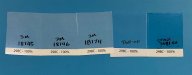
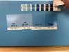
It is acting as though the cyan is printing at 25-50% density of the requested pantone color (298C in this case), and the print itself is slightly splotchy.
I've changed cyan ink cartridges thinking possibly that one had a defect causing air in the lines, but printing 100% cyan yields a nice rich color, where as the pantone colors are muted. I've also printed the colors converted to CMYK and RGB, which still appear muted, though slightly shifted in color.
So... where should I begin to check to see what the issue might be?