-
I want to thank all the members that have upgraded your accounts. I truly appreciate your support of the site monetarily. Supporting the site keeps this site up and running as a lot of work daily goes on behind the scenes. Click to Support Signs101 ...
You are using an out of date browser. It may not display this or other websites correctly.
You should upgrade or use an alternative browser.
You should upgrade or use an alternative browser.
Shop Boat Wrap....
- Thread starter Graphicdetailsinc
- Start date
Pat Whatley
New Member
The "GRAPHIC DETAILS" part flat out sucks. The logo you've got up there in your avatar would look a whole lot better.
Graphicdetailsinc
New Member
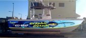
The proportions of our logo don't work very well in the layout. This is going to be in tournaments and such, and needs to be easy to read if picked up on camera.
BigfishDM
Merchant Member
You should do your logo in reflective that would look sweet! When I looked at the boat I thought it was already wrapped and it looked like you used reflective but its just a proof. I like it! But then again I love anything that has to do with fishing. What tournamnets are you doing this year? Im just getting into tournament fishing out here in Southern California
Flame
New Member
The proportions of our logo don't work very well in the layout. This is going to be in tournaments and such, and needs to be easy to read if picked up on camera.
Then you designed a poor logo. Period. If you can't use your logo for everything then you have failed at creating one.
Gotta be harsh here because what you just put up SUCKS. And you want it to create attention, right? To get people to call?
Now, IMO, you could leave the background. I've seen better but hey, it could work too! It's not really that bad, but the text is just hideous. So bland. Zero excitement. If you don't like your logo bro (hard to see it cuz it's spinning but doesn't look too shabby), come up with a new one and stick with it. But seriously, your logo is part of YOUR IDENTITY. WHO YOU ARE, WHAT YOU DO and let people know YOU ARE DA** GOOD AT WHAT YOU DO. Keep everything nicely flowing together, complimenting each other, not just random pieces of artwork with your phone number on them.
So, there's my $0.02 of the day, good luck man and keep us posted!!!!!!!!!!!!

Graphicdetailsinc
New Member

TheSnowman
New Member
That's better than the old one by a long shot.
Graphicdetailsinc
New Member
The owner used to be an off shore boat charter captain so the type of fish and what the boat is used for ect. all makes more sense to him than I. The boat wont be out marlin or sail fishing, but yellow fin tuna, cobia, and a few other things it will do. I'm going to work a bit more on this as far as the spacial relations, once you get to much past the front of the tower, the boat hull starts to roll under pretty drastic, so were trying to keep all the main elements out of there.
Thanks again for the input!
Thanks again for the input!
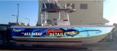
looks better. but instead of being concerned about a sail fish next to a tuna, why didnt you think about using a sailfish background rather than the tuna? makes a lot more sense when tying into your current branding.
Joe Diaz
New Member
Much better! and FYI... it's ok to change your logo color from time to time.")
I agree! maybe try this:

Graphicdetailsinc
New Member
J Hill Designs
New Member
looks MUCH better - maybe grab yellow off the fish (was thinkin behind the eye) and use it for all yellows? (I'm new to this whole design thing, so take it with a grain of sea salt)
Graphicdetailsinc
New Member
This is just a concept layout, Once we go to full scale all colors will be chosen and all values for yellows blues and such will all be purposefully picked. Thanks for the tip though...
looks MUCH better - maybe grab yellow off the fish (was thinkin behind the eye) and use it for all yellows? (I'm new to this whole design thing, so take it with a grain of sea salt)
TheSellOut
New Member
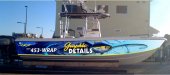
Can't believe no one has mentioned this yet but...why did you stack the logo? Why not leave how it is in your post #6? This way you could get the name much bigger!
I do think it is looking much nicer now! I also agree with ProWraps on using a sail fish, but bosses will be bosses!
I do think it is looking much nicer now! I also agree with ProWraps on using a sail fish, but bosses will be bosses!
artsnletters
New Member
Can't believe no one has mentioned this yet but...why did you stack the logo? Why not leave how it is in your post #6? This way you could get the name much bigger!
I do think it is looking much nicer now! I also agree with ProWraps on using a sail fish, but bosses will be bosses!
X2 X2 X2....make your name the dominate feature NOT the fish...
make it so you can see the thing on the water across the lake...
Tim
briankb
Premium Subscriber
Just curious how much of this graphic will be seen once the boat is in the water? I really liked the color changes and proof you made after Joe's suggestions.
Offtopic: Would you mind changing your Avatar so it's not spinning. I can't really see your logo because the rotation speed is too fast.
Offtopic: Would you mind changing your Avatar so it's not spinning. I can't really see your logo because the rotation speed is too fast.
Graphicdetailsinc
New Member
i have been meaning to change it for a while, its almost annoying to have it spin. one of those sounds like a good idea things but ended up not being one HAHA
as far as the suggestions to blow up the logo even bigger, im not trying to see it from space, i would like it to still be a balanced layout but ill try it and see what it does for the boat, and as for how much is seen, the yellow line is the waterline, so everything above that will be seen in the water.
Thanks again all!
Just curious how much of this graphic will be seen once the boat is in the water? I really liked the color changes and proof you made after Joe's suggestions.
Offtopic: Would you mind changing your Avatar so it's not spinning. I can't really see your logo because the rotation speed is too fast.
Fuzzbuster
New Member
I would also try your original style logo, much larger,
change the red to yellow and move the tuna ahead some
at 70 mph it CANT be big enough
IMHO
change the red to yellow and move the tuna ahead some
at 70 mph it CANT be big enough
IMHO
ZsVinylInc
New Member
I would suggest moving your phone number up towards the bow of the boat on the other side of the tuna and move your logo back towards the back and use the tuna as something to separate the both of them and make your logo a lot bigger.