SIGNTIME
New Member
We are looking for opinions on a few things.
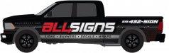
First off we are thinking about wrapping one or both of our shop trucks, to bring in some more wrap jobs. Currently both trucks are nearly identical (see photo 1). We are happy with the current layout and it has been working great for us for the last 5 years. But when trying to steer a customer towards a full or partial wrap we have no example for them to see in person, only pictures of previous jobs. Also it might be easier to sell a wrap when our trucks are wrapped.
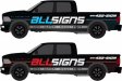
So we had a wrap design drawn up and are looking for a critique of it, anything good or bad.
We also want to hear others opinions on whether or not changing from red as our primary logo color to the blue shown here. The color change would only be for the truck(s) at this point, but who know maybe eventually change everything over if we decide to go that way. Our only real reason to change to blue is we like the way it looks in this wrap design vs the red layout. We have also considered doing 1 truck with each wrap layout.
We know branding is important but just how critical is it for a smaller local company? Must we have everything identical, or can we have one truck wrapped one lettered? One truck red and one blue? Are we hurting or confusing our brand with a color change or by dropping the "& Graphics"?
Also please feel free to critique the layouts.
First off we are thinking about wrapping one or both of our shop trucks, to bring in some more wrap jobs. Currently both trucks are nearly identical (see photo 1). We are happy with the current layout and it has been working great for us for the last 5 years. But when trying to steer a customer towards a full or partial wrap we have no example for them to see in person, only pictures of previous jobs. Also it might be easier to sell a wrap when our trucks are wrapped.
So we had a wrap design drawn up and are looking for a critique of it, anything good or bad.
We also want to hear others opinions on whether or not changing from red as our primary logo color to the blue shown here. The color change would only be for the truck(s) at this point, but who know maybe eventually change everything over if we decide to go that way. Our only real reason to change to blue is we like the way it looks in this wrap design vs the red layout. We have also considered doing 1 truck with each wrap layout.
We know branding is important but just how critical is it for a smaller local company? Must we have everything identical, or can we have one truck wrapped one lettered? One truck red and one blue? Are we hurting or confusing our brand with a color change or by dropping the "& Graphics"?
Also please feel free to critique the layouts.


") Red would be the best choice since this is your shop color. However, if it does not change the look I would try putting some white behind it and change the website to a lighter color, maybe something similar to your phone number. If possible, I would also try to arrange the spacing of your list of services so wraps is not interrupted by the door.
Red would be the best choice since this is your shop color. However, if it does not change the look I would try putting some white behind it and change the website to a lighter color, maybe something similar to your phone number. If possible, I would also try to arrange the spacing of your list of services so wraps is not interrupted by the door.