-
I want to thank all the members that have upgraded your accounts. I truly appreciate your support of the site monetarily. Supporting the site keeps this site up and running as a lot of work daily goes on behind the scenes. Click to Support Signs101 ...
You are using an out of date browser. It may not display this or other websites correctly.
You should upgrade or use an alternative browser.
You should upgrade or use an alternative browser.
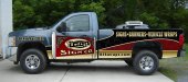
shop truck wrap, critique it!
- Thread starter kstompaint
- Start date
CanuckSigns
Active Member
I really like the graphics on the bed of the truck! i'm not convinced by the angled sign on the door, but I think you are on to a great start!
Jillbeans
New Member
Text looks stretched on bed.
I'd lose the gold on the bottom and make it just the truck color.
Maybe bring the curve of the dark/black part down lower.
I'd change the sign to make it look as if it had a bit of grass around the bottom of the post or something to make it not look just stuck there, maybe a crack like in concrete or something.
The logo on the sign along with the angle of the sign seems off. It's not a bad idea but it needs some work. The lettering on the sign looks squished, and I would make the icon part be white rather than cream, and move the stuff in from the edges just like on a real sign, it's too crowded. The flourishes just look thrown on.
Love....Jill

The lettering on the sign looks squished...
Love....Jill
Put that design on the opposite side of the truck and it is really going to look off.
John Butto
New Member
It will get attention, the colors are great and your main objective is to get people to buy your product.
GraphixUnlimited
New Member
The colors work pretty well together although i think the gold would be neat as more of an accent tone and done with "hand turned vinyl" gold or gold leaf. It has a very regal look but your brand... the thing you should be promoting most... is lost.
Rework how your logo is played up on this as it is FAR from the hero of this design. Keep up the attempts and it will come thru a bit of trial and error.
cheers eh
Rework how your logo is played up on this as it is FAR from the hero of this design. Keep up the attempts and it will come thru a bit of trial and error.
cheers eh