• I want to thank all the members that have upgraded your accounts. I truly appreciate your support of the site monetarily. Supporting the site keeps this site up and running as a lot of work daily goes on behind the scenes. Click to Support Signs101 ...

Small letter cutting issue

jeffkics

Sign Says
I am having an issue with cutting small letters on my SP540

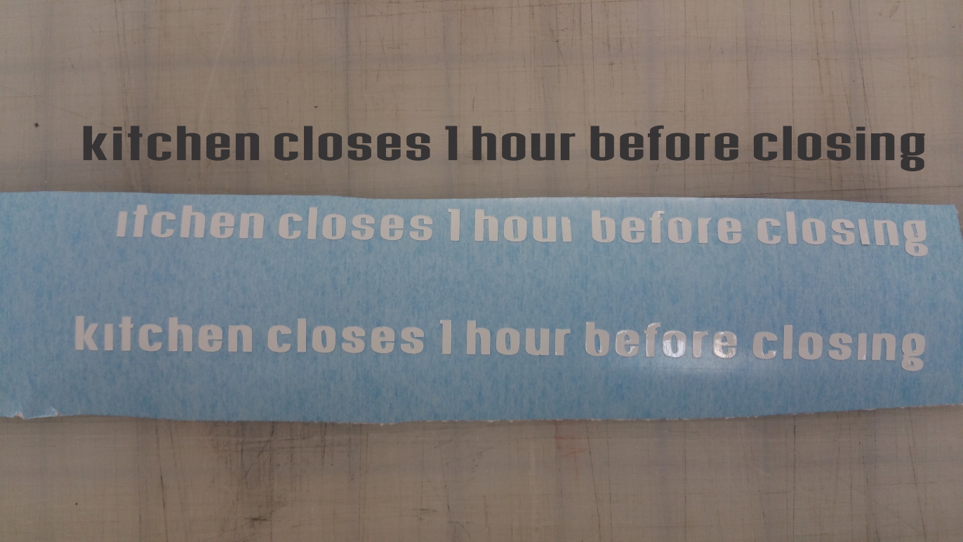
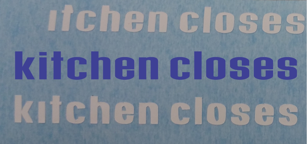
Top is the actual EPS cut lettering
top white is Versaworks
2nd is Flexi

Letter height is 1/2"
Getting 2 different results, neither match the eps.
The cut lines look good when you zoom in on them in versaworks and flexi production man, they look just like the eps.

Look at the specific letters like T, C, O, S. in the versaworks output they are straight line cuts. In flexi they are curved. Again none match actual file.

I have tried a new blade.
Cleaned the holder and applied oil.
Checked the pinch roller assemblies for any cracks.
Tried doing the cut on the left side of the machine where the cutting strip is perfect.
Slowed the cut speed and up-speed to 1 and checked the offset.

Ribbon cable was replaced maybe 4 month ago

Anything else? Thank you!


C5 Service&Repair

New Member
Change your cutting strip and check the offset value in your cut config. When you do the test cut with the circle around the square, are the corners of the square sharp and correct, or are they rounded, or look like mini 7s?
 

Solventinkjet

DIY Printer Fixing Guide
As C5 said, change the strip just to rule it out. You want to keep that looking new anyway. The offset could also be affecting it. Other than that the only time I have seen something similar was on a Graphtec and it was a broken gear on the drive mechanism that caused the issue. Take a look at the motor and other parts that have to do with driving the head and see if there is anything that looks broken or just not in the right place.
 

bob

It's better to have two hands than one glove.
It would appear from your exhibit that you're sending something other than the image in black. A font usually does not go from one weight to another because of an obstreperous plotter. Letters do not get heavier because of malfeasant cutting strips, incorrect offsets, blade holder issues, or much else. Is there a stoke, an outline, something besides the basic type face?
 

jeffkics

Sign Says
It was a font that was converted to the eps with the cut contour for versa

In flexi i used the eps file, imported then cut.

What I find interesting, for one of the better examples, the letter T, is cut perfectly coming out of flexi, but is cut with a slanted line in versa

The other letters in versa all have slanted lines, and flexi has curved ones. strange strange strange

Heres a close up (top is versa, middle is the eps, bottom is flexi)

 
Last edited:

bob

It's better to have two hands than one glove.
Ok, the sample done in Versa would appear that something might be mapping the vectors to be cut into a parallelogram rather than a rectangle. Or maybe not. Since there is a difference between Flexi and Versa I would just naturally assume a software issue. Not certain but suspicious.

Both the Flexi and the Versa samples show plain old crappy cutting which would point the finger at the plotter. There's a myriad of things that might cause this but it appears the the dubious cutting is always on curves, the square characters look about right. More perplexing is that the curves on the Flexi sample appear identical, wrong but identical. Not so much with the Versa sample. In Flexi the two s's, e's, and c's seem to be identical. Again, not so much with the Versa sample.

Along with the due diligence you've done with the blade, blade holder and cutting strip, Have you removed the tool carriage dust cover and blowing out any accumulated dust and crud paying special attention to the blade up/down mechanism. It doesn't take much contamination to interfere with the quality of the cut. Drastically.

It would be interesting to place the sample inside of a rectangle then copy the sample text to the left and right and up and down in the rectangle thus moving the location of the text relative to the plotter's origin point. Cut the rectangle with the text in each position. Do the characters change? If they do then the plotter's x/y positioning tackle might bear a look. If not, then the repeatability of the characters might make the software suspect but it's curious that the slant notwithstanding, both Flexi and Versa are doing the same sort of things. Which points back to the plotter, perhaps something to do with the machine's curve quality settings, if any, or firmware issues.

Cutting the text on another computer and/or another plotter could be telling. As it is, the results so far don't seem to point to any sort of definitive cause. When you find it it's probably going to be a forehead slapper.
 

Gino

Premium Subscriber
I doubt the down force has anything to do with it, but according to what type media you're using, could change things a little bit. Also, the speed at which you're cutting. When going small like that, we always cut back our speed. Last, it looks as if your pinchers are not doing the job. That's more noticeable when doing small things like this.
 

jeffkics

Sign Says
Just for the heck of it I increased the scale in versa (200%) and made the letters 1" high, and the cut is perfect, or at least acceptable.

Also tried putting rectangles around them and moved them into the different corners and cut, and got same results
 
Last edited:
Top