• I want to thank all the members that have upgraded your accounts. I truly appreciate your support of the site monetarily. Supporting the site keeps this site up and running as a lot of work daily goes on behind the scenes. Click to Support Signs101 ...

Some Recent Wrap Designs - Kickin' it old school; Simple & Clean

Dan Antonelli

New Member
Been very inspired by some late 80's and early 90's SignCraft articles, which had the works of some insanely talented lettering artists. These guys were big on 'supergraphics' - easy to read, bold, and minimal copy. And being all about the brand. Guess that's why historically, I've shunned photography, and probably will continue to do, except in rare instances where I think it's warranted.

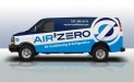
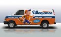
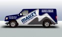
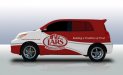
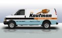
Here's a collection of some recent ones. Funny, looking through my portfolio I think out of the last 30 designs, only a handful were non-vector based. Mauzy's van had some airbrushing done in PS and drop shadow. But most are flying out of here from Illustrator.

In all these examples, we also handled the brand development.
 

Attachments

  • airzero.jpg
    airzero.jpg
    36.5 KB · Views: 112
  • allegiance.jpg
    allegiance.jpg
    37.7 KB · Views: 100
  • davebrown.jpg
    davebrown.jpg
    49.3 KB · Views: 89
  • mauzy.jpg
    mauzy.jpg
    35.9 KB · Views: 91
  • lars.jpg
    lars.jpg
    32.4 KB · Views: 104
  • dckaufman.jpg
    dckaufman.jpg
    34.4 KB · Views: 87
  • strawberryblossom1306846489.jpg
    strawberryblossom1306846489.jpg
    37.2 KB · Views: 97

Dan Antonelli

New Member
All live except Lars and Dave Brown. Air Zero is about to be live. Actually, I could use an installer in FL if anyone knows of a good one for that one. All photos are obviously PS comps though. Can never seem to get good pics from clients after they're installed!
 

WrapperX

New Member
I always take photos right there in the parking lot or garage after I'm done installing - takes away the possibility of or the trouble of getting the Customer to supply them. Now sometimes you don't get the "best looking" photos but it's better then nothing.
 

njshorts

New Member
All live except Lars and Dave Brown. Air Zero is about to be live. Actually, I could use an installer in FL if anyone knows of a good one for that one. All photos are obviously PS comps though. Can never seem to get good pics from clients after they're installed!

we're in lutz, if you're still looking. our installer will travel throughout florida and up into south georgia.
 

SignManiac

New Member
Now that's my idea of what a wrap should look like. Absolutely awesome designs Dan. Clear message, concise, bold, fantastic colors, crisp, brand identity. 100% well done!
 

Jillbeans

New Member
And that, sir, is the epitome of how an effective wrap should look.
Clean, concise, no guessing as to the message.
No frou-frou, readable from a tiny thumbnail.
Hats off to you.
Love....Jill
 

Pat Whatley

New Member
Those are horrible. I can read them, there's not diamond plate...or flames....or gradient light bands....or skulls....or chrome lettering. You apparently don't pay attention to what wraps are supposed to look like.

(that's all said with the utmost amount of available sarcasm, just in case somebody doesn't get it)
 
Last edited:

Ponto

New Member
Nice Work!!!!!!!!!!..........but the poor buggers ear got cropped....can't get over why......

JP
 

neato

New Member
Great work! Oh if only everyone stuck to good layout techniques on wraps.

I can't believe you didn't throw any diamond plate or carbon fiber in there Dan?!?!
 

signgal

New Member
I haven't been on in ages (unfortunately) but always have Signs101 as my home page and saw you posted these. Logged in immediately to admire my favorite "signguy's" work. You never disappoint and made it certainly worth while. You are a true inspiration!
 

Marlene

New Member
I can read them, there's not diamond plate...or flames....or gradient light bands....or skulls....or chrome lettering. You apparently don't pay attention to what wraps are supposed to look like.

OMG, I was about to post something almost like that! those are what wraps should look like and just don't these days.
 

ucmj22

New Member
Those look great. I am very strong in photoshop, and kind of feel like Ive been using raster as a crutch because of that, but recently I have been trying to do more vector as well, and have had a lot of success and fun doing so. this one has a raster wood overlay as per customers request, but I managed to keep ugly food pictures off of it!
 

Attachments

  • SIDE LAYOUT.jpg
    SIDE LAYOUT.jpg
    372.2 KB · Views: 93

Dan Antonelli

New Member
OMG, I was about to post something almost like that! those are what wraps should look like and just don't these days.

This is actually a good thing. Its much easier to design stuff that stands out, when so much out there is just merging into the background. I don't care how much diamond plate is thrown in, it blends. That's actually the missed opportunity most businesses don't see. And it's pretty ironic, actually. They request to stand out and usually all they succeed in is fitting in.

The general proliferation of bad wrap design is partly an indication of how many business owners have no understanding of how to build a successful brand for their business, and what's required to pull it off.

I'm knee deep in that very subject matter, as I'm about 5 chapters complete on a new book which really goes more into the ways in which you can build a better small business brand.

Big thank you for all the comments!
 
Top