-
I want to thank all the members that have upgraded your accounts. I truly appreciate your support of the site monetarily. Supporting the site keeps this site up and running as a lot of work daily goes on behind the scenes. Click to Support Signs101 ...
You are using an out of date browser. It may not display this or other websites correctly.
You should upgrade or use an alternative browser.
You should upgrade or use an alternative browser.
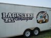
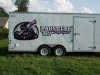
Trailer I finished up today.
- Thread starter Ursta Graphics
- Start date
SignManiac
New Member

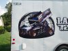
Really hate that the drop shadow on 72 faces the other direction from the LAGESTEE drop shadow. Are there two suns where you are? The car illustration is great but would be better without the background scene, it's distracting and lowers contrast, making it harder to see how excellent the car is.
OldPaint
New Member
2nd that!!!!Really hate that the drop shadow on 72 faces the other direction from the LAGESTEE drop shadow. Are there two suns where you are? The car illustration is great but would be better without the background scene, it's distracting and lowers contrast, making it harder to see how excellent the car is.
g&eprinting
New Member
Looks good to me.
Maybe when doing 2 shadows in opposite directions add more emphasis or fade for more dramatic effect of movement. Like Motorsports was flying by.
Still looks good.
Mind if I ask what fonts those are?
Maybe when doing 2 shadows in opposite directions add more emphasis or fade for more dramatic effect of movement. Like Motorsports was flying by.
Still looks good.
Mind if I ask what fonts those are?
Ursta Graphics
New Member
LHF OUTLAW and A BILLY ARGEL Font. The 72 I modified from a standard block font.
Ursta Graphics
New Member
Crap! That drop shadow is one thing I didn't pick up...lol. Didn't bother the customer at least.
Brandon708
New Member
Very cool. How did you add the beveled effect to LHF Outlaw?
Ursta Graphics
New Member
I added an overlay and edited the nodes to create the base chisel then used a black to white radial fill on all the parts while "ungrouped" to make the faded chisel look.
Craig Sjoquist
New Member
I like you made the car most important, yes everything could be better but good job.