• I want to thank all the members that have upgraded your accounts. I truly appreciate your support of the site monetarily. Supporting the site keeps this site up and running as a lot of work daily goes on behind the scenes. Click to Support Signs101 ...

Truck wrap for HVAC Company / Photoshop Comp

Dan Antonelli

New Member
We hired a photographer to shoot some Ford's and Chevy's at different angles so we could better comp up our designs. Here's one we recently finished comping up. I think it looks pretty realistic, and helps the clients visualize the job much better. It also helps us for our portfolio since we often won't get back photos as tight as the comp.

Spending this extra time really helps the sales process, and really helps make your own work look more professional on your own site.
 

Attachments

  • hvac-truck-wrap-samples.jpg
    hvac-truck-wrap-samples.jpg
    86.3 KB · Views: 208

rjssigns

Active Member
Nice work and good use of Photoshops power.:thumb:

Reminds me of college. Everyone did a prototype package and had to use the 3D and mesh tools to "wrap" the graphics onto our containers.
Man that seems like forever ago. Would have to reboot the brain to do it again.LOL
 

Dan Antonelli

New Member
I like it, looks like the job was already finished.

Hi -

Thanks for the feedback. A little background - Blanton's is a larger HVAC firm that has been around for over 60 years in the community - so they have extremely good name recognition. Their brand colors have always been purple and light grey, so this approach might not be totally appropriate for a brand new company. But I do think an important part of branding is color schemes, and character based brands to tend to have characteristics which typically make them more memorable. The combination here I think serves them well - and reinforces their longevity in the market. I think this has good distance legibility as well, which helps tie mascot to main copy.

We've done retro for brand new companies - so it's nice in this instance that the new brand is retro - and the company actually is from the 50s.
 

Craig Sjoquist

New Member
Outstanding ok beyond outstanding.

Dan I do hope in your 3rd book you be writing about wraps & design & what really does bring in customers.

As you know most wraps are just a bunch of mush mash color & is insulting to the trade
Like here is Orlando very few shops get it even close to your professional approach to wraps.

One of the reasons that keeps me wanting to learn design help by PC.
 

Dan Antonelli

New Member
Here's another I just finished. For some reason this one doesn't look as realistic. Maybe it needs more reflections or something. I know the corner wrap isn't perfect.

I honestly don't know how to do those mesh or warps. I kind of jury-rigged it using 'spherize' which prolly is the wrong way!

Good point on the tire tracks leading up to it haha....
 

Attachments

  • iChat Image(1745641382)-1.jpg
    iChat Image(1745641382)-1.jpg
    77.8 KB · Views: 84

Gino

Premium Subscriber
The problem with your back door is you're not using any perspective. As things get farther away, they get smaller. You only rotated and did not distort for things moving away from the main focal point which is the back corner. The easiest place to see this is with the two phone numbers. They don't align themselves to both parallels. This happens with everything in both real life and drawing and/or computer graphics.
 

Dan Antonelli

New Member
The problem with your back door is you're not using any perspective. As things get farther away, they get smaller. You only rotated and did not distort for things moving away from the main focal point which is the back corner. The easiest place to see this is with the two phone numbers. They don't align themselves to both parallels. This happens with everything in both real life and drawing and/or computer graphics.

Thanks Gino!

I thought I did, but maybe not as much as I should. The way I do it is side and rear are two different images. Drop it in, than grab the corners and skew until the lines roughly match the body line to give me horizontal perspective. I probably should have done more though. I know it's off because on the real job, the black circle should be dead center.
 

Gino

Premium Subscriber
It's not easy getting it to look realistic and yet legible at the same time. Take for instance the orange band going through that very same black circle. According to your Photoshopped deal, the end closest to us is about an inch or two away from the tail light, where on the other side, using the same techniques to get one's bearings, you're probalby 3, 4 or more inches away from the same lens. However, if you made it realistically complete, you'd never be able to read the other side. Taking poetic license like this is fine in my opinion, but if this was a fine arts test..... you'd have a low end 'C' or high 'D'. :Big Laugh

Like you said.... it's a marketing trick. The average eye which isn't trained will never pick these things up. They'll say.... something looks off, but I don't know what and move onto other things.


Take for instance John's outlook..... all he's noticed is that the fresh as a daisy truck, looks like it's in a trash dump. So, I don't know which is worse..... drawing 101 mishaps or putting a truck in the middle of a dump. :rolleyes:


All-in-all, it's still a great presentation. You got that part down. My only wish is... I wish I could talk customers in my area into letting us do this kind of jobs and not always nickle and diming us to death on vehicles.

Believe it or not, we used to do 7 to 9 trucks almost weekly, but with all the backyard hacks, we're down to an average of 5 a week and no one wants to spend a lot.​
 

Dan Antonelli

New Member
It's not easy getting it to look realistic and yet legible at the same time. Take for instance the orange band going through that very same black circle. According to your Photoshopped deal, the end closest to us is about an inch or two away from the tail light, where on the other side, using the same techniques to get one's bearings, you're probalby 3, 4 or more inches away from the same lens. However, if you made it realistically complete, you'd never be able to read the other side. Taking poetic license like this is fine in my opinion, but if this was a fine arts test..... you'd have a low end 'C' or high 'D'. :Big Laugh

Like you said.... it's a marketing trick. The average eye which isn't trained will never pick these things up. They'll say.... something looks off, but I don't know what and move onto other things.


Take for instance John's outlook..... all he's noticed is that the fresh as a daisy truck, looks like it's in a trash dump. So, I don't know which is worse..... drawing 101 mishaps or putting a truck in the middle of a dump. :rolleyes:


All-in-all, it's still a great presentation. You got that part down. My only wish is... I wish I could talk customers in my area into letting us do this kind of jobs and not always nickle and diming us to death on vehicles.

Believe it or not, we used to do 7 to 9 trucks almost weekly, but with all the backyard hacks, we're down to an average of 5 a week and no one wants to spend a lot.​


Damn - only a C or D+ lol. Back to school for me!

Soon enough I think the backlash from poor wrap design will benefit those doing good design work. We're definitely seeing that, and honestly, it's become a bit easier to sell with the more poorly designed work that gets put out there. People are seeing poor ROI on those designs, and getting a better understanding of what they should have done instead.

I've said before, it almost reminds me of how the industry went when the Gerber IVBs came out. Wildly popular at first, then a big anti-vinyl lettering backlash after every sign started looking the same.
 

Dan Antonelli

New Member
Amazing... as usual! Like the suggestion of your next book being about wraps.

-Margaret

There's a whole chapter on it. We are finally in InDesign with the layout stage, as it's all written thank god. Hoping its done in the next 3 months. The design and layout of it is really coming out amazing - very stoked.
 

Gino

Premium Subscriber
Damn - only a C or D+ lol. Back to school for me!

Soon enough I think the backlash from poor wrap design will benefit those doing good design work. We're definitely seeing that, and honestly, it's become a bit easier to sell with the more poorly designed work that gets put out there. People are seeing poor ROI on those designs, and getting a better understanding of what they should have done instead.

I've said before, it almost reminds me of how the industry went when the Gerber IVBs came out. Wildly popular at first, then a big anti-vinyl lettering backlash after every sign started looking the same.


Don't worry about the low grade, I always marked hard and saved a curve scale for the end of the semester. :rolleyes:


I'm not sure your comparison is quite on. I know this isn't the right thread, but it's as good a place as any to begin.

Back when we were doing lots more trucks, you're correct, not as many hacks were around and there were only maybe 8 or 10 shops in the whole county you could go to for your work. No internet, no computers, you had a practically built in clientele list.... if you were good. Remember, I came from an era when we customized vans and did lotsa murals and very little lettering. We did commercial work and lettering of signs, but that van craze did wonders for our pocketbooks.

Today, regardless of computers or not, most people in our area can't afford the market prices no matter how good of a design you have. Sure, there are some, but they'll take their designs to a guy who will do the whole thing for like $1,500 to $2,000. Remember, you have clients seeking your designs and expertise out for wraps and mostly wraps only... along with websites and other marketing needs. We only have people wanting to letter their trucks and can get it lettered by Bobby the Iraqi sign guy who doesn't speak English, but will letter your two doors for $50.

It's not an easy task to get a good price for an ordinary lettering job, let alone a partial or full wrap. I did presentations like your for years and although the customer always liked it and wowed over it.... it still came down to the mighty buck and what mindset this area has.

Here's one..... a guy came in yesterday to pick up his truck. He was looking at some signs which just came out of the printer [flatbed]. He said, that is really cool. How do you get those letters to be raised up so high off the board and almost look flat when you look sideways at the boards. I slid my hand over it and said it really was 2D and he didn't believe me until he ran his hand over it. He looked at me and said..... how do you do THAT ??

Anyway, I explained things to him and told him it's all done in the software and he said he wanted to come back and get some signs like these. He asked how much and when I told him, he says... well, guess I'm gonna stick with the ones I already have.

Right now we're in the middle of printing quite a few signs for a local trade show and we're doing 8 or 9 companies. We're still getting artwork today and the show starts Friday morning. Another company wants an 8' x 32' sign done for tomorrow to install Saturday.

The reason I mention this is.... we're getting a good buck for all of this stuff and actually making a killing on it, but the trucks for some stoopid reason..... no one wants to part with that kinda money.

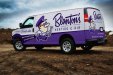
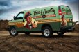
That's why a while back, I posted up some ideas for our own trucks. Got feedback I didn't agree with, but still wanted to consider and I'm not sure I agree with the many posters, yet, but we want to do it up right, so we can sell more wraps in the area. Our old truck was a partial wrap, but now we have two nice canvases and we wanna do it up right.

Anyway, I trust you realize I was just bustin' your balls on the grade. That was fine arts and this place is all about making a living while you're alive, not after you're dead..... like fine artists.

:thumb:
 
Last edited:
Top