• I want to thank all the members that have upgraded your accounts. I truly appreciate your support of the site monetarily. Supporting the site keeps this site up and running as a lot of work daily goes on behind the scenes. Click to Support Signs101 ...

Vehicle Wrap - Looking for Feedback Critique

SotaSigns

New Member
Hey everyone!

This is my first go at a truck wrap design. My gut says it's very busy and needs more negative space, not sure where to start because the client needs the copy!

Let me know what you think, I am new to the forum would love to get some advice.
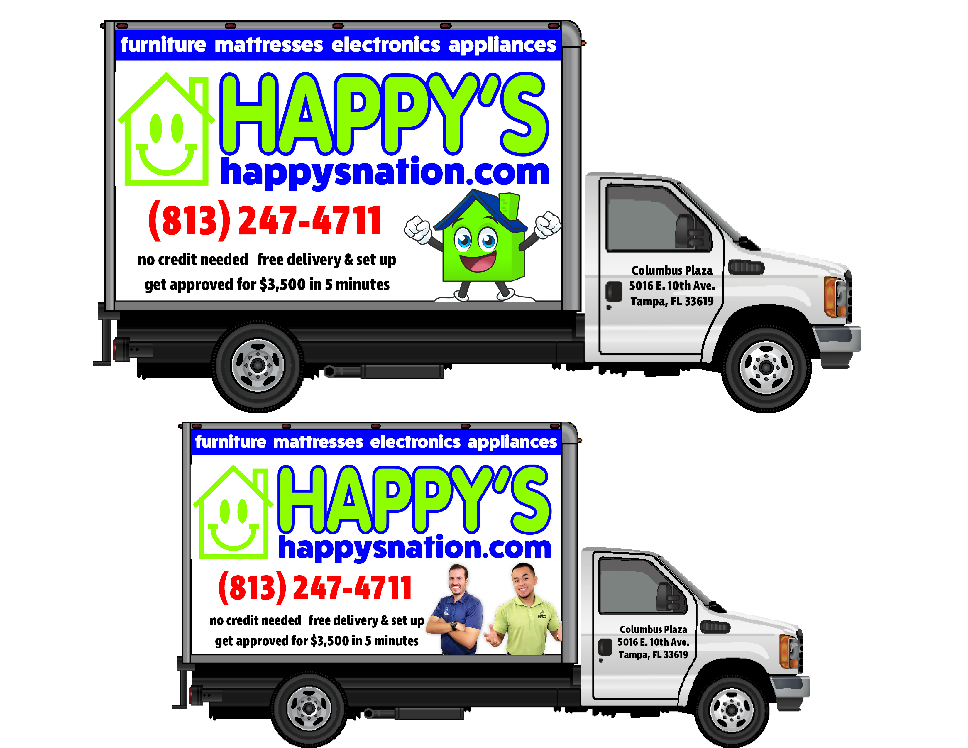
Truck Mocks.png
 

Attachments

  • Truck Mocks.pdf
    735.3 KB · Views: 523

TimToad

Active Member
All the weights on your font choices are too similar. The colors are a bit vivid and are competing with each other. The top panel should be down at the bottom to create a solid foundation for everything else to rest upon. The superfluous copy about credit, delivery, credit limit need to be knocked WAY down if not eliminated. What if they change their policies or credit limit next year?
 

Gino

Premium Subscriber
Nah, keep the blue band at the top, otherwise it becomes bottom-heavy. Ruins the flow.

Try reducing everything by about 15%, thus bringing all the edges in and creating some negative/white space along the sides. Maybe have one line besides the blue band go out to the edge, to create a better eye flow.
 

Craig Sjoquist

New Member
Quickly grab the book Mike Stevens Mastering layouts. sort in 3 areas main copy, secondary copy & minor copy. When new to this business it is very common without the proper education to come up with this & it is a disservice to your customer no matter how successful they have become, just because you have the equipment & know how to use does not mean you are qualified to be a designer
 

letterman7

New Member
Get rid of the graphic images at the bottom right corners, move your black text to the bottom and put it on one line with a bullet between the 'no credit' and 'free delivery' (convince your client they don't need the "get approved" copy - contradicts the "no credit" part). Move the phone number down and the logo away from the blue band - spread it out a bit. Tighten up the copy and reduce size on the truck doors - that's secondary and not that important.
 

#racewraps

@printwithspeed
Hey everyone!

This is my first go at a truck wrap design. My gut says it's very busy and needs more negative space, not sure where to start because the client needs the copy!

Let me know what you think, I am new to the forum would love to get some advice.

View attachment 137681

Assuming this is intended to be a fully printed wrap and not just print cut, correct? Besides some of the advice mentioned above make sure the clients color expectations are not for this. Beside it being a hideous color combination hitting colors that bright as a combo will be likely near possible unless you have a printer that runs fluorescent inks or you are using cut vinyl.

Create a color proof on the actual material it will be wrapped in to make sure you and the client are on the same page, to start.

I'd agree with moving some things around to create more whitespace. Contrast is also a key element that needs to be considered here.

The simplified version Kerning posted is a much cleaner, more legible design but you'll still have the color thing to sort out however you decide to do that!

Anyhow, good luck, take the advice presented and create another layout for them.
 

Texas_Signmaker

Very Active Signmaker
Assuming this is intended to be a fully printed wrap and not just print cut, correct? Besides some of the advice mentioned above make sure the clients color expectations are not for this. Beside it being a hideous color combination hitting colors that bright as a combo will be likely near possible unless you have a printer that runs fluorescent inks or you are using cut vinyl.

Create a color proof on the actual material it will be wrapped in to make sure you and the client are on the same page, to start.

I'd agree with moving some things around to create more whitespace. Contrast is also a key element that needs to be considered here.

The simplified version Kerning posted is a much cleaner, more legible design but you'll still have the color thing to sort out however you decide to do that!

Anyhow, good luck, take the advice presented and create another layout for them.

100% right on the colors on printed. Only way to get them that bright would be "Brilliant Blue" cut vinyl and some bright green. Printed would be much more muted. The green would be a lot darker.
 

Gino

Premium Subscriber
I do know that most of these furniture companies believe 110% in the fluorescent colors. We've done literally 1,000s and 1,000s of these things and they either want the crazy green, chartreuse or red/pink with lotsa black. Good luck talking them outta those colors. They also, never listen to layout or design rules.... as they always feel bigger is better. Hit the customer, right between the eyes.
 

Marlene

New Member
It looks super cheap and shifty, just like their webpage so I say go for it as is, there's not much you can do to make it any better.
 

2B

Active Member
of the versions shown, Kerning has the most appealing/easiest to read.

They need to re-think their color scheme
 

equippaint

Active Member
I do know that most of these furniture companies believe 110% in the fluorescent colors. We've done literally 1,000s and 1,000s of these things and they either want the crazy green, chartreuse or red/pink with lotsa black. Good luck talking them outta those colors. They also, never listen to layout or design rules.... as they always feel bigger is better. Hit the customer, right between the eyes.
Furniture sales is a dirty business akin to buy here pay here car sales. I like the cleaner layout from kerning but I think that tacky is part of their strategy. They cant appear like a Havertys or their target market wont look at them. Judging by the layouts Id say they are a step up from a rent a center? If they're not, then this should be revisited.
On another note, am I the only one fixated on the GMC wheels on the back of the Ford chassis?
 

Solventinkjet

DIY Printer Fixing Guide
One thing no one is mentioning is that most of the colors in the file are outside the CMYK gamut and will look much more washed out than they appear on your screen. You should get in the habit of designing print jobs in CMYK mode rather than RGB. The discussion you are going to have with the customer when it doesn't print nearly as bright as this image is not a fun one to have after you have already printed it. Take a look at Myront's post above with his alterations. The reason his colors look relatively washed out is because he worked in the CMYK color space which converted the RGB colors in the original file to a color within the CMYK color space.
 

equippaint

Active Member
One thing no one is mentioning is that most of the colors in the file are outside the CMYK gamut and will look much more washed out than they appear on your screen. You should get in the habit of designing print jobs in CMYK mode rather than RGB. The discussion you are going to have with the customer when it doesn't print nearly as bright as this image is not a fun one to have after you have already printed it. Take a look at Myront's post above with his alterations. The reason his colors look relatively washed out is because he worked in the CMYK color space which converted the RGB colors in the original file to a color within the CMYK color space.
can-of-worms1.jpg
 
VanderJ, that is not correct as to the designing in CMYK. You will have a larger printable gamut when designing in RGB. When you design in CMYK, you are losing colors that our printers will reach. Design in RGB and allow the rip to bring in the colors to what is obtainable. I understand why logically people think that, but with a correctly profiled machine and a decent rip, you will obtain much a much greater printable color palette in RGB
 
Top