-
I want to thank all the members that have upgraded your accounts. I truly appreciate your support of the site monetarily. Supporting the site keeps this site up and running as a lot of work daily goes on behind the scenes. Click to Support Signs101 ...
You are using an out of date browser. It may not display this or other websites correctly.
You should upgrade or use an alternative browser.
You should upgrade or use an alternative browser.
What do you think?
- Thread starter Flubber
- Start date
Circleville Signs
New Member
ouch.
Flubber
New Member
ouch.
Whats wrong with it. My clients are club promoters as well as some dj's for electronic music. It goes well with the industry that i work with.
ucmj22
New Member
Whats wrong with it. My clients are club promoters as well as some dj's for electronic music. It goes well with the industry that i work with.
This is a good place for this logo. I would still have a black and white available for screen printing, and promotional items.
HaroldDesign
New Member
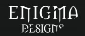
That "strike-through" and clipping of the right hand side seems to be reaching far too hard.
Flubber
New Member
That "strike-through" and clipping of the right hand side seems to be reaching far too hard.
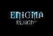
That was the only thing that worried me. should i just do another single line like the one towards the middle?
HaroldDesign
New Member
I think you're looking to give it some individual style, and a strike-through is not going to achieve it, because the font is not simple and fat enough to support it.That was the only thing that worried me. should i just do another single line like the one towards the middle?
Flubber
New Member
I think you're looking to give it some individual style, and a strike-through is not going to achieve it, because the font is not simple and fat enough to support it.
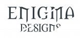
Better?
Attachments
HaroldDesign
New Member
loose the effects while designing until it can stand on it's own without them. "Designs" is descriptive, so make it a different simple font to get some contrast going. Let Enigma be THE name with sub-copy. And get rid of the idea that having something run through it is a positive point of interest. It's interesting because it looks wrong.
1/2-4CR3
New Member
Enigma - a German-built enciphering machine developed for commercial use in the early 1920s and later adapted and appropriated by German and other Axis powers for military use through World War II.
Design - to plan and fashion artistically or skillfully.
Enigma Designs = Communist Artistry
Design - to plan and fashion artistically or skillfully.
Enigma Designs = Communist Artistry
Flubber
New Member
loose the effects while designing until it can stand on it's own without them. "Designs" is descriptive, so make it a different simple font to get some contrast going. Let Enigma be THE name with sub-copy. And get rid of the idea that having something run through it is a positive point of interest. It's interesting because it looks wrong.
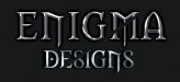
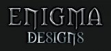
not sure about this font but ill give it a shot.
Attachments
J Hill Designs
New Member
he said simple font
HaroldDesign
New Member
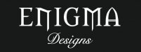
On the right track, but don't have two stylized fonts, or at least not SO much for the "Designs". Not sure any script font is the answer.not sure about this font but ill give it a shot.
Flubber
New Member
On the right track, but don't have two stylized fonts, or at least not SO much for the "Designs". Not sure any script font is the answer.
any ideas on a good simple font but not one that you see everyday?
Fatboy
New Member
I like thisnot sure about this font but ill give it a shot.