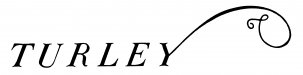
Thanks in advance for the help. So this is a logo that I thought was meant to an antiqued, slightly distressed font, but the client can't provide me with any cleaner image and thinks it should be smooth. The font identifiers keep thinking its a distressed font because of the image we were given. I've got to believe the swash on the Y is added on.
-
I want to thank all the members that have upgraded your accounts. I truly appreciate your support of the site monetarily. Supporting the site keeps this site up and running as a lot of work daily goes on behind the scenes. Click to Support Signs101 ...
You are using an out of date browser. It may not display this or other websites correctly.
You should upgrade or use an alternative browser.
You should upgrade or use an alternative browser.
WTF? A little bit of a challenge
- Thread starter TimToad
- Start date
SignosaurusRex
Active Member
Looks like a very poorly hand-rendered Bodoni Twelve Italic
Pippin Decals
New Member
Use Old Standard TT (Italic) and tweak the little curves that are needed on certain letters and you have it .really easy to do. The Curly on the Y is custom made.
I found Centennial Light Italic fairly close. No concave in the serifs though... and the E is slightly off... as well as the T... I hope you're able to match the font you're looking for!
Thanks all, I looked at all of those and it just feels like the concave curves in the baselines are intentional and the fonts suggested don't have them. I knew it would be a tough one.
Gino
Premium Subscriber
It looks like something which was hand done to begin with and after generations of xerox copies over the years, it's been distorted. None of the serifs match whatsoever and that is due to inconsistent calligraphy applications. The swoosh is terrible and should be re-drawn to get the correct perspective.
I agree, but suspect what actually happened was someone in the marketing department did an AutoTrace of the logo without zeroing in on the best settings to get it really accurate. One of us is heading out there right now to try and find any other printed examples at the vineyard or tasting room.I would say its hand done (and not by a journeyman sign painter), the serifs are not consistent and of course how bad some of the other curves and strokes are drawn/painted....
Ultimately this is going to be cut from 1/4" polished stainless steel about 30"x72" for the new monument sign we're producing for them, so it would be nice to not have it be wrong.