• I want to thank all the members that have upgraded your accounts. I truly appreciate your support of the site monetarily. Supporting the site keeps this site up and running as a lot of work daily goes on behind the scenes. Click to Support Signs101 ...

Need Help XR-640 unexpected colour issues

Recently we have upgraded from a RS640 (4-colour CMYK setup) to a second-hand XR640 (CMYKcmk). The new machine has been looked over & serviced by our local Roland technician, and everything checks out fine. Heads in good condition, machine all functioning as it should from their point of view.

However, I am seriously struggling to get even close to replicating the colours that would come off the RS640. Generally speaking, the RS was pretty good at being in the ballpark at printing what you see on screen. I realise this is RBG, printing in CMYK, which is well and good when you are printing vector art and can isolate spot colours, but in instances where I am printing a flat image, the results on the XR640 are way off where I would expect.

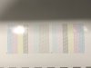
Attached is a good example of this, to where the printed results are miles off what I expected they would be looking at the flat image on the screen. You can see it is not even close. Greys also seem to be very blue if they are rbg greys. The only way to get a neutral grey is pure K. This is fine with vector artwork, but if I was printing a photograph with less control this becomes an issue.

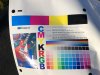
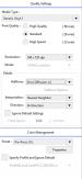
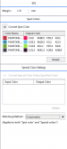
Since I still have the RS640 in operation, I printed these comparisons at the same time, same climate, same material etc. Only run genuine Roland inks on both machines (XR on MAX2 and in a 7-colour set though). Roland Versaworks 6 as the RIP. Both printed using Generic profiles. Have tried different colour management presets with no joy. Downloaded some aftermarket ICC profiles but haven't found anything that will remedy my problems.


At this point, I am keen to hear advice from anyone who may have ideas on how I can get my XR640 any closer to what I can print from the RS640. As you can imagine I have 1000's of files that have been set up for my old machine, so preferably it would be nice to have both machines in the same ballpark and not have massive differences. I don't care how they exactly stack up side by side, I just want to be able to print a photo and not have the colours be miles off to where even someone without a keen eye can tell something is not right.

I understand going from 4-colour to 7-colour there are going to be differences, but I did not expect to have this much headache. If this looks normal and I just need to deal with it, I guess I will have to do so. Hoping there are some handy tips out there somewhere on this board.

Many thanks in advance,
Mitch
 

Attachments

  • colour-comparison.jpg
    colour-comparison.jpg
    509.7 KB · Views: 837
Last edited:

C5 Service&Repair

New Member
Can you post the test prints?
Obviously, the main 'out' is to profile the XR machine. The biggest challenge is that the RS has 2 channels of yellow, and the XR has only 1.
Can I ask why you want one machine on dual CMYK and another on 7 color? You'll spend just as much if not more re-profiling the XR than you would to just convert the XR to dual CMYK as well. And it will print faster.
Hi, thank you for your response.

1. 2 x test prints attatched
2. What is involved in 'profiling' the XR? I am based in Auckland, NZ, so finding help down here may be tough if this requires an expert. If someone like yourself can offer help remotely I am more than happy to look at paying to do so.
3. I anticipated running the XR as its typical config of CMYKcmk. The XR was supposed to be an upgrade replacement however so far the colours of the XR are way off where I thought they would be. They do not need to match each other per se, I hoped the XR would be able to print somewhat close to what I would expect to see from a file I have printed from the RS being that they are both Roland machines on Roland inks etc. Would running CMYKCMYK essentially replicate the same colours my RS would print, or not necessarily?
 

Attachments

  • IMG_9065.jpeg
    IMG_9065.jpeg
    1.4 MB · Views: 693
  • IMG_9066.jpeg
    IMG_9066.jpeg
    1.5 MB · Views: 673

GTSTech_1

New Member
Your artwork should always be in RGB colorspace, if the artwork is CMYK change it to RGB and see if that solves. Looking at your nozzle check, you have 2x Lk on head A (should only have 1 channel of Lk), and no Lk on head B which could be the real culprit to your problem.

Just my .02
 

Joe House

New Member
Looking at your nozzle check, you have 2x Lk on head A (should only have 1 channel of Lk), and no Lk on head B which could be the real culprit to your problem.
Actually the nozzle test is correct. The missing channels on head B would be for white or metallic silver. He likely has a cleaning cartridge in the 8th slot.
Can you post a screenshot of your quality tab in versaworks? What color management setting are you using? What profile?
 
Hi guys, thanks so much for your input. Really appreciate anything anyone has to say at this point!

Regarding the nozzle test, the Roland tech had no issue with this when he serviced the machine and came across as this being standard for this machine. I forget the explanation, but he did tell me why Lk was back to back. Cleaning cartridge in 8th slot.

I typically do work in RYB colour space, and the example posted in the initial post was an identical file to show the vast difference in output.

Joe - Some screenshots from Versa attached. Have tried various colour management profiles which make slight differences but nothing that corrects the large gap in colour output from the RS. Profile wise, mostly have been running Generic Vinyl 1, but have also downloaded several Avery & Arlon profiles with no joy. If anything they lay more ink, but don't correct the colour output.
 

Attachments

  • Screen Shot 2019-06-04 at 8.29.46 AM.png
    Screen Shot 2019-06-04 at 8.29.46 AM.png
    61.9 KB · Views: 557
  • Screen Shot 2019-06-04 at 8.29.54 AM.png
    Screen Shot 2019-06-04 at 8.29.54 AM.png
    50.2 KB · Views: 572
Last edited:

GTSTech_1

New Member
Sorry about the misinformation in my earlier post. 9 out of 10 installs customer has went with dual cmyk. I'm used to seeing mirrored nozzle checks.

About the only color setting I would change is from US Pre-Press to Sign&Display, unless your using Pre-Press for the RS printer (No need to add another variable). I also stay away from he Generic Profiles, but again if that's what you have been using, no need to re-invent the wheel.

When comparing the Pantone colors between the XR vs the RS do they have the same Delta Value?

Just my .02
 
Last edited:
No worries. I have tried Sign & Display. This adds some density but the colours themselves are still miles off what I see on screen/would expect. On the RS I have always run an Avery profile, but I am yet to find anything with the XR that works well. If you can point to me any good profiles to try I will give anything a go.

Thanks!
 
It almost seems like Versaworks is correctly converting an RGB colourspace during the RIP. Any greys that are not pure K come out extremely blue. And if I try to print an RBG teal, it comes out as a pastel cyan (see example in first post attachment.

Just thinking if there are any settings I am unaware of that could help with how the printer &or RIP interprets the RBG -> CMYK conversion.

Can anyone suggest a free/cheap & easy way I can print a test outside of Versaworks to see if I get the same results?

Any other ideas? Appreciate the input so far.

Cheers
 

Joe House

New Member
Are you using Roland Inks? The test print from Versworks looks off as well. I've found that profiles for Roland materials generally work pretty well as a "generic" substitute. Try PCV4 or GCVP for glossy films or MCVP for matte films.
The other things I would try is upgrading firmware if available and updating Versaworks to the latest version. Then, after making a note of the IP addresses for your printers and quality settings for your queues, close Versaworks and go to the start menu>Roland Versaworks>Initialize Application. This will reset the defaults for your software, but will save any profiles you've downloaded.
You'll have to enter the IP addresses for your printers when you re-open VW, but you'll have a clean slate.

Good Luck
 

Vohaul

New Member
for colour matching, have you tried using roland colours?...with vector art, anyway, if you use roland colours / pantone colours in your art....
the roland picks these up as "special" colours" and you can adjust the indivdual values within versaworks.....

you can get much more vibrant rich colours than either rgb or cmyk....and you can match anything....

other than that, with my xr-640, i sometimes use max impact, or play with the prepress settings if im really not happy with it....
 

Joe House

New Member
Another thought (since this popped up again)... You might try upgrading to VersaWorks 6 (and make sure that you load the latest update and using the True Rich Color setting. This is new to Versaworks 6 and, in my mind anyway, kind of combines the color accuracy of the Pre Press settings with the vibrancy of the Max Impact or Sign and Display settings.

Good Luck
 

Adis

New Member
Hello,

Sorry to bring this back up, but did you ever figure out what was causing the colors to be off? I am running into a similar issue after updating VersaWorks. We experienced some issues with our XR-640 printer that resulted in both heads being replaced and after the work was completed the colors seem to be slightly off. I have used the same profiles and settings as in the previous version of VersaWorks but my inks seem slightly less vibrant. I usually print the same profiles and settings over and over again, but I haven't been able to figure out why my colors appear a couple shades lighter compared to some of my previous prints. The codes match all the way across and I am using the same Pantone chips that I always used. Long story short my currant prints do not match my original color chips that were printed a couple of years ago on the same printer, ink, and media. all the nozzles are firing correctly and there is no banding or image distortion on any of the prints.
 
Top