HaroldDesign
New Member
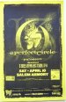
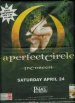
New things in the works. Here's some old stuff fa 'ya bathzzz...Dig this bro! Though the secondary, tertiary info feels like a complete after thought.
Yinz got a demo/ep available for us common folk?
http://www.alinebetween.com


")