• I want to thank all the members that have upgraded your accounts. I truly appreciate your support of the site monetarily. Supporting the site keeps this site up and running as a lot of work daily goes on behind the scenes. Click to Support Signs101 ...

Banner

Marco

New Member
Letterhead Fonts

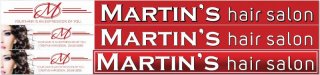
HELP. I rather use a letterhead font. I must say everyone in this community (Cleveland, OH) knows Martin by first name, recently moved from Orlando, FL. His clients say they stopped in after seeing his name on the small 24"x24" temp window sign. So, for this reason the name must be in bold letter form.
 

Attachments

  • Front Banners.jpg
    Front Banners.jpg
    42.5 KB · Views: 89

Jillbeans

New Member
That is worse than your initial attempt.
Why must it be a Letterhead font?
Why can't it be a Signfonts or Sign DNA font?
Try Desire from Chuck Borges, there are a lot of ligatures and things.
Your last attempt was a lot better than this one, except for the blue and the small tagline.
 

Malkin

New Member
In post #13, I would change the blue to black, in addition to changing the name to something more legible and bold with only a hint at style, maybe LHF Kona BOld, or A&S Truckin Thick & Thin.

Is this just all printed, or are you cutting/applying vinyl?
 

Marco

New Member
TY.

That is worse than your initial attempt.
Why must it be a Letterhead font?
Why can't it be a Signfonts or Sign DNA font?
Try Desire from Chuck Borges, there are a lot of ligatures and things.
Your last attempt was a lot better than this one, except for the blue and the small tagline.

Thank you Gill.
Didnt know other two sites existed. TY. Looked up Desire by Mr. Borges, didnt find it.
 

Marco

New Member
Ty.

In post #13, I would change the blue to black, in addition to changing the name to something more legible and bold with only a hint at style, maybe LHF Kona BOld, or A&S Truckin Thick & Thin.

Is this just all printed, or are you cutting/applying vinyl?

Ty Melkin. Its going to be printed.
 

Marco

New Member
TY.

This is what you need, something like this example. Big, Bold 'MARTIN'S SALON' and that's it. Obviously don't just slap those words on a white backround but I think you should lose the clipart, pictures and tiny text that you would have to put your nose up to in order to read.

Do you have a distance/text height legibility chart? If the banner is only 18" high all that small text is a waste of ink/vinyl.

Ty. Will lose clipart and small text. The sign must display Martin's Hair Salon.
 

Billct2

Active Member
What is the permanent sign going to be? Unless it's a dimensional or illuminated sign why not just go right to acm instead of banner. Unles he's got something really special in mind I have a feeling that banner will end up more permanent than temporary.
 

bob

It's better to have two hands than one glove.
Banner for print.

It's OK but bring the 's' in "Martin's" over so it's leader joints the 'n's trailer. Then move the apostrophe so it's equidistant between them.
 

Marco

New Member
Thank you.

I stared at it, but couldn' t see it til now. Ty. I will make correction prior to print.
 
Last edited:

Billct2

Active Member
Is it a barber shop or hair salon? Your previous design led me to believe it was a beauty parlor.
If it's unisex maybe a mans profile on one side, womans on other.
 

Marco

New Member
Reply

Is it a barber shop or hair salon? Your previous design led me to believe it was a beauty parlor.
If it's unisex maybe a mans profile on one side, womans on other.

The overall height of the sign (18") and visibility from a distance will make the two heads look like dots; tried it, but didnt like it see post #1.
 

Marco

New Member
Printing this one.

Thanks all:thankyou:
This one is gone to print.
 

Attachments

  • Front Banner 2 7 14 s101.jpg
    Front Banner 2 7 14 s101.jpg
    15.7 KB · Views: 83
Top