-
I want to thank all the members that have upgraded your accounts. I truly appreciate your support of the site monetarily. Supporting the site keeps this site up and running as a lot of work daily goes on behind the scenes. Click to Support Signs101 ...
You are using an out of date browser. It may not display this or other websites correctly.
You should upgrade or use an alternative browser.
You should upgrade or use an alternative browser.
Critique if you must
- Thread starter Steve C.
- Start date
rjpjr
New Member
Another alternative idea... Maybe convert the type faces the client requested into a neon look..."He did ask for these fonts specifically"..."but with out the typical diner fonts"..."Feel free to offer more critique, opinion and suggestions."
Attachments
SignManiac
New Member
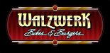
I prefer the bottom left too.
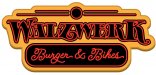
He likes the top right. Funny, to me, that is the one with the least attitude of
all. I thought the bright color red and gold on black bkg helped create
attitude. Oh well, you never know.
Gino I'm going to try your suggestion, but I can only work on this in the
evening. So... later. Client does want me to try one other option.
Thanks all for you input.
all. I thought the bright color red and gold on black bkg helped create
attitude. Oh well, you never know.
Gino I'm going to try your suggestion, but I can only work on this in the
evening. So... later. Client does want me to try one other option.
Thanks all for you input.
Marlene
New Member
I think he picked the one that looks the best, top right. it has a lot of style but it keeps the focus on the name & tagline. the red dot top and bottom really makes you look at the center/middle of the design. the ones with the brighter color at either side kind of pulled attention out and away from the the copy, even if it did look really nice. nice job
SignosaurusRex
Active Member
I definitely like this one better than the bottom left of the others. The alt s on 'Bikes' bothers me...pushes the '& Burgers' away and increases the negative space between the s and the &, beyond visual comfort in my mind. The Bogie script reads very smooth and easy with a 'Diner' feel. I like the background of the top right for more attitude. While I like the top right design, I personally think it has too much going on with both fonts being so decorative. ....JMPO
SignosaurusRex
Active Member
...maybe Shorten the tail of the alt s in 'Bikes' a tad bit and then pulling the & back towards 'Bikes', thereby increasing the space a tad between the & and Burgers. That may tuck the & a bit better below the z as well.
SignosaurusRex
Active Member
Sorry, disregard my comments....I forgot that the customer already made a decision........
Sorry, disregard my comments....I forgot that the customer already made a decision........
Right, But your points are all good, and I may make the changes anyway if I
should use this as a portfolio piece later.

SignosaurusRex
Active Member
Maybe Add the same flourish element on the W
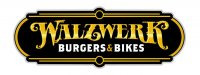
Ohh Noooo...... It's a font from 'the other guys' (BIKES & BURGERS)....somebody get a rope! LOL
