-
I want to thank all the members that have upgraded your accounts. I truly appreciate your support of the site monetarily. Supporting the site keeps this site up and running as a lot of work daily goes on behind the scenes. Click to Support Signs101 ...
You are using an out of date browser. It may not display this or other websites correctly.
You should upgrade or use an alternative browser.
You should upgrade or use an alternative browser.
How do you keep consistent colours on roll to roll printer? (Epson SC80600)
- Thread starter JayVal
- Start date
ColorCrest
All around shop helper.
Are you sure to say "converted" here, and not "assigned?"If that is unchecked, it will always be converted to the colorspace set in the rip.
ONYXtechtips
New Member
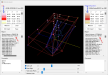
Last one, I promise. Just geeking out a little. Here is a comparison of Gracol2013 to a standard middle range mode CMYK printing device. Notice how close they are to each other. This will reduce the possibilities of error, but may not deliver the specific saturation or vibrancy you are looking for. We have a variety of tools to help with that but that is for another time.

ONYXtechtips
New Member
You are not wrong, but the colors would change on the output device if the numbers are now different from the file before it is mapped to the printerAre you sure to say "converted" here, and not "assigned?"
ColorCrest
All around shop helper.
That's a good thing because those renderings are the most primitive I've seen.Last one, I promise.
")
Some more examples...Here is a comparison of Gracol2013 to a standard middle range mode CMYK printing device.


... 1) GRACoL2013 inside an Epson CMYK ink set machine, 2) GRACoL2013 inside an Epson 11880 ink set, 3) GRACoL2013 inside the EpsonWideCMYK_Ver2 working color space.
What I'm getting at is, regardless of any very small or very significant differences in color spaces AND rendering intents, neutrals especially should not change. Why would they? A neutral is supposed to be just that; neutral. Color spaces (well made) and rendering intents mostly effect the edges of the spectrum. Much like language translation changing words or pronunciation to result in the same meaning, number values provided by ICC profiles are meant to be interpreted by the color engine to result in a color match or to be as close as possible for the process to allow.
JBurton
Signtologist
Honestly, I'd take the primitive appearance of older WYSIWYG style renderings vs today's graphics heavy shaders, at least in the CAD/CAM world.That's a good thing because those renderings are the most primitive I've seen.
As far as what you two are discussing, it's all greek to me.
ColorCrest
All around shop helper.
Honestly, I'd take the primitive appearance of older WYSIWYG style renderings vs today's graphics heavy shaders, at least in the CAD/CAM world
Well, the renderings I've posted above are from Apple's ColorSync utility software installed on Macs since the late 1990s, if I recall.No worries.As far as what you two are discussing, it's all greek to me
In the renderings, the GRACoL_2013 color shape represents the color gamut of many well behaved 4 color printing presses around the world. It's basically a standard, targeted goal. Using certain CMYK values, especially for gray scales and edge colors, one can rely upon getting the colors and tonality they expect if all things are aligned. In other words, input values will match output expectations.
The larger gray wireframe shapes from their corresponding printer profiles represent their specific printer / ink / media combination color gamut. The shapes merely show more vivid colors are available beyond that of the typical GRACoL CMYK printing press. The main contributor for this happens to be the ink set in these machines.
Something to note by attention to the 6 outermost color points of the renders. 100% of, say, yellow ink using the GRACoL space, will not be as vivid as 100% of yellow ink using the Epson 11880 printer / ink / media combination. Many times these effects go unnoticed, but again oftentimes, they are noticed but the remedy should not be so mysterious and elusive as they usually are.
JBurton
Signtologist
I find most folks around here correct bad colors by loading a different profile, as if that's all the printer and software is capable of. If not, this printer is trash... I guess a lot of blame is to be laid on the install techs, or, to stab at the heart of the issue, deceitful (or uninformed) salesmen.Many times these effects go unnoticed, but again oftentimes, they are noticed but the remedy should not be so mysterious and elusive as they usually are.
With the prices we pay for a print machine, at least, they should have a damn densitometer and an automatic system for autocalibrating. Its like prices of printheads, or price difference between a small cut plotter (like 200€) or a 140-160cms (5000+) for a larger belt and x axis.
Anyway, every machine is shit without a trained operator. In my area, never seen anybody using an i1 or similar. They all try profiles, some even dont know that there are profiles, and some have several i1 models and dont know and dont want to use them. Well... And there are always an expert that with just them eyes say, "bah, just put a little more of magenta on the tif/PDF". People just want to print fast and go, no matter the colours are not the most near possible with an ink/media combination. Dont know how they survive!!
Anyway, every machine is shit without a trained operator. In my area, never seen anybody using an i1 or similar. They all try profiles, some even dont know that there are profiles, and some have several i1 models and dont know and dont want to use them. Well... And there are always an expert that with just them eyes say, "bah, just put a little more of magenta on the tif/PDF". People just want to print fast and go, no matter the colours are not the most near possible with an ink/media combination. Dont know how they survive!!
somcalmetim
New Member
Got a Roland but the only two instances of Color Drift I experienced were
1- Clogged Orange capping station wasnt keeping orange head primed
2- Tried to "Kramer" an almost empty yellow ink cartridge and didnt notice till too late a warm grey I was printing had went cold.
1- Clogged Orange capping station wasnt keeping orange head primed
2- Tried to "Kramer" an almost empty yellow ink cartridge and didnt notice till too late a warm grey I was printing had went cold.