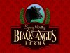
The C in black is out of place, its throwin me off. I also do not care for the green wreath looks out of place. Looks good though
I think I like Craig's idea about a gold wreath, rather than the green. I thought making it a subtle element would be better so I went with the green. As far as the C goes, I'm not sure I'm seeing what you're referring to, but maybe less embellishment on the main copy wouldn't hurt. I did perhaps go a tad overboard but working letter forms together artistically is something I need to work on so that was partly my main focus with this logo. Connecting the L and the U was an afterthought that I'm not real sure about, but it seemed like a different approach so I figured I would try that.
I'm on the fence about that. I could go either way, but all in all, I do like the design though.
I like the embellishments on the letter forms but I'm gonna reverse it back to just plain copy and see if that helps
I like the basic design & Charles font is beautiful, but when I think of a ranch it is bold, rustic & hard work.
Myself would bold up the same font for a start.
The next I really saw was the picture seem to just look like hot air balloon picking up the panel of copy, would lower it some.
Those green ferns would change to gold, again a ranch is not colorful like a parade.
Likes it in general & thinks ya can still use it
Thanks for your input, Craig. I will play with the colors and elements a bit. As far as going bolder on the copy, are you thinking the same serif font made bolder, or more like a slab serif font like Rockwell, Clarendon, Chunk Five, Deathe Maach, etc? Or maybe more country, like some old vintage Letterhead font with spurs, spikes, or whatever you call them?
I recommend you take off gradients and use solid colors. Example make the reef solid green. I also recommend you get the logo and make it all black and white. If it doesn't work in in black and white, it isn't an effective logo.
I always produce a logo in black and white, color, and then also make a full color illustrative version like you see above.
Just looking at the thumbnail, it doesn't pass the squint test. As much as I like the Desire font, I think in this case it's simply just overdone and the colors definitely aren't working for the theme you're going with. But....It's still a great learning exercise.
I think it's overdone as well with the connecting letter forms and swashiness. I think all of those elements balance well, but if readability is affected than it's less effective as a logo. I find it's easy to get carried away with these things but that makes it an enjoyable learning experience. What color scheme might you suggest? Color is not my strong point at all. I've been struggling with my blatant disregard for color theory for years.