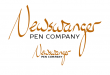
So I finally made time last evening and played with the logo a bit more. I made some minor tweaks to the lettering for more pleasing aesthetics, but I don't want to totally lose the handwritten feel of it. I also set up a version for smaller sizes with thicker lines for better legibility.
Make sure you have web address in a legible font somewhere on all your marketing materials. I now know that it says Newswanger but my mind is trying to make it something familiar - News wranger.
Yes, with my last name being a bit unique, having the name in a legible font like the website will be important. That's something I already was planning to do.
I don't know much about calligraphy but aren't the vertical strokes usually heavier than the horizontal lines like you have?
It bothers me that both of your w's are exactly the same (minus the a connector). No handwritten letters are exactly the same.
This is emulating writing with what is called a stub or italic nib. Instead of being more or less a circular point like a regular pen, the nib is flattened out more like an oval and held at an angle to the line of text while writing, which produces the thick/thin effects seen in my logo.
Your comment about the w's made me check, but as was pointed out, they are different, but similar.